I wanted the ITV logo to get off the fence and stand for something. Alongside the informative BBC and the provocative Channel 4, ITV is friendly and warm. It brings about shared emotional experiences.

I felt that the logo should be based on handwriting, and that the letters might be lower case and joined up.

In the drawings below I was thinking about the flowing rhythm along the bottom of the letterforms. The little stroke flowing into the first letter enhanced this sense of flow, but it tended to make the whole unit feel less like a logo. I explored different levels of ‘life’ and energy within the marque.
First digital drawing of the logo.

I wondered whether the use of symbols within the V might work across the sub-brands.


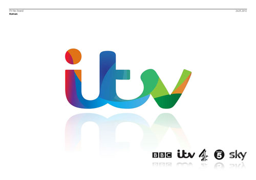
Below is the first look at the new marque alongside other broadcasters’ logos. I felt that it was distinctive and legible, but the heart symbol was too much. The typography alone had enough warmth in it.

At this point, I started to work with my old friends at Fontsmith. It was great getting into the detail. As well as considering weight and proportion, we wanted to formalise the marque so that it had authority and gravitas, whilst retaining its human DNA.

Since we dropped the idea of slotting a heart shape into the logo, we no longer had to make the V symmetrical. We all began to favour drawings of the logo without the stroke leading into the first letter.

We played with logo treatments to see how it might work across the different sub-brands.


From the beginning of the project, Rufus Radcliffe (group director of marketing and research at ITV) and I talked about the idea that the main channel would have many colours whilst the other, more specialist channels would have a single colours. Multiple colours would speak of the varied content on the main channel. In the first place, we looked at using the silhouette of the new logo as a window on an animating world of swirling colour.

This way of achieving multiple colours felt weak. I always loved Martin Lambie-Nairn’s multicoloured Channel 4 logo, and with this in mind we looked at ways of dividing the logo into distinct sections which could each have its own solid colour. The divisions are based on the flow of the handwriting on which the marque is based. To begin with, we considered having six versions of the multicoloured logo for use on and off air.

One of the six colourways.

One of the six logo colourways on a poster. The idea was that the designer would choose the most appropriate colourway for the subject.

Our brief was to create a brand which proudly held the network’s content. Also, to show ITV as a positive part of many people’s lives in the UK. I did not feel that these connections were strong enough with the range of six colourways. I suggested that we embrace colour wholeheartedly, with the five parts of the logo drawing colour from their environment.

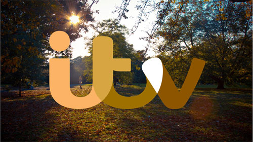
We felt that this was the final piece of the puzzle. We saw this colour-responsive behaviour as a great device in static and moving situations. The mechanism became known as ‘colour-picking’.

My intention was always to make a logo that could be big without being shouty. The colour picking device helped us even further to assert the brand in a way that was confident but not annoying. The logo could was no longer a badge, it was an intriguing and enjoyable addition to still or moving images.

The final job with the logo was to pick a hero set of colours for use where there is no imagery. The upbeat and modern colours are picked from across the colour spectrum to suggest the network’s wide range of content.

—
More from Rudd Studio.
Related: More4 rebrand options.


Comments
Gotta love the flow in it.
Great thought process and decisions behind this marque. Wonderful design.
A very effective and vibrant brand. I really like the pre-selected colorways, the picks in the last 3 banners of this post not so much (although bold).
Very interesting insight, thanks for the contribution!
I love the new logo, and now it’s totally implemented it definitely makes the brand stand out against the other big players.
One of my favourite elements was the fluidity of having a dynamic colour change, variable within it’s surroundings, such a good job!!
I Loved it so much I wrote all about it!
Well done Matt Rudd!
—
marcus
Excellent final design and application!
Thoroughly thought out…Well done!!!
http://www.utvgroup.com/motion-pictures.html
I JUST saw this mark on Downton Abbey’s Facebook page and thought, “Now, that is a great mark! I wonder who was behind it?” And then I keep scrolling my feed until a link to this post pops up. Great job, love it!
I really love the design in the circle in the first sketches, but I can understand the evolution due to legibility. It’s great that you’ve found a way to link the logo with it’s surroundings without having the window into the world like channel 4. I think a simpler way of doing itv 2,3,4 etc. would be to place the number inside the dot of the i, but maybe this would be too small.
ooo love this logo despite many opposing views on this one, I’ve seen a lot of this lately but was nice to see some sketches and brand treatments I haven’t seen yet, thanks for sharing
I like this…very thoughtfully done.
I really love it. It’s always a good idea to play with color and change the subject. The final logo is smart and beautiful. Excellent work!
Thank you for posting about the process and meaning that went into the logo creation! The final is not only beautiful, but powerful too. Love it.
Golly, am I the only person around here who thinks the new ITV idents are this years equivalent of the London 2012 logo?
IMHO they most certainly do not “proudly hold the network’s content”.
Works well for cITV though…
I absolutely love the new logo, it is upbeat and dynamic and playful. i love the idea of using different colors with different imagery.
I like it however not sure about the crossover colors that happen when the letters flow into each other.
I love seeing the process of other creatives, to me its the most important part of the design base. This is a very versatile logo, and looks to be well thought out.
I wasn’t amazed at first, but it has grown on me more. The development and application is much more impressive than the standalone logo.
Can I leave an ‘unappreciated comment’? I think its crap. Its weak and when placed with the other TV station logos looks like a dating agency advert slotted in the middle. The copy on this about ‘warmth and friendship’ completely disregards that its the channel of choice for the majority of Chavs that Britain has to offer and upon whom good design is utterly lost as they buy car insurance from a Meerkat with a ‘simples’ catchphrase…oh and don’t even get me started on ‘Catchphrase’ or come to think of it ‘You’ve been framed’ etc. Had ITV created more meaningful TV in the past 20 years I might be more inclined to think harder but as it is, it fits nowhere with the brand of TV offered or the people who watch it. 6-12 months, you’ll be able show another design evolution I think. I just showed it to my focus group and they said it was ‘crap’
Love the illustration of the process. Always interesting to see the stages of a logo design. The new logo is good too, the brand will benefit from a lift I think.
Wow, I never knew so much when it to designing a logo. If I was given the job of creating a new logo for a popular TV channel I would probable just use Microsoft paint and open a text box and type (in this case) I T V. It would be in upper case because its an acronym of a company and I think that’s the proper way to do it. I may experiment with a few colours, but that would be it, file, save as, ITV Logo.jpg
Unfortunately no one is going to pay me to do that, which is a shame, because I could do with the money and my MS paint version will do exactly what any logo is supposed to do on this situation – identify the channel so viewers know where to find the program from the advert or know what channel they have tuned to.
So could the above be the reason I don’t work on creative media and a reason maybe why I should?
I personally really like the multicolor logo. 8th up from bottom. Not really a fan of the yellow used in the final but i think it works overall. Thanks for the process thought.
Jimmy, You’re exactly the type of person that should never work in the creative industry. There is so much time and thought that goes into creating a logo. It is definitely not a one step process through MS paint, you for real?
I think you went the right route with your design Matt. Looks much better without the heart or extra graphic in my opinion. I like the flow of your type and the compactness of the logo. Nice job.
Still no mention of why the letter ‘t’ features an ink trap on the crossbar. I would love to know the reasoning for that feature on a primarily digital logotype.
Honestly I don’t like it. This is a very dispersive logo, and doesn’t strike me unless it’s used with many colors, textures, illustrations, etc., but the base isn’t good. If I use this logo in black and white it would be bad! But I understand that sometimes the customer is right.
I love seeing the process of other creatives, to me it’s the most important part of the design base. This is a very versatile logo.
It’s great to see the process behind this. I’ve started to include sketches in my case studies in my portfolio and I’ve had positive feedback from clients saying that it’s great to see my process. Worth showing, if you can.
Thank you! Really great to see the sketches (and therefore, the thinking) behind this identity. So often these days, designers start ‘designing’ straight in the computer. I realise that computer software is another tool at our disposal and it definitely has its place in the overall process but pen strokes, crossings out and hand notation are such an important part of the early visual development process in my opinion. Great work!
Great seeing the process on this logo and I have to say that its a great logo especially the use of color throughout the variations to the logo. I believe that the logo reflects the warm and friendly nature that you described above.
I think it looks okay but it doesn’t hold a candle to the BBC logo, or the Channel 4 logo for that matter. In the time the BBC has used its current logo, ITV have changed as far as I know three or four times. That just shows how good the brands really are. Personally I think the BBC logo is timeless and looks just as fresh as it did back in 1997 and dare I say ‘British’ (even though that sounds cheesy nowadays). I know this isn’t a BBC/ITV comparison but seeing as their major competitors I think it’s still relevant.
Excellent post. I love seeing the process and how much attention to detail goes into designing great looking logos.
I’ve always loved the design process and rational of creating a logo. The sketches, mistakes and its solution. This is missing from a lot of graphic design books out now. Their are just too many pretty pictures in design books now and not enough of the beginning process, the bare bones are lost. This is very refreshing to see as a young designer. You learn more from the beginning rather than at the end. We need more of this.