

Designed by Mucho, the monogram is based on Cervantes’ iconic throat ruff.
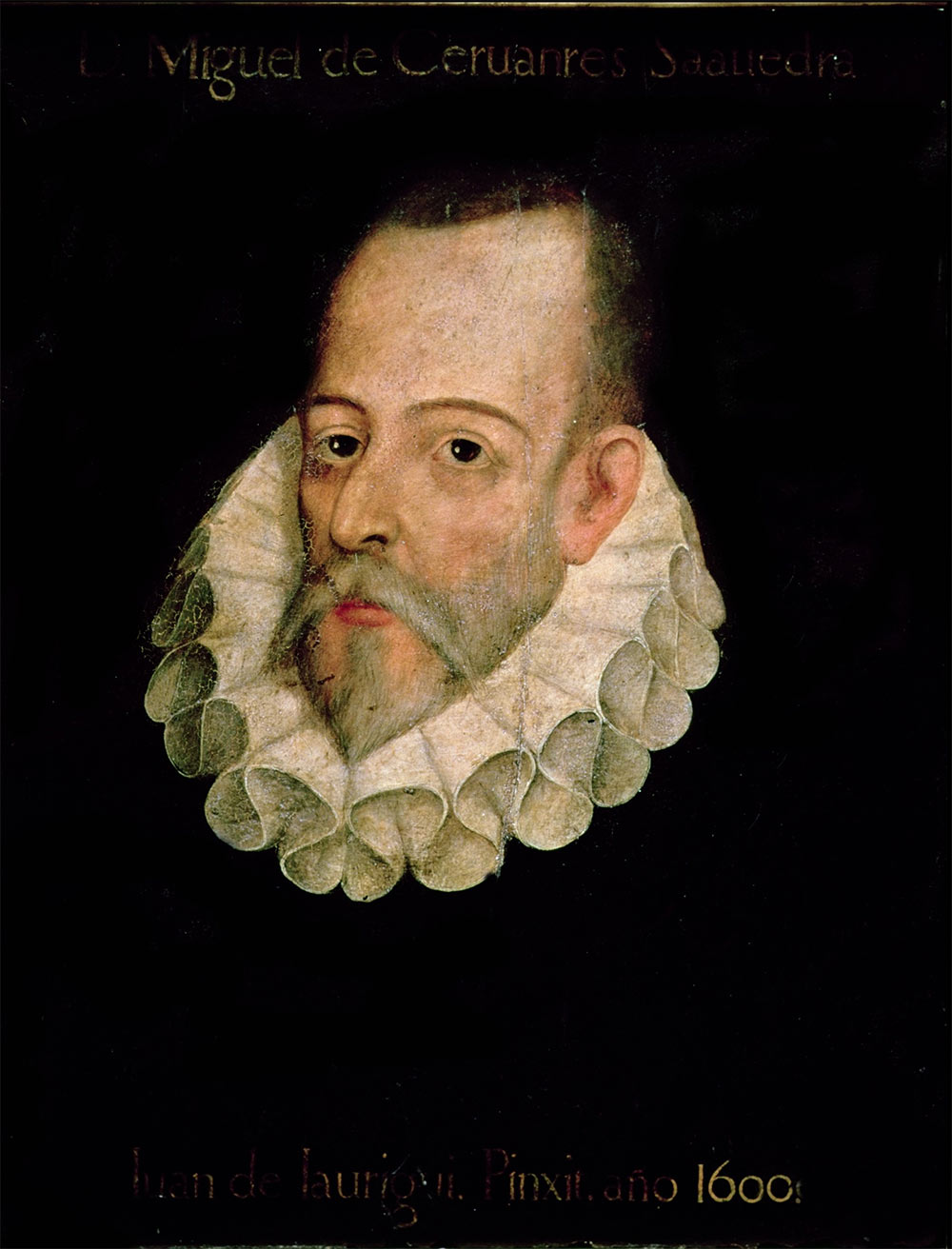 Miguel de Cervantes, 1547-1616
From the Mucho portfolio…
“The brief asked to focus the corporate image on the figure of Cervantes, and detach it from his most famous pieces like Don Quijote, a reference which has been used in many occasions for similar identities. On top of this the symbol or logo had to be easily understood by a very big audience, and also have a great capacity for printing and reproduction under all kinds of circumstances by a big range of institutions and corporations.”


The Ministerio de Educación of the Spanish Government hired Mucho following a portfolio pitch. I’ve had quite a few recent requests for free work so it’s at least something to see a pitch based on existing portfolios.
Catch all Brandemia winners.

Comments
So simple – I love the execution on a dark background.
A simple, bold and appropriate logo mark. You need to see the video on their site as well. Thanks for sharing.
Love this! So simple and yet so good!
I also posted this opinion on Twitter when David published it.
I don’t like to go against the main opinion, but I like to look deeper at graphic design work here and I find it a pretty good execution, the grid is perfect but the idea a little obvious. Good but predictable.