 Flag of Fukuoka. Stylised hiragana of ふく (fuku). Also represents ume (plum), the prefectural flower.
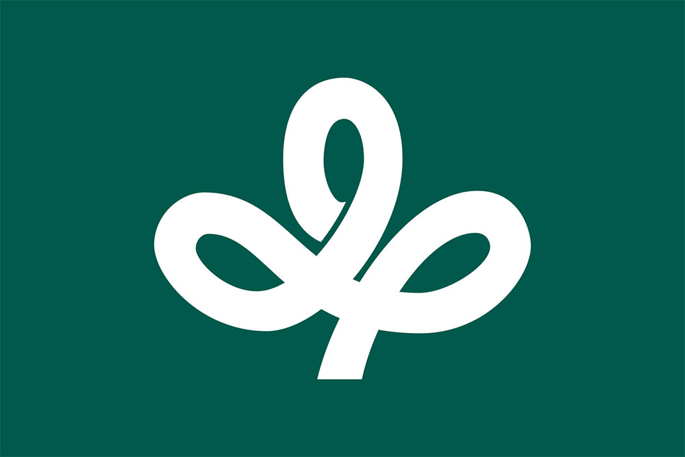
 Flag of Gifu. Stylised kanji 岐 (gi). The emblem expresses peace and harmony. Green for the nature of Gifu.
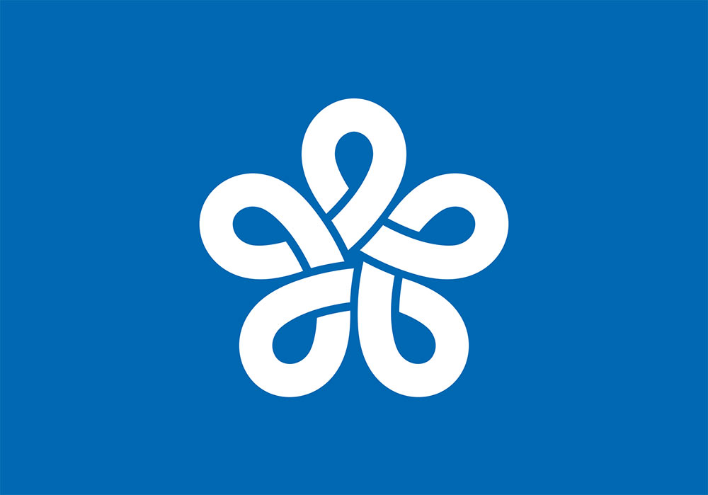
 Flag of Ibaraki. The prefectural flower rose on blue field. Blue for the Pacific Ocean and Mount Tsukuba.
 Flag of Kagawa. Stylised and slightly rotated katakana of カ (ka). Also represents mountains, and leaves of the olive, the prefectural tree.
 Flag of Kyoto. Stylized kanji of 京 (kyō).
 Flag of Miyagi. Stylised hiragana of み (mi). Also represents the miyaginohagi (lespedeza), the prefectural flower.
 Flag of Tottori. The symbol represents the hiragana と (to) and a bird (tori) to form a rebus of Tottori.
All prefectural flags are on Wikipedia.
Below the level of prefectures are the municipalities. They also have flags with nicely considered symbolism and, for the most part, appropriate restraint.
Via @TheLogoFactory.

Comments
These are some nice samples (there are a lot of terrible ones, not shown in this post, as well).
The Kyoto symbol is particularly gorgeous – albeit a bit of a stretch with the stylization of the 京 Kyo kanji.
I can understand that people who are not very used to kanji see no resemblance, but I feel like it’s not exactly a stretch that the flower is a stylization of the kanji. Though I want to add that the font used in this case is a little misleading.
Edit: My Japanese is pretty non-existent so I’ve no idea know how accurate the representations are.
If you learned traditional Japanese calligraphy, it is actually quite visible. Learning to read what to the western eye appears to be squiggly lines running down a painting is tough even for modern Japanese.
Bear in mind: the symbol here in the text is the Japanese equivalent of ARIAL or TIMES NEW ROMAN, which to us also has very little to do with calligraphic handwriting.
Examples:
These are gorgeous. Would love to know more about how these fit into the daily lives of people.
Albeit, not perfect, many of these flags are clever depictions of either their kanji form of its name or symbolic of items the region identifies with, say flower, tree, bird. The prefecture my mother grew up in was Oita, Beppu, Japan. The regional bird, the rising sun, and color are all represented by this flag.
The flags are very respectfully designed and I believe bring pride for each memeber of that prefecture.
https://en.m.wikipedia.org/wiki/Ōita_Prefecture
https://en.m.wikipedia.org/wiki/Prunus_mume
https://en.m.wikipedia.org/wiki/Zosterops
https://www.reference.com/geography/japan-called-land-rising-sun-d0c4a5f1f7f3fbb1
Not perfect because some non-Japanese person said so in their ignorance? Who said anything is perfect? Nothing is perfect, not a painting or a car or building or even any language itself.
The prefecture flags are correct representations of the Kanji, which Japanese people can see instantly. It isn’t their fault if a non-Japanese person struggles.
It’s not about non-Japanese not understanding them. It’s simply about the principles of good flag design. These are great logos, but just okay flags.
Abolish the genetically selected strictly male Tenno (Emperor of Japan) and replace him with quinquennially Diet-elected Ceremonial Presidency; elected by the National Diet and not immediately by the people in order not to needlessly disturb the Prime-ministerial system because two leaders would hinder the then Republic of Japan, 日本共和国.
I love the two colours of the Shimane Prefecture, but the aspect ratio should be the golden ratio, and inside I want the Shimane symbol replaced by a centered disc of height smaller than the flag’s height according to the golden ratio.