 Sendai, Miyagi (1933)
 Hida, Gifu
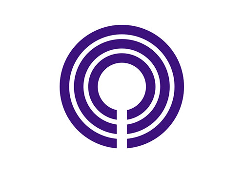 Kawasaki, Kanagawa (1925)
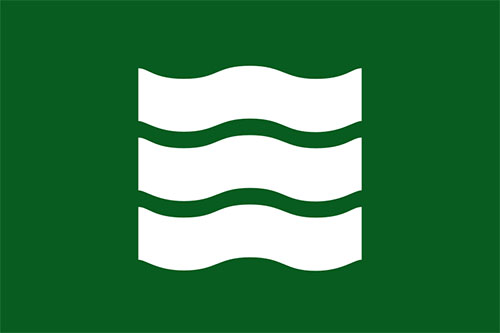 Hiroshima, Hiroshima (1896)
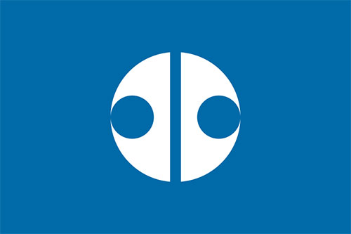 Kitami, Hokkaido (1947)
 Kochi, Kochi (1920)
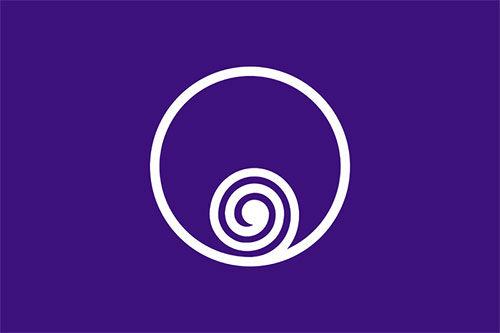 Naruto, Tokushima (1947)
From this list of Japanese municipal flags (split into regions).
A few of the designs are briefly explained over on Pink Tentacle. Biei’s symbol, for example, features the hiragana び (bi) in the shape of Mt. Tokachi.
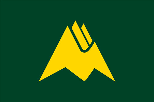 Biei, Kamikawa
Via Design Observer.


Comments
Very clean. Any idea when they were designed?
The year of design is underneath most. Dates are from Wikipedia so they could be wrong.
Wow, these are great! Simplistic and powerful.
Very interesting that they would have different flags for different towns. But overall it makes sense. The designs are extremely clean as I would expect them to be.
A little late to the party, but these reminded me of the japanese manhole covers http://www.itsnicethat.com/articles/japanese-manhole-covers
It figures that the Japanese, with their attention to style and symbolism, would design flags like these; i.e., free of unnecessary clutter. It’s also worth noting that they don’t hesitate to utilize colors such as brown, lavender, turquoise, and burgundy, that are rarely found among national, provincial and regional flags in most countries.