If there was a soundtrack, The Prodigy probably headlined.


Mario Kart and Super Tennis on the SNES. I always thought that four button symbol was a bit odd.

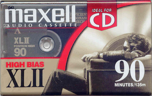 Maxell cassette tape photo: Ron Kane
Tape-to-tape recording on twin cassette decks, taking great care while filling out the blank inlay card.

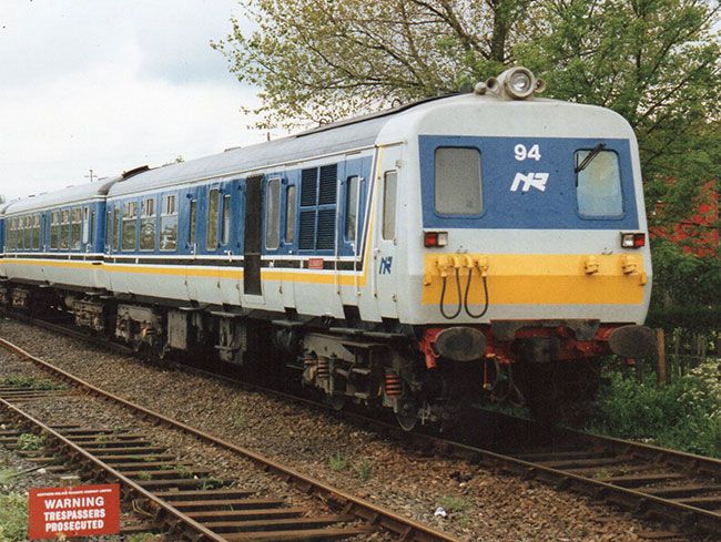 Photo by Northern Ireland Railfan
Riding the buffers on NIR (Northern Ireland Railways). The monogram isn’t used anymore. Good mark, though.
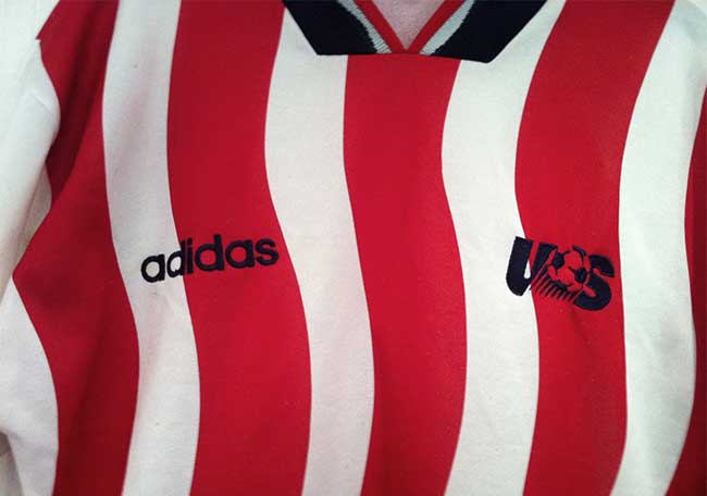 Photo via WaywardEffort
You’d often find me playing football (badly) until it was too dark to see. I sported the USA shirt after the 94 World Cup. Most people thought I was a Sunderland supporter.
![]() Photo by Alex Segre
Photo by Alex Segre
I vividly remember failing the acid test.
Comments
Love it… the Jilted album cover still remains one of my favs — back when life was much simpler — no work, school, living at home, easy life!
Ah, those Maxell cassettes bring back a lot of memories.
David, congrats. I got my copy of your book “LOGO DESIGN LOVE”, and it becomes part of my trove of creative resources for brand identity. Keep me posted David.
The inside illustration brought a flashback, too, Derek. Here’s a small sample of recent music likes in case you’re interested.
Thanks so much, Simon.
The design styles of the 90s are so different from today’s. Logos used to be more simple, strong and distinctive. These days designs are so ambiguous and all look like the same.