
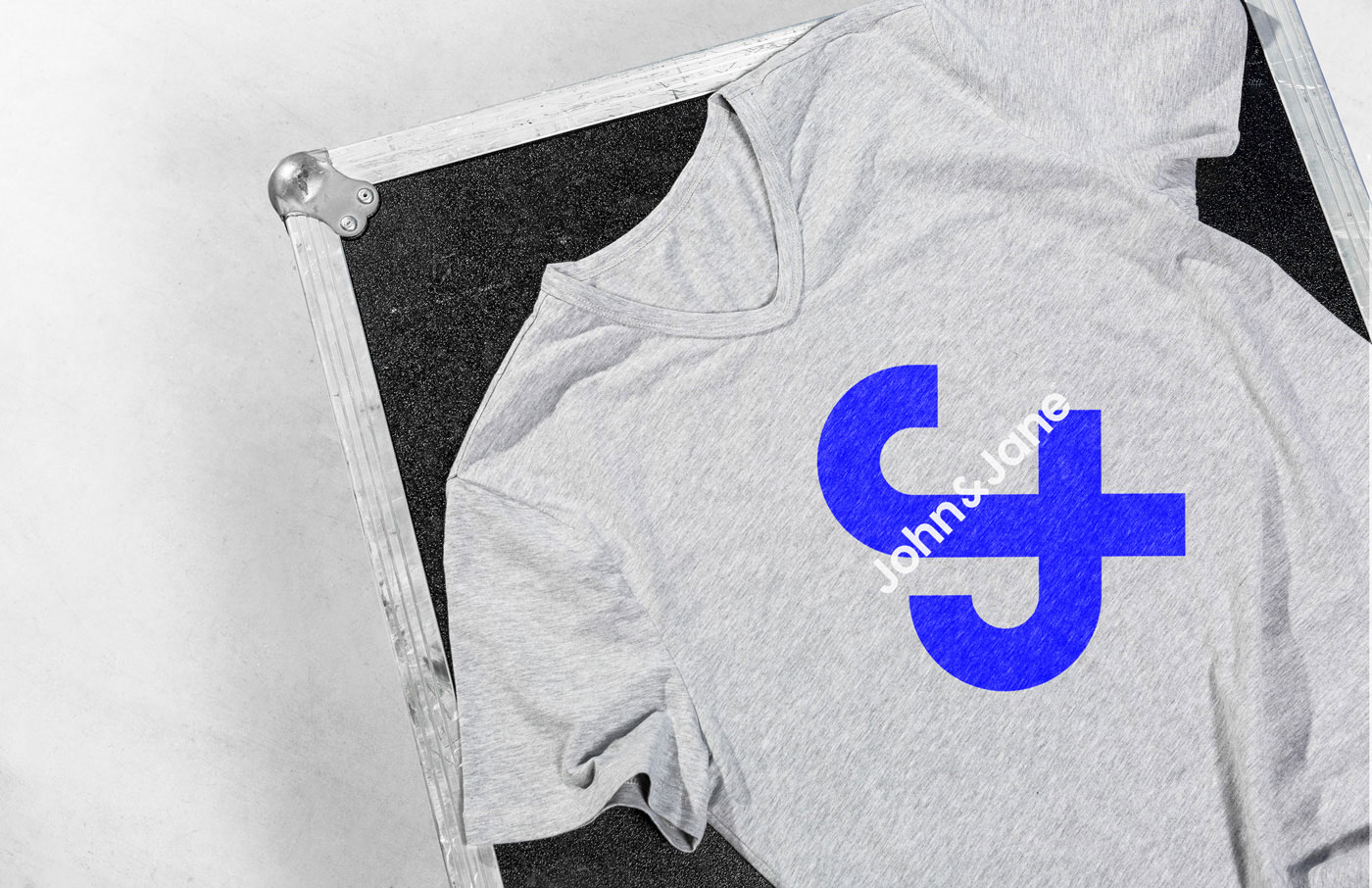
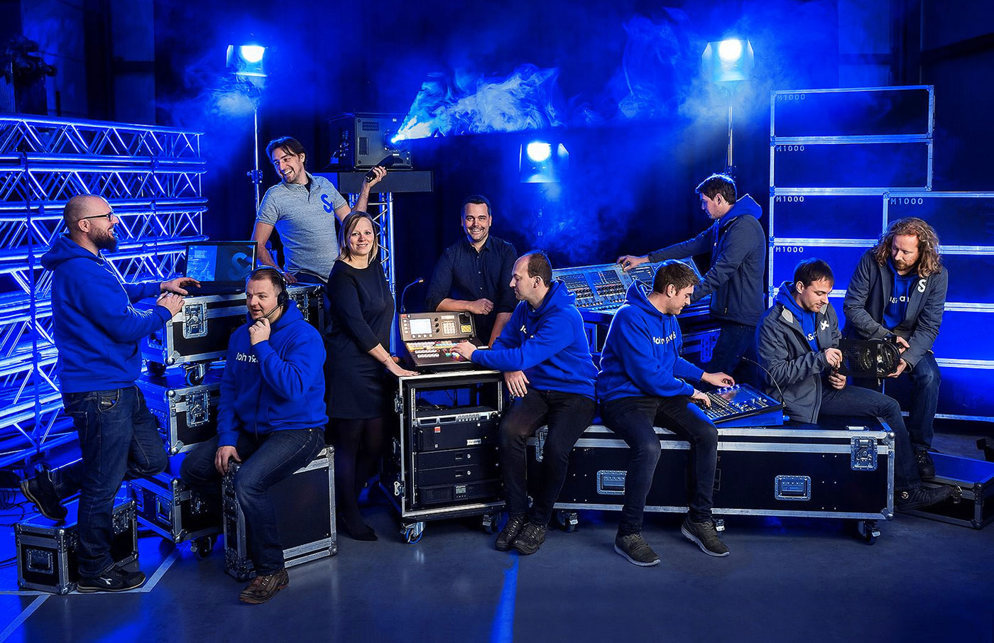
John&Jane is a technical event support company. The lovely John&Jane logo and visual identity was designed by Bruges-based Skinn.
![]()
![]()
![]()
![]()
![]()
More from the Belgian studio on skinn.be.
Via Kristian Labak on FormFiftyFive.
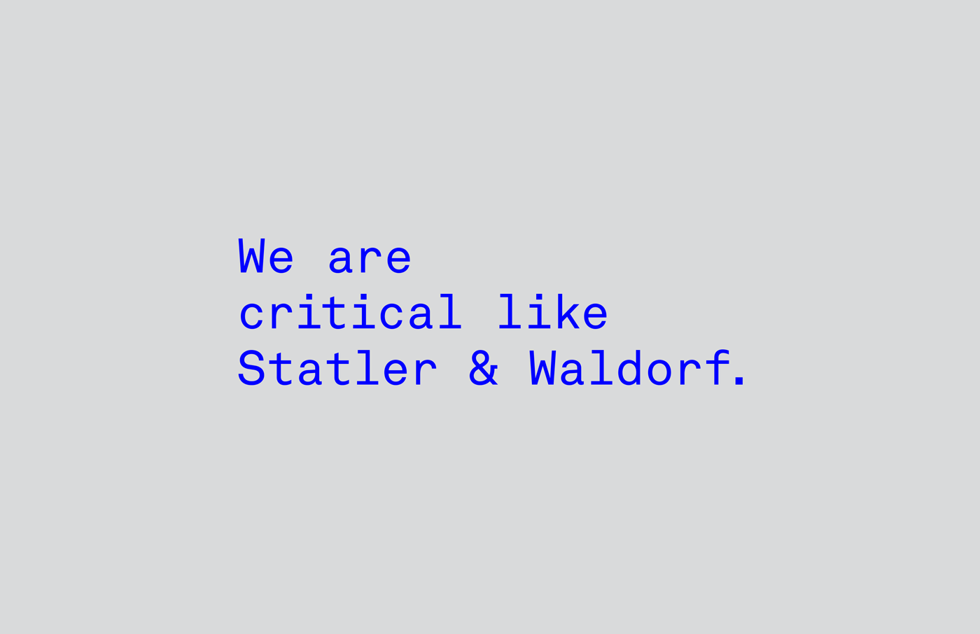
The ampersand, one of those symbols that’s just nice to look at. And when you can merge it with a fitting idea? Well.
John&Jane is a technical event support company. The lovely John&Jane logo and visual identity was designed by Bruges-based Skinn.
![]()
![]()
![]()
![]()
![]()
More from the Belgian studio on skinn.be.
Via Kristian Labak on FormFiftyFive.


Comments
Brilliant idea.
Great idea, one of those you see and think damn – so simple! Not keen on the overused reflex blue though.
Is it me, or does the weight of the ampersand motif look a little less than the ‘John’ and ‘Jane’ – it’s especially noticeable on the business card mockup. I’d prefer if it matched the weight of the words, or was a little larger.
I love the look and feel of this logo. Everything is quite nice but the idea is similar to the logo I did 2 years ago:
https://www.behance.net/gallery/25362959/John-Partners
Identity of the year? It gets my vote!
Wayta make this about you, Rikky Nguyen.
That would work perfectly for an umbrella company, although with a lighter font for the J’s.