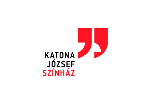
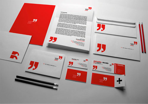
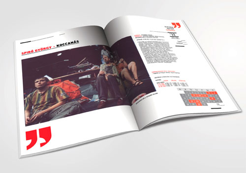
It’s by Budapest-based Botond Vörös for the Katona József Theatre. The quote marks are a reference to theatre masks, a well known theatre motif.

More images on Behance.
Via Brand New.
A good, relevant way to differentiate a “speech marks” logo from every other speech marks logo.
It’s by Budapest-based Botond Vörös for the Katona József Theatre. The quote marks are a reference to theatre masks, a well known theatre motif.
More images on Behance.
Via Brand New.


Comments
Clever, it has that classic “Aha!” moment when you notice they are more than mere quotation marks.
Clever and subtle and really brilliant thought-process. I think designers and creatives will love it…but I wonder will it be too subtle for the average eye?
Hidden yet obvious. It has taken a long time to see such a creative idea out of quote marks.
i think people too will get it. In time maybe, but it’s there to be discovered. Great job!
I agree, very clever yet subtle. I get the idea/relevance of the theater masks but I don’t understand the use of a quote mark as it looks like a closing quotation mark after the theater’s name. I’m curious to know if they were used simply because they inspired/fit the mask idea or if there was some other reason. All in all, nice concept.
Love it, and don’t see how people wouldn’t get it.
Like the idea, i think it’s clever. But, reading the reactions, and how much attention it gets, i think is little overrated.
As a consumer i wouldn’t make the link to the masks, now that it’s been sad you do see it. No offense to the designer, but the concept maybe has more potential.
Am I being stupid? I see why theatrical masks are relevant, but why are quotation marks directly perinent to or expressive of theatre?
If it was a personal brand for a theatre critic or theatrical review magazine or radio show about theatre it would make complete sense. As it is, I see a clever idea applied attractively but innapropriately.
I’ve seen something really similar to this:
http://www.portoeditora.pt/headerPE/images/logoPE_2010.gif
I can’t help the feeling that this is perhaps a design which is simply too clever for its own good…
I love it
I love the idea of the masks and the black and red. Yet, like mentioned above, I don’t quite understand the half quotation mark. Maybe there is another way to show the smile/frown? Not sure.
G.
The Idea is very clever. Love the design. People may not get it though – but I think with time it will be accepted very well by the audience.
I agree that relevance is an issue: the half-hidden masks-as-quote-marks are clever, but that concept is hurt by the quotes having no obvious meaning or relevance beyond being visually convenient.
The identity could be expanded to use the quote marks to actually quote something. For example, famous quotes from plays, chosen for their relevance to the personality of the Katona József Theatre.
Too subtle for my husband to see and he’s a web designer.
Very clever though.
I agree with others that this may be a little too subtle for it’s own good, but it is beautiful…
I like it.
I don’t think it should be debated so much why he used quotation marks.
I feel like I should defend him though (my fellow Hungarian), since it has been questioned in most comments:
if you really think about it, every single word in theater could be considered to be a quote. The actors are constantly quoting the original piece of art, the written script, any type of literature which had been turned into a play etc.
Thinking like this, it could be a really nice metaphor.
What bothers me though is this other identity, which seems very similar:
http://www.brandingserved.com/gallery/Eastside-Bookshop-identity/353238