
The Lale TV channel for children was launched in Ukraine on June 1st, 2013. The channel’s shows, created by children themselves, are broadcast in the Crimean Tatar, Ukrainian, and Russian languages. Art Lebedev designed a bright and playful logo and visual identity for the project.
“The name means ‘tulip’ in Crimean Tatar, and the logo is a representation of the name where the letterforms make up leaves and petals. It is designed to be recognisable even when broken up into different parts.”
Quoted from The Branding Source.

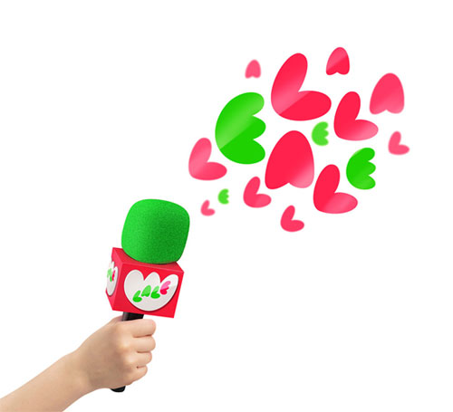

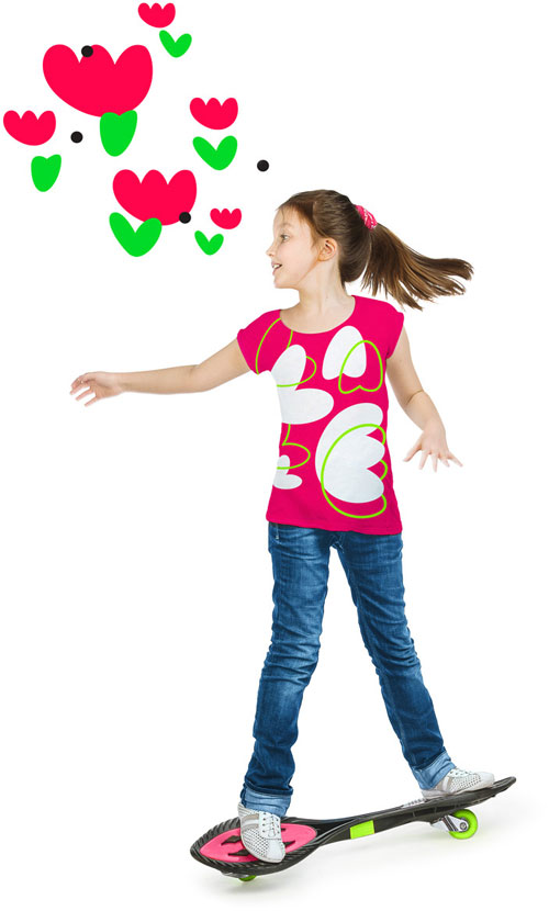

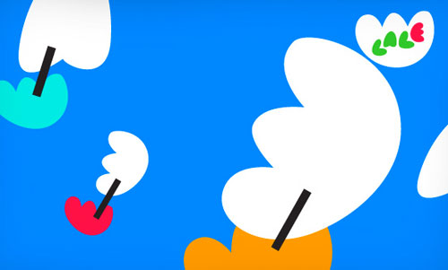
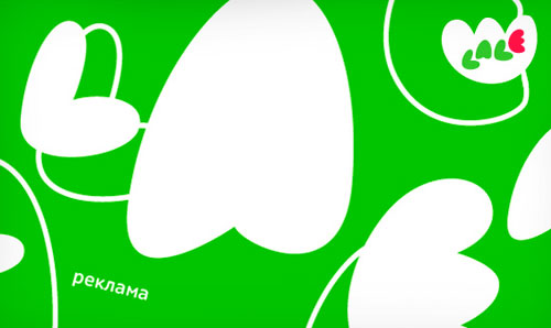
“Flexible and expressive, the logo sets playful mood for the rest of the visual identity: it can morph, transform, and break down to separate building blocks, but always remains recognisable, whether on screen, products, ads, navigation, or documents.”
Fun, appropriate, distinctive work by Art Lebedev.
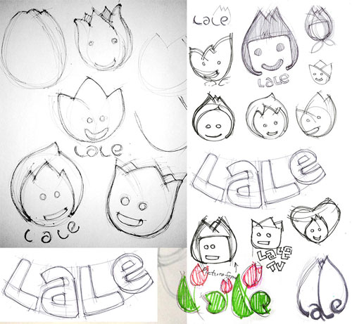
Some alternative ideas on the Art Lebedev process page.


Comments
A perfect fit. Like the simplicity and playfulness it represents for children.
Very creative, has definitely grown on me like a tulip after seeing the reasoning and process behind it.
Inventive and creates a great foundation for a stellar brand identity. The possibilities are endless.
I’m from Russia and Ukraine. This identity was not welcomed warmly, and a large number of designers dislike Lebedev because think most of his work (“hack”?).
Sorry for my bad English.
@DSkvar Is there any evidence to support the case of him being a “hack”? Also, it’s not very constructive to dismiss a logo/brand identity based on one’s own feelings and opinions of the person and not the work. Not saying this is your opinion. Just curious of your thoughts.