
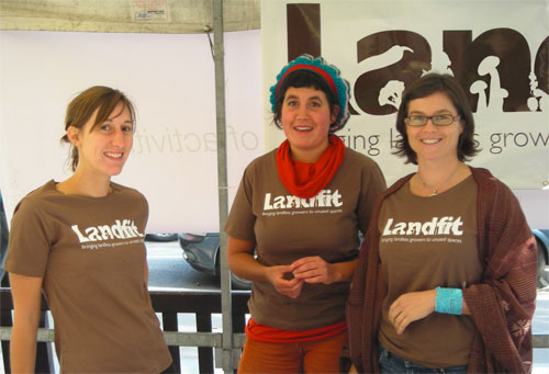
“I had a great idea,” said Tim. “It’s called Landfit. I match people who have gardens that they don’t use with people who don’t have gardens who want to use that space to grow flowers, herbs, and vegetables.”
![]()
“If it’s about getting people to use unused spaces, why not grow vegetables in the unused spaces in the logo?”
— Good People
Nice idea, designed by Good People.
More negative space logos.


Comments
Love it – the logo and the organisation :D
Excellent work. Love this kind of logos. Simple, clean, one coloured with good typography and a great idea.
Would be more than proud if it was my idea! Congrats!
Lovely logo execution. Is that a slug sneaking in at the end of the logo though? Surely not a welcome guest?
The logo look good on a t-shirt too, always a good test.
Wow David, I had no idea you had posted this. Many thanks and thanks for the comments. We have been amazingly busy recently!
I’ll be in touch soon David, I promise. Lucho, keep making comments like that and I’ll have to add you to my Christmas card list!
What a great idea…on all levels.
That’s a great logo, and a great idea!
If I’m not mistaken the slug is actually an eggplant… although I stand to be corrected.
Great work.
That really is supremely clever.
Like it!
Though I think a little more care in terms of placement and selection of the silhouette’s would have taken it from good to great.
What a fabulous idea for a company. I miss my garden but I’m too far away to take advantage.
I love the logo as well (but reducing will be a wee bit of a problem me thinks).
Hope the company goes world wide. Lovely logo. Should last as long as the company, no problem.
Clever idea, although I agree with Catherine, it’s very detailed and anything smaller than we see here would be fairly difficult to see the effect. Having said that, the name would still be legible which is the main thing!
I like that a lot. Very nice.
@David, It does go fairly small and yes, the name still reads. You ‘discover’ the vegetables when it gets bigger.
Actually I love the idea of “discovering” the plants! :)
Lee, am I eligible for the Xmas card list already? :)
You’re more than welcome, Lee. Credit where it’s due.
This is such a smart design. Very cool post, David! Thanks for sharing.
Cool concept, okay execution. More identifiable icons may convey a clearer message.
Seems very similar to this wordmark:
http://cargocollective.com/thinktank#355499/Origin-Electronics
I love the logo. Looks very cool.
Hi,
Worth noting that the concept of this was fist thought of in the UK by a TV chef Hugh Fearnley-Wittingstall. I man who is passionate about home grown food.
His site was setup about 5 years ago – http://www.landshare.net/
Actually the H F W landshare site was launched on April the 9th 2009.
The Landfit logo was designed in 2008. Tim had been toying with the idea of setting something along these lines for some time as he had been operating a similar idea informally for a while with neighbours gardens.
Whoever thought if it first, it’s a great idea and a very worthwhile cause in this day and age. We support any scheme of this nature.
Often various people have similar ideas at the same time independent of one another.
It works from a distance, but it boggles my eyes a bit when close up!
Love the colour. I am a HUGE fan of brown in design :)