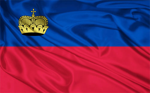
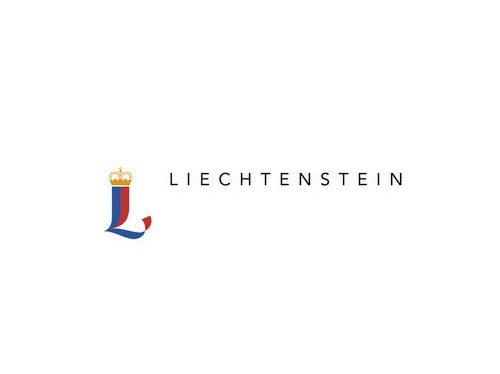
A competition was launched in January (2012) where the entrants were briefed to create a logo using the Liechtenstein national colours of blue, red and gold, and to reflect values such as self-determination, independence and security.


The winning design (below) was created by UK-based designer and citizen of Liechtenstein Marc Weymann.

“According to the Liechtenstein government, Weymann’s identity was chosen from the shortlist of five following a nationwide poll open to all citizens of Liechtenstein aged 14 years or over — around 30,000 people.”
— Design Week
 The five shortlisted logos
Weymann’s logo picked up 6072 votes from across Liechtenstein to win the competition ahead of consultancies and designers in Spain, Germany and Switzerland.
The new identity will be used from May 1st 2012 and replaces the 2004 identity created by Wolff Olins.
Story and info via Design Week. Also reported by Wolff Olins.
—
Related: Crowdsourcing Haiti


Comments
This is a shame, I think the logo and identity that Wolff Olins created in 2004 should have been built up, rather than discarded.
I agree.
The new one looks like a logo for Sir Lancelot.
To be fair, and probably play devil’s advocate, although these might not have the depth of Wolff Olins’ 2004 identity they’re far from the worst crowdsourced logos I’ve come across. It’d be interesting to see some follow up material but the winner seems to be a very good and experienced designer with real pedigree.
Does anyone remember the name/ident of the tv channel in Shrek 2? It was great, but I can’t find it.
Owen, here’s the general standard when everyone everywhere is invited to submit: Crowdsourcing Haiti.
Haven’t seen that one, Miles.
Don’t know whether to laugh or cry, David! That is a truly, truly depressing thing. Backs up my point that the Liechtenstein one is a rare high point I guess…
Congrats to Marc Weymann on winning the competition. However, what was the reason for discarding the Wolff Ollins design? I’m sure they paid a pretty penny for the design and it was very good and quite regal so it seems weird that they’d completely discard the design after only eight years. It seems like many companies and tourism bureaus are trying to create buzz through random identity redesign contests.
I agree with Miles and, like Natasha, wonder why they needed a new identity so soon. Are they gunning for the Olympics?
I agree that the standard is impressive and I like the winning design. It does seem strange for a country to feel the need to throw away such comprehensive branding in favour of a crowdsourced logo but I can appreciate why they might want to change.
The last logo reminds me of a high street fashion chain. The new logo has a traditional feel to it while also being quite novel and contemporary. The 2004 logo makes me think of the tacky trend for encrusting iphones and things with jewels an association that would not have been there when it was designed and not something a citizen would want their nation’s logo to suggest.
They should have evolved the current branding scheme rather than confuse google image searches with yet another country logo.
Places don’t need logo’s. They need identities that are campaignable, recognizable, based on truth that have the ability to be taken to heart.
Yeah, these are pretty good and the new logo is pretty ok. I do like that they specified Liechtenstien folks to do the creative. Minor plus there.
Perhaps they had a real reason for a ‘rebrand’ which we don’t know about.
If that’s the case, and it had to be done, then I quite like the new id.