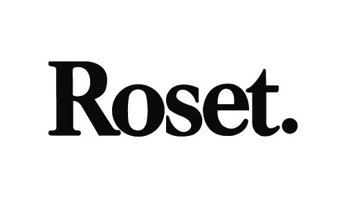
High-end French furniture manufacturer and distributor Ligne Roset recently celebrated its 150th anniversary. Here’s a look at how the Ligne Roset logo evolved through the decades.

The family business is currently under the leadership of the fourth generation of Rosets, brothers Pierre and Michel, recently joined by their sons Antoine and Olivier. Today Ligne Roset does business in 71 countries.


“Our first logo, before the days of modern branding and marketing. Circa 1930, as we began to establish our upholstery collection pre-WWII.”

“Moving towards the mid-century, our logo evolved to reflect our product; ‘sieges’ as in seats.”

“Our logo in the ’60s.”

“Moving into the ’70s, clearly; ‘the best moment of the day!’ was our tag for a period of time.”

“Later in the ’70s we expanded back to the full Ligne Roset name, adding in the smaller LR mark. As you’ll notice, moving into the ’70s as most other businesses, our logo and branding became more of a focal point, seeing more revisions.”

“Moving past the ’80s, we used this particular logo from 1990 up until very recently in 2007.”

“And our most contemporary logo, which we’ve stuck with through the ’90s and ’10s.”


Looking at how the earlier variations compare to today’s wordmark I’m glad the boxed-surround of 1990 onward was ditched. It seemed to restrict the brand name to no obvious benefit. Brand equity has been kept with the use of the same type-style for the past 40 years, and if there was to be a switch from the current iteration, I’d like to see experiments with the original script from the 30s. It shows a personal touch that says “high-end” more than the current type, and the handwritten style would also suit the familial nature of the business.
For more logo histories in the archives, have a look at Ferrari and Kodak.


Comments
Good stuff. I like the 30’s mark too, simple and as you said “high end”. it would look great stitched onto a label or directly onto a sofa. I’m also a big fan of the version from the late 70’s, although I think the LR at the bottom is too much. thanks for the retrospective, cool evolution.
Nice to see a real brand’s logo evolution. I do like the last one, it is just as good as the first though. Anyways if it was to me I would not change anything and be proud of the job done!
What I really appreciate about the brand evolution is that there has been revolution throughout the years too. Times change, as do trends, tastes and brand ethics, so it’s great to see Ligne Roset exploring who and what they are through the years.
Personally I think the latest iteration is a little dated (has an 80s feel?) now. If the brand has embraced change before then perhaps now, in their epic 150th year, is the perfect time to have a re-think.
Thanks for the post David.
Mat.
I love your logo evolutions posts. I, too, was impressed by the consistency of the last 40 years. What I find interesting is that although the company is celebrating 150 years, their “logo history” only goes back to the 1930’s. Its a good reminder that a brand identity is far more than a mark.
Thanks for posting.
Great post. I don’t know about anyone else, but I find these types of logos particularly challenging to get right. The client is often expecting something sophisticated and clean, but wants it to have a genuine edge… When you’re dealing with a clean layout that doesn’t often give you room for experimenting too much.
I think the ‘s’ mirroring the ‘e’ fits the brief perfectly here, and the cut off ‘t’ finishes it all of beautifully!
Cheers for the post.
Great post, this is the kind of thing I wanted to do with the Bell logo when they did their redesign a couple of years ago.
I like the consistency with the ‘s’ and the ‘e’ in use for the past 40 years!
Interesting to see the evolution, the expertise building behind a simple logo.
Great post