The Chase is a UK design and brand consultancy in Manchester, London, and Preston. Founded in 1986 by Ben Casey and Lionel Hatch, the firm has grown to a team of 46, and recently became part of the Hasgrove Group. Here’s a small selection logos by The Chase.
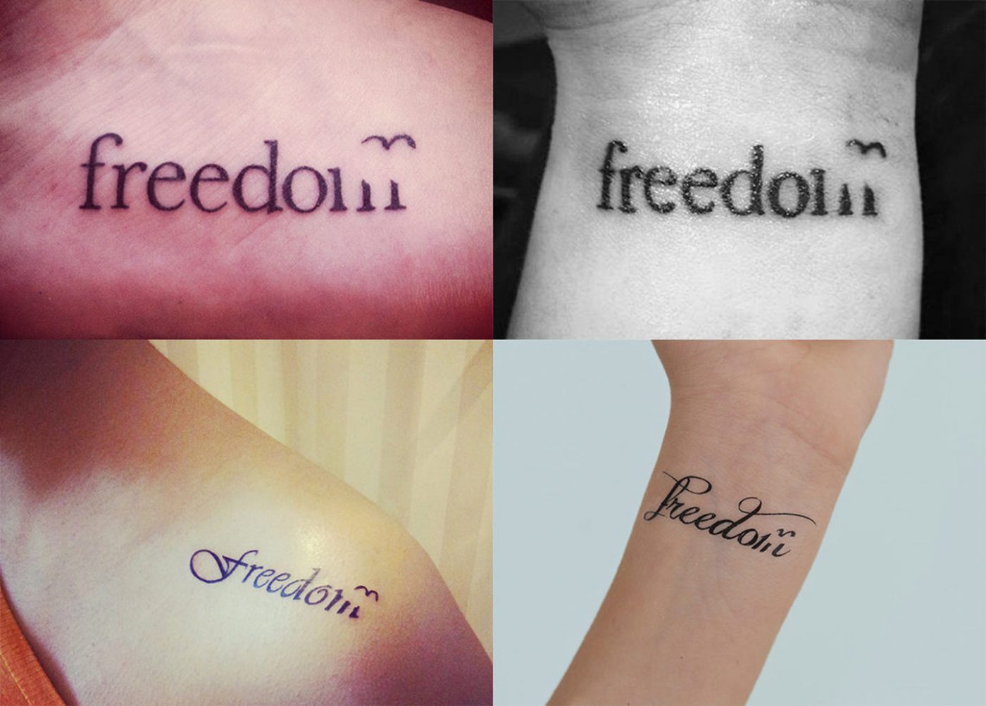
Freedom Travel logo
Easily one of the most memorable marks they’ve done, for Freedom Travel. As you can see by the header image, “The mark has such a strong resonance with people that we’ve seen many choose to keep it with them permanently.”
Leaf Street logo
An environmentally friendly housing association in northern England with a name that can prove its credentials. A leaf becomes a row of houses, becomes a logo.

Keycutters logo
An identity for… go on have a guess.

3CV logo
Ethical marketing company with three core values.
Layezee Beds logo
Part of the Silentnight group. The mark uses a cap L turned 90 degrees to make a bed. The flexible mark uses photography of people to add a human touch, and was also used for diagrams to show product benefits.

Conception logo
A marketing business that’s trusted for fertilising brands with its strategic thinking.

Great Room logo
The logo for the Great Room, Preston North End Football Club’s dining room.
Hostage logo
An identity for a film production company specialising in commercials. “The answer was in the name, which we followed to the letter.”
You’ll find a nice interview with The Chase founder Ben Casey on designboom.
“To paraphrase Bob Gill, ‘every graphic designer should disregard all the theories and rules being thrown at them’ …especially the ones in this article!”
And this from The Chase magazine, is your brand in need of some logotherapy?
More from The Chase.



Comments
All the selected logos look very clever. There must be such a brilliant mind behind them.
Pelham Street http://www.thechase.co.uk/images/portfolio/logos/pelhamst.gif is also a clever piece that i like a lot from their portfolio.
I really like the Leaf Street one, not very keen on the hostage one… seems too boring but also overly complicated.
the Layezee Beds one is interesting, just taking one letter and rotating it seems almost TOO simple, but you can see how well it works, something to keep in mind maybe for future projects, look at what your fonts look like from all angles…
Wow, leaf street is perfecto! really good stuff here David, thanks for sharing.
I really like the Leaf Street, Keycutter & Layezee Beds,
it’s really good strategy in logo design.
This is a nice selection of concepts, and for a diverse range of business types. I think without doubt that most successful of the group is the ‘Leaf Street’ design, clearly reflecting both the houses and the leaf whilst making good usage of just two contrasts of green.
I’m not too sure about the ‘Layezee Beds’ design, as this seems a bit too simple just rotating a letter on it’s side. For me it’s just lacking that little bit extra that shows the effort put into a logo concept.
The hostage identity is strong, but I think could have negative connotations. I wouldn’t see this design and connect it with a film production company, I’d believe it to be something extremely serious. Thanks for another interesting portfolio, I look forward to seeing more of these soon.
Leaf Street in particular stands out for me, too.
I am in love with both the Leaf Street and 3CV. Clever and simple yet with depth to them. Thanks for the post.
Keycutters – amazing, one of those “why didn’t anyone think of that sooner?!”
Thanks David. Really clever designs. Helps all of us see what’s possible if we “let go” of preconceived design notions. I love Conception. Leaf Street is great too.
Thx
Giulietta, fearless branding chick
Very inspiring collection. Thanks for sharing, David. I personally think the Layezee Beds logo is genius and probably took a lot more thought than we think.
Very nice indeed. I also liked the cidu logo, which you didn’t feature here.
While i love the keycutters logo concept, i dislike the use of photos here.
Here in america, a logo can not be trademarked if it has a photo in it. From my understanding.
i enjoyed looking at these logos, and the great efforts behind them,
i don’t know guys but do we still need more than a symbolic logos, i think making a symbolic logos needs the symbol to be more than a symbol, maybe a unique symbol, a symbol that has different look, a symbol that is simple but hard to forget, maybe a symbol that you enjoy looking at in different angles, a symbol that is a logo.
All are nice. Super collection.
I like the Great Room Logo and of course the Lazybed. Really fantastic job.
I love all of them. I can’t believe some people don’t like lazy beds.
Sam, a symbol is a graphic device not made of type. A logo is a distinctive wordmarque, like Mother and child by Herb Lubalin. A symbol isn’t also a logo. Don’t you think all the above are unique, distinctive, memorable, describable logo’s/symbols?
I’ve always admired the Chases work. The letterhead for the Preston North End is lovely. It’s worth looking up their book. Worth adding to your library David.
What a great find. Their work is great. Leaf street is my favourite.
I also like some of their promotional ideas very simple but different. I love the MEN moving card and the decking invite.
We actually favour the Leaf Street and Hostage marks the most, although Hostage would have trouble at small sizes.
The rest seem too lack that certain blend of elegance and provocation that marks a truly great symbol or logo….sure they’re simple, but are they memorable and informative?
The first three logos are fantastic, although I’d definitely prefer the Keycutters one in silhouette. ‘September’ on their website is nice and eclectic as well.
Everyone of them is very clever, I just do not really get the Great Room. What is it?
I liked the 3CV Logo. It is nice and simple.
Really inspiring work! The Chase demonstrates how thoughtful design can communicate a brand story with simplicity and impact. It’s a great reminder of the power of strategy-driven creativity—something we also focus on at DN Designs, helping brands stand out through branding, packaging, and digital design solutions.