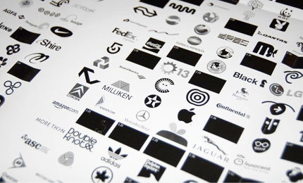
Is it time to retire the black and white logo? Ben Terrett poses a question that brings an overwhelming response in favour of ‘no’. A good thing too, with many of today’s aspiring graphic designers being exposed to an ‘online-only’ kind of world.

What is the logo worth? Michael Surtees talks about how “logos as we know them are dead”. The post mentions how in the past, organisations thought a fresh logo would help change their fortunes. I hope they don’t still think that way.

Should there be a law against logos? David the designer muses over logos that communicate nothing. I don’t know about you, but I’m liking the sound of being paid for ‘not’ designing.

Logo Design Love, the book, gets the green light! Many of you will already know, but for those who aren’t subscribed to my main blog, I’m working towards becoming a published author. Exciting times!
If you’re part of a design agency, producing top notch identity design, I’d love to hear from you about a possible feature. You can contact me here.

For a light-hearted finish, I thought this retro Apple logo fruit salad looked pretty juicy. Via @ucllc.
More logo-linkage on Twitter (with the occasional ramble).


Comments
Great links, thanks for posting this David. Excited to read the b&w debate.
Well, I think most of the time, even when you do a full-fledged colour logo, the client still wants a monochromatic logo. This mainly happens with the people I work with because they want to print their stationeries in monochrome.. so they always ask for a “black and white” copy of the logo.
.. and I don’t really have problems with b/w logos at all.
I’m pretty excited for your book. It will be a great addition to my tiny collection!
Interesting debate. I for one am ‘old school’ when it comes to logos and agree with Ben Terrett for the most part. Techniques and styles are not ideas. Fashion is transient and who knows how the communications landscape will evolve.
I like the juicy look of the apple picture too, makes me really want some kiwi!…I liked their original logo the best and miss seeing it, reminds me of my first Apple II with floppy disk :)
The apple logo reminds me of Pinkberry for some reason. Designed by some boutique firm in LA they have really neat stuff on there site
http://www.ferro-concrete.com/
Best Luck for your book !
Thanks very much, Sindur, and to everyone else for your comments.