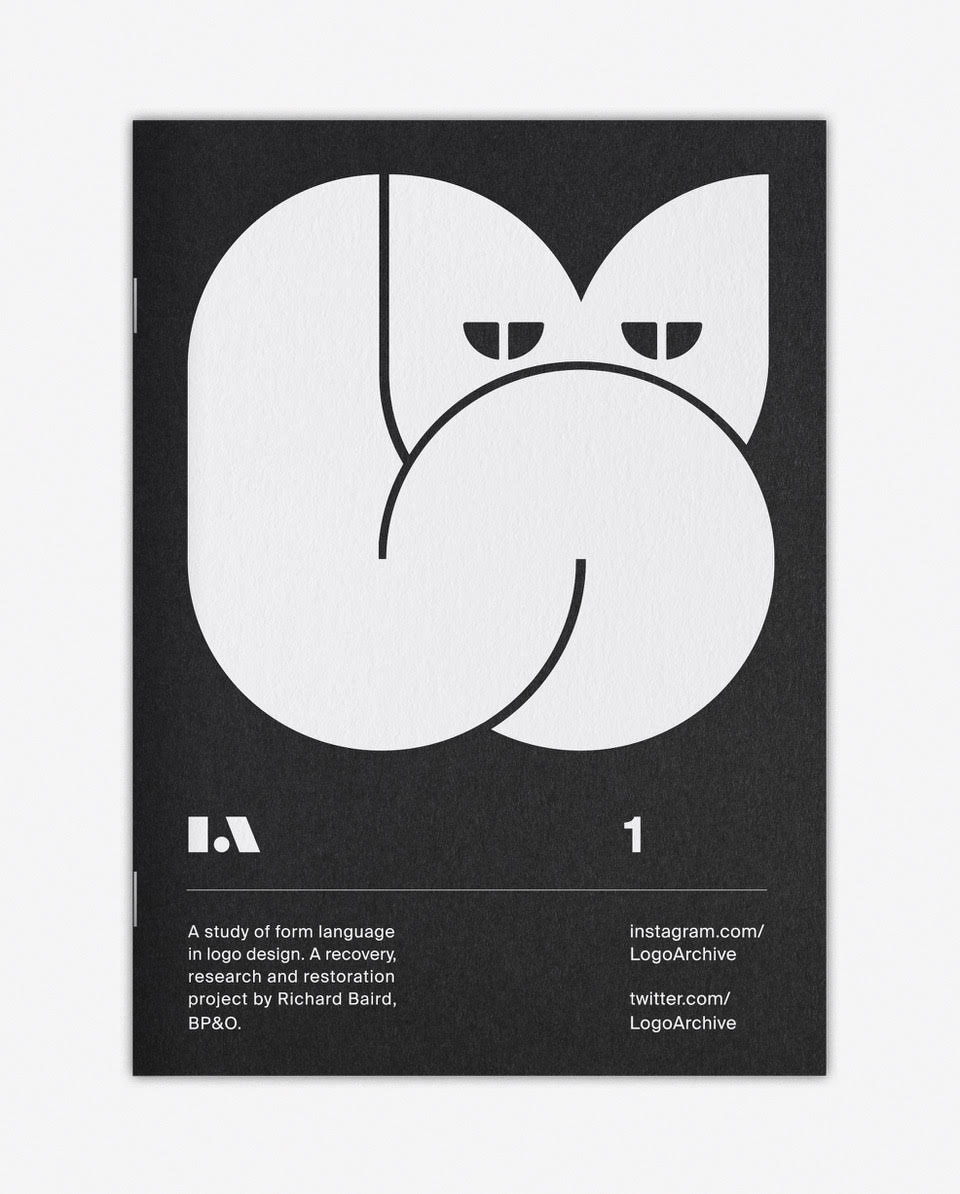
“The difference between digital space and material artefact manifests itself in a number of ways. With the digital landscape being infinite, curation is open to anything with a compelling use of form language between 1950 and 1980. With the finite space of print it takes a more personal approach, so anything that really speaks to me on a personal level, something that has a joy in its metaphor or a sophistication in its abstraction. This first edition draws together some of my favourite animal logos.

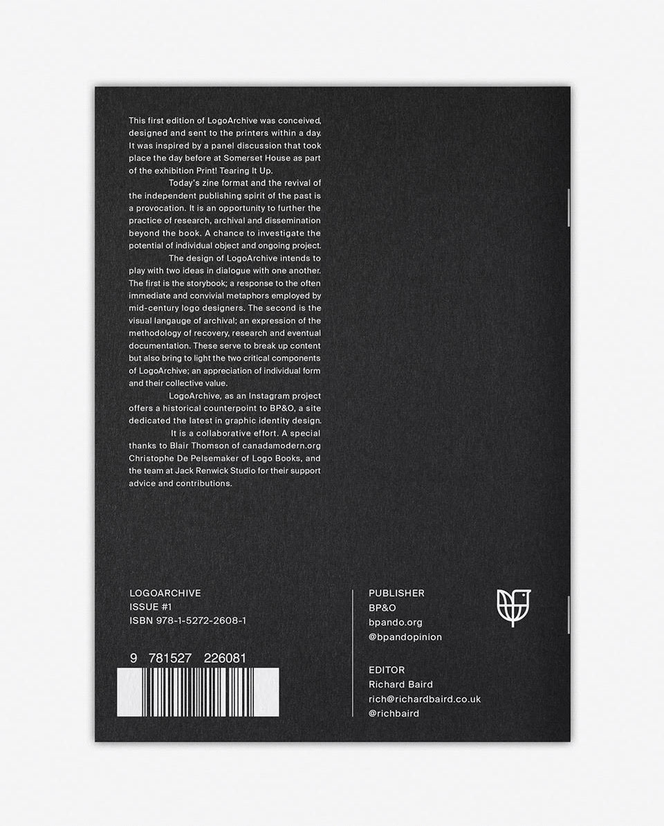
“A critical relationship between LogoArchive online and LogoArchive in print is formed by maintaining a white on black distinction, where logo books are typically black on white. This also provided the potential to acknowledge LogoArchive’s new physical context through the uncoated and dyed qualities of Colorplan Ebony, the physical layering of white ink, and binding with black staples.

“It was a challenge to print white on black while avoiding the expense of foil and screen printing. WithPrint did a fantastic digital print job, maintaining sharp edges and making the white on black as white as possible.

“As it’s a small booklet (10pp plus cover), details such as consistent layering of ink through eight passes, carefully trimming the dyed, uncoated paper, and the use of black staples were essential. They help to justify its price point, which, at five pounds, aims to be just a little more than an expensive birthday card, and hopefully sets LogoArchive up for a second edition. I ran 400 and have 100 left. There may be another run later but I want to get on with the next edition.

“Getting the ISBN number was a first for me. I’ve generated barcodes for clients in the past, but never registered as a publisher and requested a number. It’s a fairly straightforward process through Nielsen BookServices, costing £89 for one, or £149 for 10. A barcode was generated using a few online tools and knocked out of a block of white. There is a requirement to submit any publication with an ISBN number to five institutions, one of which is the British library.

“A critical part of LogoArchive in print is its story — its capacity to take something pragmatic, like research and documentation, and give it a personal component. There are a lot of logo books out there, so this mix of story, new mode of delivery, and distinct materiality intends to separate LogoArchive and lay the foundation for an ongoing relationship with readers.”

LogoArchive (featured previously) is a recovery, research, and restoration project by designer Rich Baird. LogoArchive #1 is distributed by Counter-Print, and stocked by Magma Books, magCulture, and Standards Manual.
Update: LogoArchive #2 is now available.


Comments
Thanks for sharing stuff like this with us, David! :)
Beautiful design — worth the ink! :)
I have a copy of the first book, which Rich kindly sent to me. Although it’s only a few pages long, it’s a fantastic format for logo design, and the paper quality is great too. I can imagine continually collecting them into a folder as I did with magazines when I was a kid. Hopefully once 10 or so issues come out it will be turned into a hard back book.
Hi Ian, the print job’s lovely. A great accompaniment to the online archive and something I can also see becoming a book.
Stunning. Can almost feel the tactile paper stock!
I guess its never too late to put something on your Christmas list right? It is so incredibly difficult to create a logo which is more than just a word mark. Absolutely love these examples!