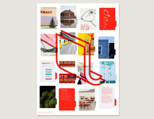
Designed by Manual, it’s a good example of relevancy between the symbol/monogram and the brand name.


More info on the Loose Leaf Editions website.
Via Visuelle.
Loose Leaf is a biannual publication designed to hang on a wall, packaged as a collection of unbound and large-format printed art works.

Designed by Manual, it’s a good example of relevancy between the symbol/monogram and the brand name.


More info on the Loose Leaf Editions website.
Via Visuelle.
Comments
I impressed that they didn’t take the easy way out and make *another* logo with a leaf in it! :P
Well that’s just nifty. And the humble identity underscores the niftiness. I’m fighting the desire to want the lowercase Ls in the name to have a similar vibe (no bend on the ascender) as the graphic though.
Love the simplicity.
Love the color.
Love the typography.
Love the concept.
Love the clock in pic1 …
But I wonder whether it works as bad as the one that hangs on my own office-wall…
“I impressed that they didn’t take the easy way out and make *another* logo with a leaf in it! :P”
It’s about loose leaf paper. A leaf wouldn’t be the easy way out, it would simply be irrelevant.
That being said, it is a great concept. Very clever.