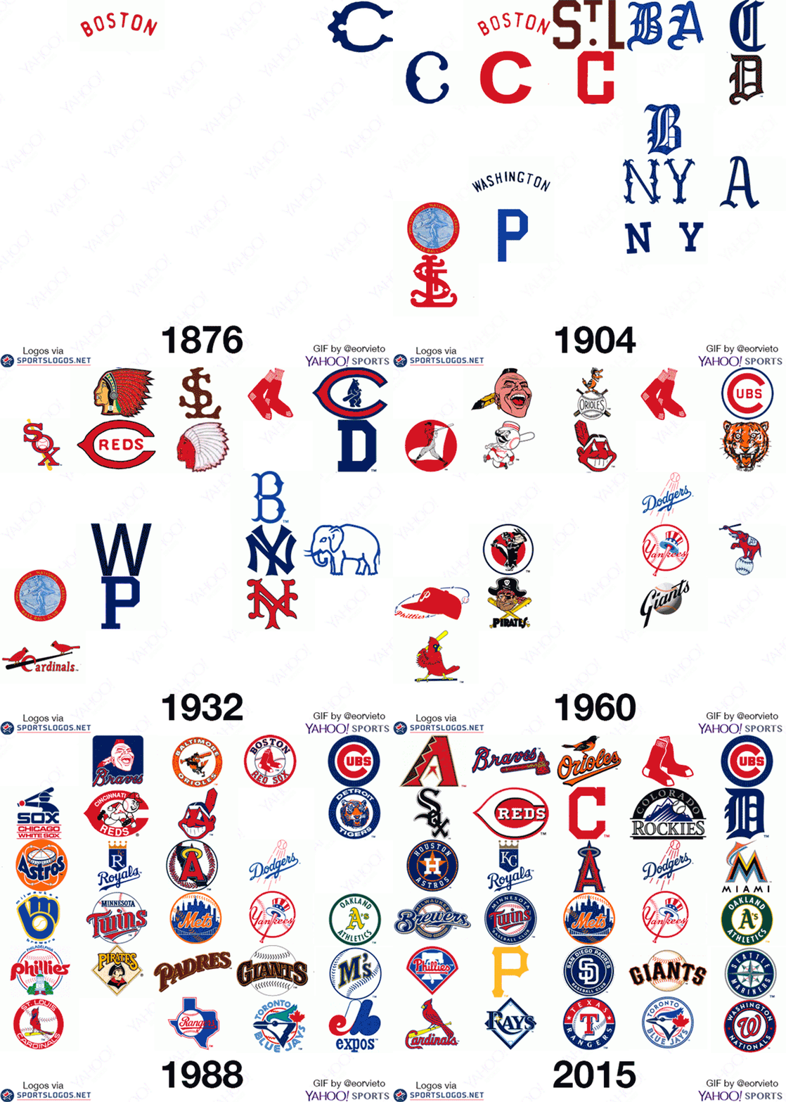
I’ve only ever watched one baseball game — from the bleachers at PNC Park to witness a Pittsburgh no-hitter — not particularly my thing, but fantastic stadium, with great views of Pittsburgh. Still, I found this GIF for the evolution of Major League Baseball logos interesting.

A few inaccuracies were mentioned in the comment thread on Yahoo Sports, but on the whole it seems well pieced together. What stood out the most was the widespread use of mascots for baseball logos between the 1950s and 70s, tying in with the prevalence of mascots in a lot of product branding at the time. Those designs definitely had more character than many of today’s marks (no pun intended), although some didn’t go down too well.
The GIF is by Yahoo Sports’ Eric Orvieto, and if you’re also thinking a pause button would be nice, you can see each team in a lot more detail on Chris Creamer’s fantastically detailed SportsLogos.Net. Scroll through the Pirates page, for example.


Comments
By the 1990’s there were waaay too many circles. :) I love the final Orioles logo.
Seems like there are fewer mascot logos these days. They’re using badges with cursive retro texts very often, looking similar with one another.
Ok, David. Branding aside for a moment, let’s talk about how you’ve been to one baseball game in your lifetime and it was a no-hitter. I’ve been to several hundred and have yet to be present for one.
You’re like… the chosen one or something.
This is bull. It shows Boston and Chicago and a whole host of others before the Reds.