
Mark Spencer is a forensic botanist. In other words, he helps police with criminal cases where plant-based evidence can make a difference. His visual identity, designed by London-based Fieldwork Facility, needed to be intelligent, simple, and memorably executed, and part of the challenge was to avoid any insensitivity to the gravity of Mark’s work.
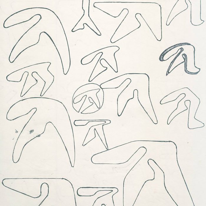
“In forensic botany the main tools at Mark’s disposal are his observational skills and his vast botanical knowledge,” said FF’s Robin Howie, who created the vectorised logo from his photograph of a leaf with good “eye” qualities.


When not working in forensics, Mark is a field botanist, public speaker, and TV presenter. To cater to his varied roles, the word “forensics” was omitted from the logo, leaving two phrases in the identity to hint at the different activities — “Plants Hold Secrets” used exclusively for the forensic assignments, with “Plants Tell Stories” used for Mark’s public-facing work.

Regarding the photo above, Mark Spencer tweeted, “There is no accident in the choice of this image of brambles and nettles. I often use them when doing forensic casework.”
Fieldwork Facility commissioned photographer Robin Friend to join Mark and them on a walk through the British countryside simulating a forensic investigation. “For Plants Hold Secrets we photographed plants that are often useful in forensic investigations, and for Plants Tell Stories we photographed plants that are non-indigenous to the UK,” said Robin Howie.


Thoughtful, memorable design by Fieldwork Facility, made even better by how happy the client looks here. Via CR.
Posted .
Learn how enduring logos are made in Logo Design Love, third edition.


Calvin Emerson,
This is incredible! The detail is lovely, timeless — classic but forward thinking as well. Well done Fieldwork Facility!
Calvin
Digitality,
Love it. For a field of work which is often considered cold, clean and clinical it’s lovely to see a natural take on forensic science.
Fernando,
The “eye-leaf” concept is very similar to the artwork of “Ahora – Pedro Aznar (2012)” by graphic designer Alejandro Ros.
http://media.rock.com.ar/fotos/discos/000/009/416/original/aznar-ahora.png
Lee @ Designed By Good People,
Bob Gill would love this. He’d probably say, “A clever logo, designed with an eye for detail for a client who’s job is having an eye for detail and being clever.”
Alessandra,
LOVE