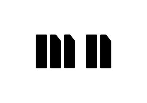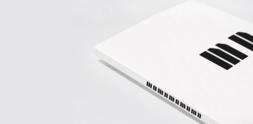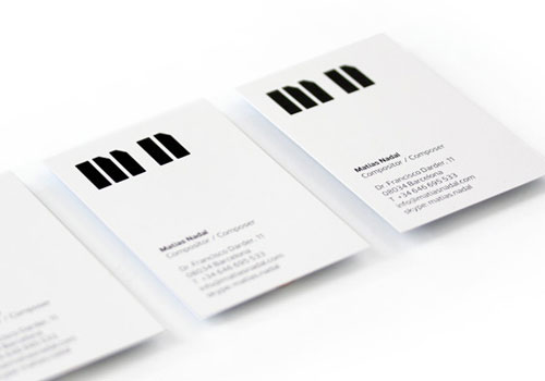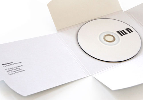
“Matías Nadal’s initials in stencil, MN, form a music keyboard, his main tool for expression when composing music. Five logos together form the whole keyboard and can be used to further develop the graphic system.”

“The result is a conceptually strong icon that is powerful and intrasferable (it represents the client’s initials). It’s made to last in time, trend-free and neutral enough to represent a wide variety of musical styles.
“The monochrome solution is given by the black and white keyboard, therefore, keeping the production budget to the minimum without looking poor.”


I’m fairly sure this idea won a D&AD award, but at the time of writing, something funky’s happening with the D&AD website.
More from Rocío Martinavarro.
Via Stylo Design.
Other monograms in the archives:
Goodby, Silverstein & Partners
University of Sussex
10 lovely monograms


Comments
Lovely.
Brilliant! Absolutely love it. This is possibly the best example of ‘less is more’ I’ve ever seen.
Love this ! Really creative, simple, clean, right to the point!
Very clean and elegant. Really like it.
I’ve seen a lot of piano type logo-types but I think this has really resolved the idea to it’s most elemental form while retaining legibility.
Simple, clever and well crafted, excellent identity design work!
Excellent design solution…this is one of those projects that practically
designs itself! Nice design application!
Brilliant solution. I love it.
One of the most brilliant logos I’ve ever seen!
This just hits the perfect chord for me! (See what I did there? ;)