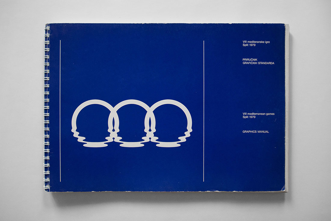
Designed by Boris Ljubičić in 1976, the three rings of the symbol represent Europe, Asia, and Africa — the three continents around the Mediterranean — just as the five rings of the Olympic symbol represent five continents. Blue was chosen to symbolise the Mediterranean, with the bottom of the rings immersed in water to further highlight the sea.

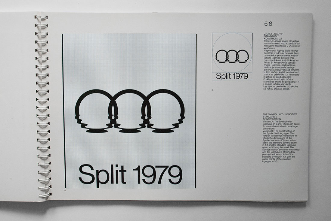
“The symbol is a symmetric graphic figure consisting of three uniform circular elements joined together to form a regular sequence. Since each of the circular elements is symmetrical along the vertical axis and the left half is mirrored in the right half, the entire symbol consists of six such halves. One-sixth of the symbol, or one half of a circular element in the upper part, may be drawn with a pair of compasses, while the bottom part is a more complex curve which must be constructed by means of a grid.”
Quoted from the manual.


The Games’ mascot was a Mediterranean monk seal, showing a touch more restraint than the gaudy mascots we see at more recent sporting events.


Catch more from the 1977 manual on designers books. Via Aisle One.


Comments
I’m the author!
Boris Ljubičić
Very nicely done, Boris. I’ve updated the post with the description you shared on Facebook. Thanks for that.
Fabulous, and beautiful execution. I also love the Klein-esque resonant blue.
Love!
Seriously, Boris… that is a superb mark.
Boris, I have designed many logos. Identity design is my work for almost 15 years. I have seen tons of them. But this is the best of all. Truly!
This is really interesting David, I didn’t even know about Mediterranean Games at all.