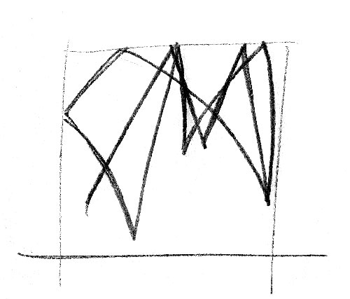
“The original ‘yes’ moment (above)!”
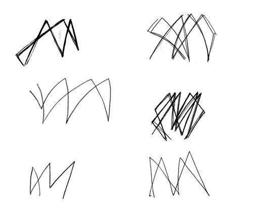
“More sketches — how abstract could we go?”
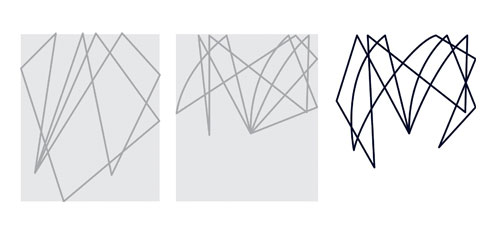
“This sequence formed part of our first presentation, to help the club understand our thinking.”

“Something that we strongly believe in is being original and visually different, for the right reasons. Here’s the page from our first presentation to help convince the club to avoid crossed rackets and silhouettes.”
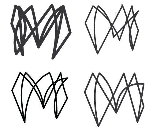
“We worked to simplify the icon further, but we also wanted to retain some of the complexity of our first draft.”
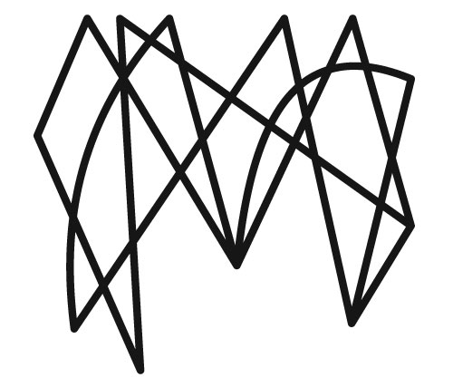
“The final icon — some of the more simple approaches just lacked the energy of our original thought. We kept much of the complexity of our first draft and opened up the spaces in-between to help visual clarity. The rebounds from the left and right provide a much stronger form. We also put in just a couple of curved sneaky drop shots to break up the rigidity of the lines.”
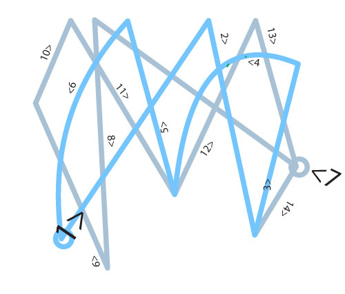
“To reflect a true squash match (and for animating the lines), we made sure the icon was formed from 2 continuous lines.”

“The ‘M’ is used both on it’s own and also as part of a lockup.”
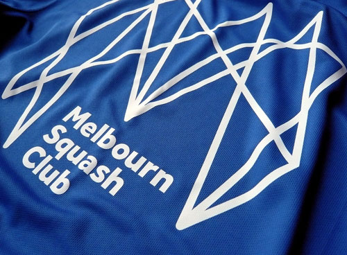

The resulting monogram is sharp and jagged — not the most obvious of squash-related traits, and not particularly sweet on the eye — but there’s no denying the distinction it gives the club over its competitors. It’s clearly relevant, too.
See more projects from Distil.


Comments
Ooh, I love that!
Not loving the type quite so much, but the logo is brilliant.
Thinking inside the box!
Reminds me of the City of Melbourne (Australia) logo… no? http://www.underconsideration.com/brandnew/archives/pieces_of_melbourne.php#.VBu8t_mSySo
I really like how the shape reflected a squash match. Therefore I have a good idea of how one would go down.
@MC completely agree with you here, I assumed they were somehow related…
@MC
Reminds me of the City of Mississauga (Canada) logo.
http://www.thestar.com/news/gta/2014/02/27/at_40_mississauga_turns_a_new_leaf_with_a_new_logo.html
Melbourne clearly likes lines, here’s the new Melbourne Polytechnic logo.
http://www.heraldsun.com.au/leader/news/northern-melbourne-institute-of-tafe-to-be-rebranded-as-melbourne-polytechnic/story-fnglekhp-1227078125350
I tweeted about this the other day, this logo is just fantastic! The best logo I’ve seen in a while.
@Ronan – It’s actually Melbourn (without the ‘e’), which is just outside Cambridge, UK. :)