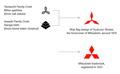
In Japanese, the “h” sound is often pronounced as a “b” when it occurs in the middle of a word. So they pronounce the combination of mitsu and hishi as mitsubishi.
Yataro Iwasaki (1835-1885), the founder of the old Mitsubishi organisation, decided on the three-diamond mark as the emblem for his company. The mark is said to be an arrangement of two family crests; the three-oak-leaf crest of the Yamauchi family, Lords of Tosa, where Yataro was born, and the three-tiered water chestnut crest of the Iwasaki family.

Mitsubishi companies have secured nearly 5,500 registrations for the three-diamond mark in more than 140 nations.
Info from Mitsubishi.
You might like the story of the Michelin Man.


Comments
Reminds me of the Simpsons episode where a Japanese company’s mascot looks like Homer. “There’s your answer, Fishbulb”
pretty amazed how the logo still has such a strong resemblance to its origins and has not been changed drastically.
Too many details in a logo makes “noise.” Therefore, simple and elegant designs are much better. Just look at Nike’s logo, almost no details but still fantastic. This Mitsubishi logo has the same level of development.
Do you see the pyramid there also?
The Mitsubishi logo is one of my all-time favorites and I’ve loved it ever since I was a kid. It led me to Japanese heraldry which is chock full of elegant logos used for centuries by samurai clans on banners and kimonos. Many of those crests influenced Japanese corporate logos today.
The three diamond logo of this company was not produced by anyone who was located in Japan. The real producer is a man who lived in New York. His name is Joseph Kowalczyk who sadly passed away. He was a graphic designer who did not get credit for what he came up with. My family has several papers that were signed by Mitsubishi stating that he designed the three diamonds but because he worked for Mitsubishi they claimed the logo as being their discovery.
The Mitsubishi logo is just the Symbol of the Triceps, which is an ancient symbol for divinity and protection. I doubt the graphic designer did any more than fill in the blank spaces with a fill tool.
This particular design, along with many other designs and motifs, can be seen on the tomb of Akbar the Great – Mughal ruler of India – near Agra (city of the Taj Mahal). This tomb is older than the Taj and was opened in the year 1613. Incidentally, I have never seen this particular motif repeated anywhere else in any other Mughal structure.
I always thought it was for the Mitsubishi airplane company that made the Mitsubishi a6m5 zero or zeke. It had 3 propeller blades which make up that emblem. But that’s what I thought, not saying I’m right.
I also thought it represented a propeller, as they built aeroplanes, similar to the B.M.W logo.
The BMW logo is based on the flag of Bavaria, not airplane propellers, as so many falsely believe.
San is three in Japanese.
There are various words for numbers in Japanese.
This is wrong. The person who created this logo was actually Joseph Kowalczyk and we have a contract that says he was the person who came up with the three diamond logo.
I was recently watching a YouTube video presented by the Royal Institute featuring a lecture by Philologist and Assyriologist Irving Finkel on Cuneiform and in the background there is a pattern of cubes on the wall oriented so that you are looking at one of the corners of cubes and the various cubes are coloured light and dark shades of white as well as black and red. And as I was watching it suddenly struck me that three of the cubes that had red on one side each with the corners or apex’s joining produced the Mitsubishi logo.
Like so many symbols that are based on simple geometry, we can find multiple examples of designs that have been used by many previous civilizations, and this design is no exception.
In the book, Symbols, Signs & Signets, A Pictorial Treasury with 1350 Illustrations, by Ernst Lehner, and published by Dover Publications, this symbol appears on page 99, and is identified as a Nordic symbol for “heavenly power”.
Joseph Kowalczyk may have been the graphic designer who provided the design to Mitsubishi, but the symbol had already existed centuries prior to the origin of the Japanese manufacturer.
You’re right, that is the truth. They are magic symbols.
This three diamonds symbol is also a perfect mathematical vector diagram of the two voltages and their phase relationships in three phase electricity.
Just round off the outside edge and put a circle in the middle and you’ve got the nuclear symbol. Don’t Mitsubishi make nuclear power plants?
The logo is a transparent nod to the Japanese Zero fighter. It matches a Zero propeller exactly. In their defense, it was a brilliant design. However, I think it’s inappropriate.