The Montblanc star emblem was introduced in 1913, and since then, all writing instruments produced by the ‘Simplo Filler Pen Company’ [as the makers were then known] would include the distinctive mark.
“The shape represents the snow-covered peak of Mont Blanc — the highest European mountain, symbolising the brand’s commitment to the highest quality and finest European craftsmanship.”
Quoted from Montblanc’s 100+ year history.
A few years ago, the Montblanc logo was chosen by Creative Review in the top 20 logos of all time. I remember thinking it was a strange decision, mostly because the magazine only showed the logo lockup, which is imbalanced, both in line weight and layout.
![]()
But seeing it again more recently, the symbol placement on Montblanc pens, that makes me smile.
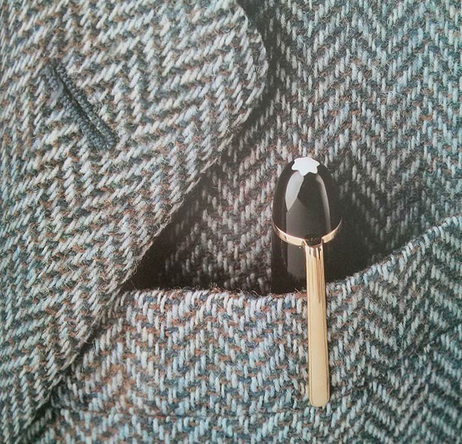
Above photo from Marks of Excellence.

Comments
Pure design. Works everywhere. Pens, packages, etc.
The on-product placement is a wonderful example of how well thought out the Montblanc identity is. The logo mark has been built around a symbolic identifier that is as much a part of the product as the ink used in the pens — it feels really wholesome but still exclusive. The imbalance in the ‘logo lockup’ referred to above makes me cringe though — I’d love to know the reasoning for it!
I don’t know for sure but, the logo looks like a top view of the pen with the logo in the middle of the ring that holds the pocket clip. The clip happens to protrude from the sidewalls just a tad.
Occult symbolism at its finest!
Snow capped mountain is what the logo is all about.
I see a revolver buttstock.
Why does is look like a silhouette of the Satanist rams head star?
A properly designed logo is timeless!