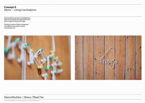
Concept A

“In our mind it was kind of our safe route. More of an evolution of the previous brand than a total reinvention.”

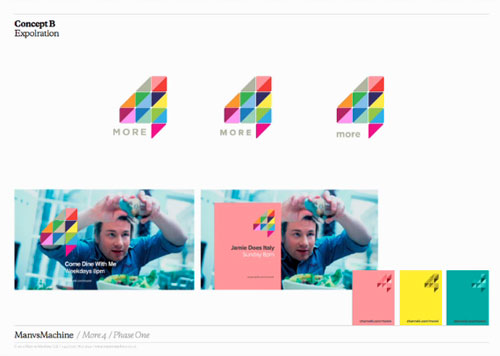
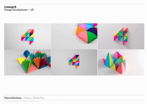
Concept B

“We couldn’t work out whether it was horrendous or amazing… Weirdly, no British channel has claimed multicolour yet… We never saw it as a flat print logo, even on billboards it should be built physically, and hinge, and be alive.”
Concept C
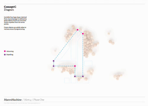
“There was no 4 as such. The inverse space created the 4 with this invisible attraction/repulsion principle.”




Take a closer look at the chosen idea (concept B) on Identity Designed.
Watch the full 20minute video from Glug on Vimeo (update: 2018 — no long available, sorry).
Design by ManvsMachine.


Comments
Initially, I wasn’t impressed with the choice for the new more4 logo, but it’s grown on me. I think experiencing it within further media has helped reinforce the opinion that it’s not ‘too bad’ actually.
I don’t mind the third option, the first is a little bland – but it’s clear they chose the best of what was presented.
good to see the best option was selected.
great work.
Interesting to see the initial concept work for this. I do like the first typographic work with the looping letterforms, but the chosen route has greater scope and is more adaptable across the intro screens and other media.
Strange that they say no British channel has claimed multi-colour because the Channel 4 Logo was multicoloured. They should really know that
http://www.youtube.com/watch?v=R86_TLuI51w
Wow, all the options look great. All I know is that the new brand for More4 is insanely good. Just so attractive and dynamic! They’ve done really well indeed, thanks for sharing David :)
I like it, however I read it as 4 More instead of More 4.
Have to agree with the last comment, I read it as 4 More also but, I guess that doesn’t matter as a brand… good stuff all very strong concepts.