 Photo via Wikimedia Commons.
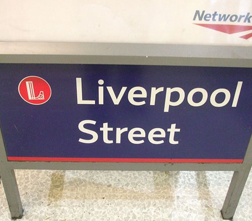
The aim of the design project was to produce an identification and sign system for use at Britain’s major rail stations. Each station was given its own symbol that reflects either the station architecture, the vicinity, or historical associations.
 Paddington Station symbol.
“London Paddington’s P reflects the form of the screens at the end of Brunel’s trainshed roofs at the station.”
 Glasgow Central Station symbol.
“Glasgow Central’s G is based on the typography developed by local boy (not that he was really appreciated at the time) Charles Rennie Mackintosh.”
 Charing Cross Station symbol.
“Charing Cross [is] the cross from the replica Eleanor Cross outside the station.”
 Edinburgh Waverley Station symbol.
“Edinburgh Waverley’s logo is based on Edinburgh Castle.”

 Photo via Wikimedia Commons.
Notice the stripes of individual colour that were pulled from the symbols.
 Photo via Wikimedia Commons.
There’s more info and images on Daniel Wright’s website, with the conclusion that the designs are slowly being phased out.
Worth a mention are these features on the classic British Rail double-arrow, and the John Lloyd archive of design work.


Comments
I like it. Just wondering if the white outline on the symbols are necessary on the signs?
Love this. I was in Manchester the other day and noticed their viaduct ‘M’. Great example of reductionist design.
Yeah, I really like these.
I live in Edinburgh, I’ve seen that Edinburgh Waverley logo before, I think it’s really smart.
Wow can’t believe I never noticed these, thanks for sharing