New York-based Gretel were tasked with creating an identity that would connect everything the Netflix brand touches. The result is one of the strongest and most comprehensive identities of recent times.
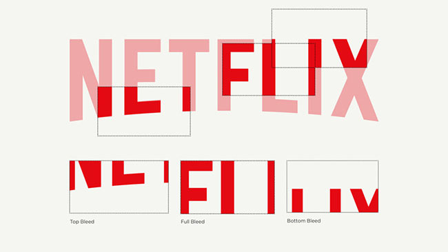
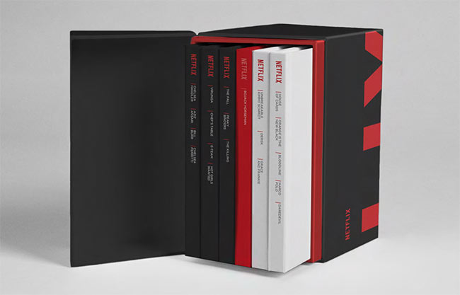
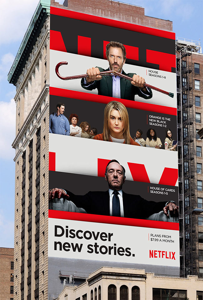
“Our solution: The Stack, a visual metaphor and an identity system in one. It implies both the infinite, ever-changing catalogue and the custom-curated selections that make up the core of the Netflix service.”
![]()
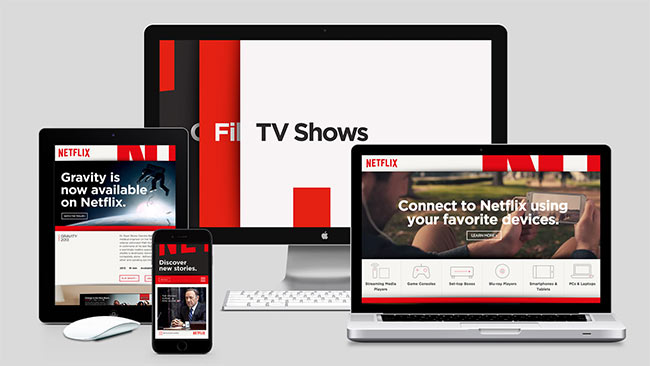
Typefaces used: Gotham Bold, Gotham Book.
See more of the case study via Gretel, with a few more words from the designers on Fast Company.



Comments
I seen this identity earlier in the week, and I really believe it’s probably one of the best brand identity redesigns this year. Stunning work. Gretel have really made the logo quite iconic – almost as much as Paul Rands IBM logo (the sliced versions of the logo made me think of his user guide). Makes me want to sign up to Netflix again just to be part of it!
I’ve not heard of Gretel before, but certainly planning to keep an eye on what they are doing…
Beautiful, impactful and very clever. It’s one of those design ideas you wish you’d come up with.
The original identity was rather flat, but this has more weight to it. I really like the ‘cutting up’ of the wordmark and mixing it with imagery. Spot on.