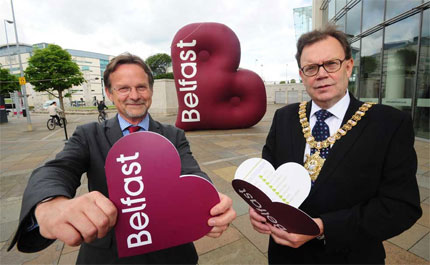

“The new brand is spearheaded by a heart-shaped B logo, accompanied by messages including the word ‘be’ – such as ‘be welcome’, ‘be part of it’ and ‘be vibrant’.
“Its aim is to help market Belfast to international visitors and potential investors, promoting the city as an exciting, vibrant and welcoming place.”
Quoted from the council website.

The Belfast logo palette has six colours: blue, grey, maroon, fuchsia, lime and aqua, and the identity includes a bespoke typeface, called Moment.
More details in the Irish Times piece, A blank canvas for a new North.


Comments
Nice design, representing both a heart shape and a “B” for Belfast. I wonder what significance (if any) the maroon colour has? Good to see a city logo which is so simple in its design.
Comment from Wolff Olins here David:
http://www.belfasttelegraph.co.uk/news/local-national/article3850707.ece
Guidelines here:
http://www.belfastcity.gov.uk/brand/
Such a simple yet sophisticated logo, I love it, no pun intended :)
Thanks for the extra info. Interesting that Wolff Olins aren’t impressed.
I think so this logo was amazing. If aim is to show the city to the world, it’s good ’cause I’m a Brazilian man and till this moment don’t known Belfast city!!! =D
Congratulation for blog David!
Regards
Daniel
I like it!
I recall reading an interesting article in Computer Arts Projects recently with a few more examples of city rebrands, seems like an increasing trend.
This is well thought out. It works all the way through to the tag. Tags can add such depth to a design. It is good to see the follow through.
When i first looked at the logo i actually didn’t see the ‘B’ represented in the shape. It was only when I read the caption that i realised what the logo was all about. I think it’s very simply, clever and effective… get me to Belfast now!! ; )
It’s a good logo really. Better that few that you mention in DA magazine. This one speaks, “Love Belfast!”.
By the way, how far is Belfast from Cardiff?
Very nice. The use of the “B” and heart shape implication is very clevery and effective!
Aaron Riddle’s last blog post…Personal Thank You Note from Mozilla and Firefox 3
Like Peter, I didn’t get that the heart was also a B until I read the post. Now that I have, I like it – it’s clever, and I have to disagree that it’s copying “I♥NY.” The heart is a common shape, and the context that each was used in was different. That’s like saying Starbucks and Target copied each other because they both have circular logos. As for the designers who came up with the London 2012 logo who don’t care for it, they’re certainly entitled to their opinion, but I’m certainly glad Belfast’s logo won’t gain notoriety for looking like Lisa Simpson.
♥
David,
Due to the odd shape of the heart, in my first glance I didn’t get ‘be welcome’, ‘be part of it’ and ‘be vibrant’.
I got boobs and bums.
Bums with the logo plain. Then boobs came with the 3d version.
(apologies if I’ve ruined it for you forever ;-)
Thank you, Daniel.
Peter, context always helps (on signage, stationery, etc.).
Rafie, it’s about 250 miles from Cardiff, but you’ll have to paddle.
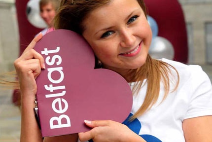
Cat, the girl in the photo seems happy enough with the pillow.
Well, either that, or nestled in some lovely boobs!
And WHERE are his hands, hmmm?
(from that cheeky grin, you just know he knows what he’s up to)
;-)
I just wonder what’d happen if Mr. Bricolage decide to open a store in Belfast.
Cool idea, I know because my logos have been using the exact same shaped heart design as letters for many years
see my
http://www.funkylovebunny.com/english/welcome/loverslogos.html
The reason being is that my real name is Funky Love Bunny so i try to include a heart love logo in everything i do, it’s kind of my trademark.
you can also see a post about it here http://funkylovebunny.tumblr.com/post/40958621/many-of-you-may-have-met-me-when-i-was-creating
Well they say great minds think alike :) Hey maybe Funky Love Bunny could be a Belfast mascot :P even though I’m now 3rd generation Aussie. (originally from county Antrim in Ireland)
David,
Disastrously, I have to agree with Cat. Before I read all the way down in the comments, I was wondering how to put that tastefully. Breasts, bums, and didn’t see the “B[e] welcome” as a phrase.
However…
I’ll assume they did some testing and Cat and I are alone in this view, to give them the benefit of the doubt. The brand problem would be (pardon my Irish-American point of view) how to move Belfast from the perception of a possibly dangerous place with the potential for terrorist activity, to a friendly place to bring your kids and your dollars?
The more I looked (after I read your article and saw what I was supposed to see), the more I think that if the brief was phrased like that, then this solution is probably what Belfast wants. Softness, happy 1970s feeling, and all.
Thank goodness they didn’t put a smiley on the other end of welcome :)
Interesting post.
Regards,
Kelly
Referring to the “Troubles” in the North, and putting them on the side… the simplicity of the Belfast logo makes my heart sing.
Learning as I go…
Kristine
well, after reading all the comments i was wondering if i should bother to give my 2cents, and i did, so here it is..
the more logos i design the more i feel that we (designers) all have this thing inside of us that tells us when a logo feels right or wrong..
logos give off vibes and without knowing the target “brand” of the logo i feel the first thing a person needs to feel is the “flow” and that it reads and feels right inside..
the logo is cool but it’s just something about the “t” and the “round” shape the clashes and give me this not so comfortable vibe.. it’s like a subconscious pause that’s not quite comfortable inside..
it could of been better :(
just being honest.
– Ney
It’s similar to the Batega logo, seen in Barcelona a couple of years ago. Just google and see.
I’m not impressed at all, then again most stuff Wolff Olins does doesn’t have an impact on me either and i find it a bit ridiculous to read WO thinks the logo doesn’t bring across what the brand stands for or what it means when this is exactly one of the major issues with the WO-created London Olympics logo.
Hypocrites i say.
But indeed i find the new Belfast logo to be missing uniqueness and proper execution.The “B” is anything but obvious which of course is due to te fact that any heart symbol has an included “B” if you will so that’s nothing specific to the Belfast heart and hence it’s not popping out at all.
So what is left is a heart shape and one that looks a bit odd at that really.If they really wanted to emphasize on the “B” aspect they should have rotated the symbol a bit more to the right so that the “B” becomes more obvious while leaving the wordmark in the horizontal position as it is so it parallels to the “B”.
Anyway, the way it is right now all i can see is a heart with the wordmark in it; remember a good logo is not one that needs a written rationale next to it because you can’t print that explanation next to the logo everytime you wanna use it.Not that logos should be selfexplanatory, but either you be really clever with it so it has that “WOW” effect when you discover the hidden gem (see Fedex etc) or if it’s not so clever then make the idea behind it more obvious.
This logo does not accomplish either of that.
Plamen, nice find. I’m not sure Belfast would appreciate Mr Bricolage’s competition.
Bunny, perhaps this is Belfast’s way of calling you home? Where in Australia are you?
Kelly, clearly some connotations that weren’t looked for, and it’d be interesting to know what the focus groups came up with. Having taken 12 months to create, surely someone saw boobs.
Kristine, the troubles seem a thing of the past, thankfully. The country’s changed so much over a decade.
Ney, when you’re looking at the ‘t’ and the curve, my eye is focused on the ‘a’ of ‘Belfast’. The gap in the centre really draws the eye.
Frank, I wonder if Wolff Olins pitched for the project. I saw the ‘B’ before the heart, perhaps because I was thinking Belfast beforehand.
David – In a place called Coffs Harbour, it’s a beach side town, but then again 80% of Australia’s population is. About half way between brisbane and sydney. Even though Melbourne is always a great art scene, Brisbane is actually starting to get a bit of a design scene starting so I’m thinking of heading that way.
I quite like this logo, I like the heart aspect of it, and the ‘B’ shape.
It reminds me a lot of the Bradford College logo, a college in the North of England. (not that I think its any good!)
http://www.bradfordcollege.ac.uk.
You can see their logo here:
http://media.studylink.com/provider/pid-si-30-bra/logo.gif
First of all, I am a newcomer to your blog/site – I think it’s fantastic and it’s definitely a welcome addition to my favourites bar.
As both a graphic designer/student, and a born-and-bred Belfast-er, I found the re-branding of the city extremely refreshing and exciting. I think it has a very understated, clever message that appeals to tourists and residents alike.
The city as a whole has progressed in leaps and bounds over the past couple of years; to me this really is the cherry on the cake.
As a Belfast resident all I can say about this logo is ‘B’ – ollocks. Apologies for any offence, but the simplicity of the design comes from the fact that there isn’t anything terribly distinct about Belfast worth celebrating.
will make it easy for the souvenir t-shirt brigade though – so I supoose there’s some value in it.
Funky, I have a cousin living in Brisbane who’s tempting me over. Should you decide to move, I hope it goes well.
Adam, nice find. The similarities are obvious.
Red, thanks for the site props.
John, no offence taken at all.
Looks like somebody has been doing a bit of copying… but who copied who??
http://nwemail.co.uk/love_barrow
Well, I get the feeling this logo only works because it is clinging to a current style… I dont think it will have the same effect a few years from now. Then again, it is probably not set to last that long.
@Mark:
nice find! also try to search for “Bradford College”
I got this:
http://www.eteach.com/EmpLogo.ashx?id=27609
It is very ‘now’ looking, I’m surprised it doesn’t have a web 3.0 gradient going through it…
I love it though, and I’ve enjoyed the commercials promoting Belfast on T.V. I’ve only been there once and I’m curious to find out more. I don’t think any Irish person would consider there to be a danger aspect to Belfast tourism, but I imagine there are still strong connotations attached to it by international tourists……they all seem keen to see the murials anyway!!
For me, I particularly like the sophisticated colours “blue, grey, maroon, fuchsia, lime and aqua” – there’s a lot of potential there for contemporary design work.
and anyone involved in the London Olympic Logo design……….I’m not sure I’d take their advice on designing my downstairs toilet nevermind anything else :o)
This is a great little logo and hopefully Belfast City Council stick with it now for the long term. Its heart shaped, simple and comes in many colours. Its a controversial little number. Many within the city have voiced their concerns but it also has its fans too. It has certainly brightened up the city’s look which was definitely needed. Perhaps the best thing about this logo is the fact that its simple and gets the message across easily. Check out another review at http://www.chewdesign.co.uk/index.php/new-logo-for-belfast
I like it. Simple and bold with a concept that works. Also looks really nice in the two tone white out version. The logo will also work really well when it comes to branding everything with the simple bold design.