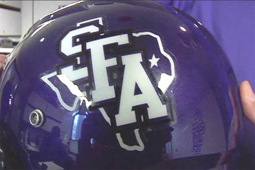
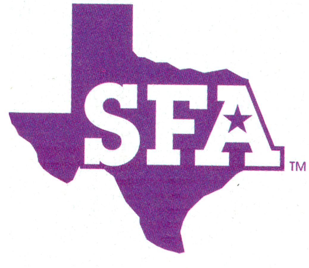
The logo was reportedly designed by Carlberg/Richards advertising agency. A day before the reveal, someone who was in the SFA student centre where a banner of the new logo was being set up was able to take a photo before the banner was covered in secrecy. The photo was posted on social media and the reaction was so negative that the school scrapped the design. The ad campaign carried on but used the old logo.
Here’s the photo of the SFA logo banner that got the social media backlash.

The biggest problem many saw with the logo is that it appeared to have the state of Texas wrap around the border of the letters, with Texas extending well into Louisiana.
Here’s the existing design that was retained instead of the newer version.

KLTV shared a video report looking back at the SFA logo fail.
I can appreciate why an update was considered because anyone unfamiliar with the original might read it as “9FA” or “SEA.” What are your thoughts on the redesign?
Via Brand New.
Related: SFA unveils new family of sports logos.


Comments
Looks like South Fsomething Africa – it even looks like the continent : )
I actually like the new (now redacted) version. The Star placement had meaning, and worked well with the typography.
Pity they weren’t strong enough to defend it.
“SFA” has a whole other meaning this side of pond.
Well I am in Texas. Superficial Femoral Artery is what I saw after nursing school. But “9EA”. Or such Is what it looks like. I spent a lot of $$$$ there on two students. We should have some say. Renew just a bit tiny bit of the old. Don’t trash what we ❤️ love!
I think the new logo was well thought out. It’s not complicated or anything pretty simplistic, but clean and well put together. The placement of the star inside the “A” representing the location of the school was a clever way to keep part of the old look. The difference between the two designs is not drastic enough to create that kind of outrage in my opinion.
Terrible decision to axe the new logo. The original logo wasn’t even designed.
@MiloW, how about Something From Africa?
I wonder two things:
Who designed it and how much they charged or whether this was something done in house. It’s pretty embrassing to get a logo axed and then make the news and have people petition against it.
There’s just something about redesigning an educational institution’s logo/brand that incites a pitchfork- and flame- bearing mob, irregardless of whether the design is for the better, or the worse.
Such a shame, stronger than the old logo.
I understand some don’t like change but axing the logo before it’s actual launch is very disappointing. Given time I’m sure the new brand identity would have been loved as much as the old.
Must’ve thought the logo and branding offered SFA.
I wonder if they had any polls for the logo before choosing?
I think this situation could have been avoided.
For the record, SFA students & Alumni hated that the new logo changed the border of Texas to house the A. Also, rather than give their Fine Arts Department a chance to come up with their own logo submissions, they paid an expensive fee to an outside company. I know art students there who certainly thought they could’ve designed something better themselves.
I went to Virginia Commonwealth University, which has a very well recognized School of Arts and an internationally known Brand Center. So loved was this art school that while he was alive, fashion designer Perry Ellis gifted the school 5 million dollars.
All the faculty had to do was outline how it was to be used/spent before it could be bequeathed. Long story short, the year deadline came and went and the gift was rescinded because there was so much infighting between the departments within the school.
It was then that I fully understood why a university with such a well known art / design school would look outside itself to avoid the politics and drama of a faculty that couldn’t get out of its own way. True to form, when it came time to design the VCU Athletics logo, the university hired a design firm outside the school. It was just easier than dealing with squabbling department heads — we just couldn’t get out of our own way.
Ah, yes, the state’s shape is altered, that certainly wasn’t necessary. And including the student body in the process isn’t a bad idea.
Still, the outrage seems overly strong, when small changes could have been made to it to fix any issues. And while spending money for an outside firm may have seemed unnecessary, it happens all the time. To me, it certainly is better to use “in house” talent, but not a requirement. I mean, it could just as easily been a story “school takes advantage of students’ free labor, sued by student body.”
That is the reason why often large community organizations put out requests for proposals where both professional and member ideas are submitted.
Firstly, I know I’m way behind this post.
SFA Alumni – a branding job on this scale SHOULD go to an agency, not faculty or students. This is why you still have that abysmal logo. It LOOKS like it was done in-house. It’s illegible. Ok, the border of Texas was altered, but why not work that out with the agency at the development level? I’m sure there are a few students who ‘think’ they can do better, and as with all rebrands there are always people who think they can do better.
This just smacks of someone at the University not having the guts to stand up to an Alumni who are living in the past and not focussing on their future students.
Maybe let the brand experts do their job, and assume there’s more to it than you understand. Think of it this way – would you go to a) a qualified, experienced doctor, b) someone who has a year of medical school under their belt or c) someone who has watched every episode of ER and Grey’s Anatomy for a consultation?
Firstly, I know this is 2+ years after the fact, but I was a student when this went down and I was in the student government meetings with the board of regents when we were discussing it.
1. This was one of the biggest problems we had: the location of the star is not “clever”. It’s in the “A-hole”. Why would we want to pay $14k+ to be called the “A-hole of Texas”?
2. The A encompassed parts of Louisiana that one of our rival schools occupies (NSU).
3. They changed the shape of Texas to make it “smooth” and also encompass the A.
4. The original logo has some class associated to it that the new one just didn’t have. It had no character, nothing to bond with. It was bland overall which tremendously magnified the above issues.
That said, I agree it could have been improved to be acceptable. I don’t think the situation was handled very well by anyone involved.
I was a recent alumni who helped to launch the petitions to get it canceled. Let me start out by saying I’m not a particular fan of the old logo, it can definitely be improved upon.
But, there where several issues with the new logo. First, it’s extremely bland. Block letters, straight across the state. Looks like an agency that didn’t care to put the time or effort in creating anything original. 10 random art/marketing students could have produced something better.
Second, you simply cannot change the shape of Texas. It’s one of the most recognizable (read brandable) shapes in the entire world. If you change the shape of Texas, it will never look right. Ever.
Third was the timing. We had just had our biggest publicity event in school history just a month or so prior with a huge March Madness win. And then, once you get all that brand awareness you decide to role out a crappy rebrand with a bland logo? That’s just bad business.
We could change the logo to something new next week and a lot of people would embrace it, but this new logo just sucked.
Shame on whoever wrote this for not stating the reason for the uproar. I’m an SFA alumn and Texas native. You can not, under any circumstance redraw the state of Texas.
Brian – You are exactly right!