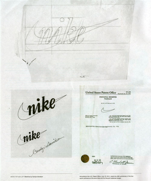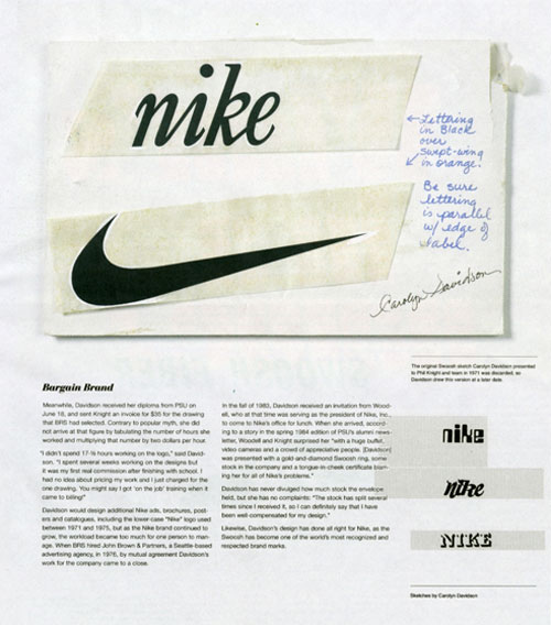
“One day in 1969, the student, Carolyn Davidson, was approached by Knight and offered $2 per hour “to make charts and graphics” for his business. For the next two years Davidson managed the design work on BRS. “Then one day Phil asked me if I wanted to work on a shoe stripe,” Davidson recalled. The only advice she received was to “Make the stripe supportive of the shoe.” Davidson came up with half a dozen options. None of the options “captivated anyone” so it came down to “which was the least awful.”

Swoosh: 40 years fly by, on Imprint, by Steven Heller. Via Kottke.
Related, from the Mail Online: Woman who designed Nike’s swoosh explains story of its inception 40 years ago.
Related, from the LDL archives: A classic through exposure.


Comments
I really like seeing the sketches in pencil…
The story behind the Swoosh mark is quite amazing considering how much value it has today as opposed to when it was created; however, it is a shame that Knight didn’t even seem to appreciate it before it became famous.
I wrote something similar to the story last month and actually found the video of Davidson when she received the certificate, stocks, and ring from Nike. I’m sure most people have seen it already but I can post a link just in case one hasn’t.
I wonder what the other options that Davidson created looked like. It would be nice to see those :)
http://guijarrodesign.com/2011/07/28/lviii-the-story-behind-the-designer-of-the-nike-swoosh/
My father and I recently had an argument over the Adidas logo. I think it’s so recognizable, with so much brand equity that they can’t change it much. He hates it, thinks they should do away with it and said;
“they need something fresh, like Nike’s new swoosh thing.”
I (and the rest of the family) tried to tell him that wasn’t new but he would only concede a few years. I should have googled it then & there to prove to him that the logo is as old as I am.