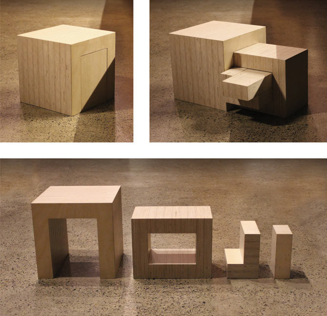
“Once I noted that the letters of the brand name ‘Noji’ could contain each other sequentially, I set myself the appropriately architectural challenge to extract them from a cube. This was to embody the ethos of considered and sustainable simplicity that Noji’s buildings exemplify. No wasted space. No wasted material.”

“A cross section of the final solution then provided the two dimensional letterforms of the brand. What this produced is a bespoke typeface to the Noji brand in which the letterforms have a unique architectural relationship with each other.
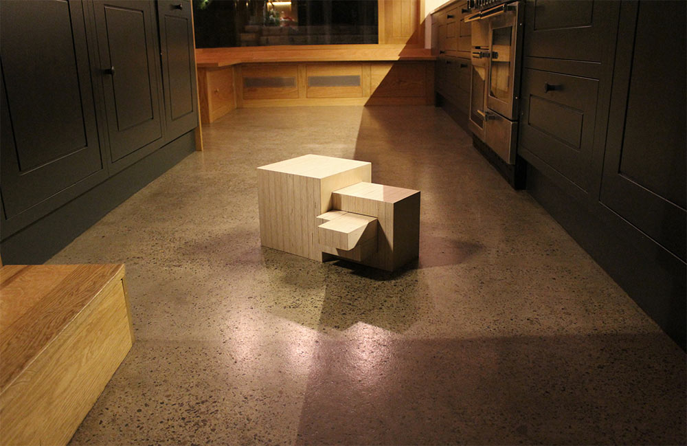
“The 2D vector format is being used in stationery, signage, print collateral and blueprints. Its 3D derivation has been made in wood and each year another will be carved, moulded and sculpted from a different architectural material; 3D print, glass, concrete and plastic versions. Precision crafted to exact dimensions we can slot the different versions together in mixed material configurations for interactive sculptures.”
The 3D animation (above) was produced by Stephen Bowen at Element for use on Noji office screens, with sound design by Will Farrell at Mutiny. The wooden model was by Oikos Furniture.

I can imagine it making clients smile when they visit the Noji office.
More from Robert Boyle.
Via Archive 100.


Comments
The more appropriate term for this might be woodmark.
In all seriousness, it’s a very fitting (sorry, had to be said) execution for an architectural firm. It really brings out their ethos in the video too.
What! That is so cool. Kids and adult designers both in awe for such different reasons.
While for me the mark might not be the most aesthetically pleasing while laying flat, it’s so laser focused and clever it’s hard to argue against it.