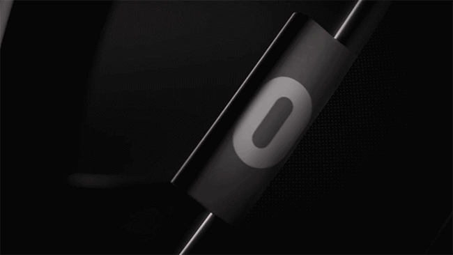
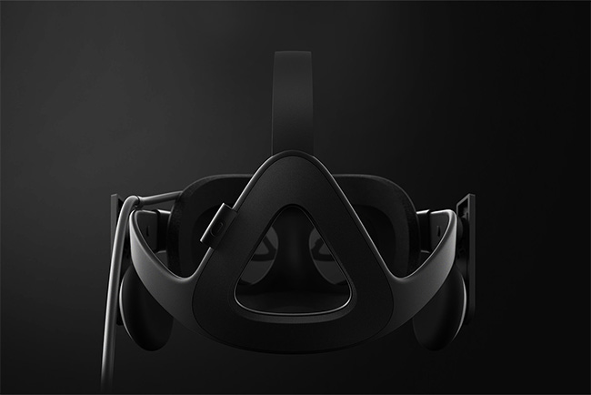
The Oculus logo was recently changed, and the result is what I hope I’d come up with. As simple as they come, but with a distinctive, appropriate idea — the stylised o also mimicking the shape of an Oculus headset, and the shape of the slider on the underside looks just like the symbol, too.

There’s a brief reveal video for the Oculus Rift embedded below.
Here’s the old Oculus logo lockup for comparison.
![]()
And the new.
![]()
The website and headset show both the symbol and the wordmark on their own, but in fairly close proximity, so placing the o alongside Oculus seems unnecessary. I’m unsure where the lockup would be used.
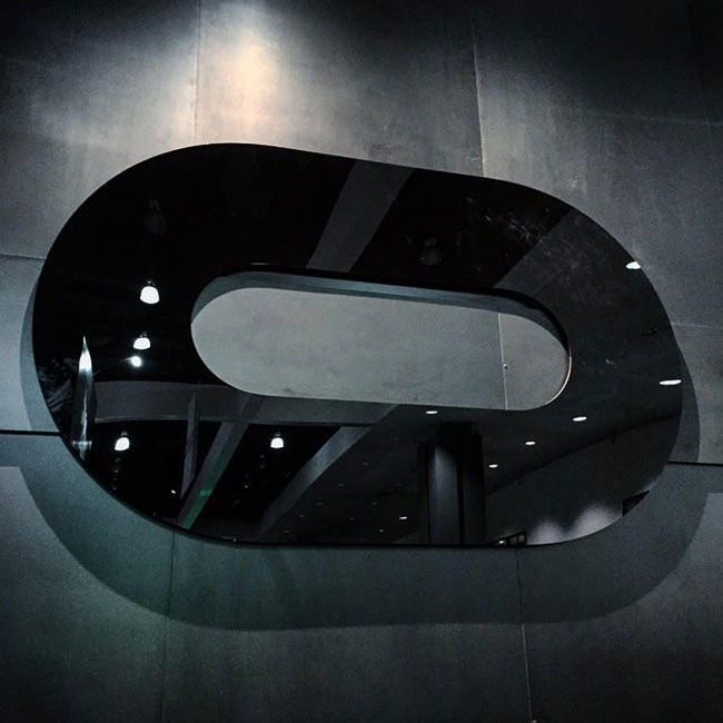
Photo via @thefoxisblack.
The design was a collaboration between Cory Schmitz, Mackey Saturday, Nicolaus Taylor, and Jon Malkemus.

Via Rick Banks.

Comments
I like the new logo much better as the old one. But in my opinion the typography still could be a little better. It is like something just doesn’t fit.
A great improvement! It definitely links the product to the name a lot better than the somewhat generic eye.
“Simplicity is the ultimate sophistication.”
Leonardo da Vinci
The new logo is apt for the new paradigm of creating simple, unique, iconic brand identity — iconic and memorable.
I can even see the “white space” inside the new logo “O” like a nob to be pressed (before shifting the slider on the underside of the Rift) — “It’s the story we tell (David Airey).”
Love it! Beautifully simple, great power.
much better, o hailo https://www.hailoapp.com
Am I the only one that thinks the logo is supposed to mimic the open mouth of the guy in the second picture?
$2B USD, that’s a lot of money. I guess the designers didn’t even get any equity off that redesign. I’m curious if they even got paid any good money because the work is just brilliant!