
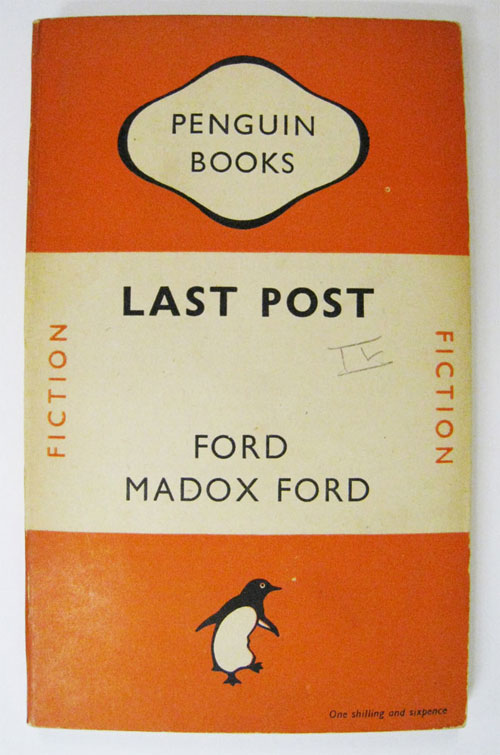
“It started with the simple logo and name, suggested, allegedly, by a typist who was earwigging the board meeting. Allen had already hit upon the idea of an animal logo, inspired by the template offered by the contemporary publishing house The Albatross Library. ‘It was the obvious answer, a stroke of genius,’ said the original designer of the Penguin logo, Edward Young. ‘I went straight off to the zoo to spend the rest of the day drawing penguins in every pose.’ The clear logo was matched with the archetypal modern, but not too scarily modern, typeface, Gill Sans, and the now classic three-band cover, with colours related to the subject: orange for fiction, dark blue for biography, etc.”
Quoted from The Guardian.
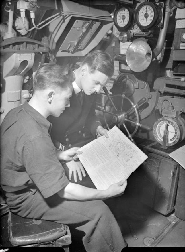
“Edward Young, who designed Penguin’s famous ‘dignified but flippant’ logo and the colour scheme for its book covers was a submariner during the war. His boat was involved in a collision which saw it sank to the bottom of the North Sea, but Young escaped by swimming to the surface.”
Quoted from jkr’s book Champions of Design.
Edward Young’s obituary in The Guardian.
The version of the Penguin logo you’ll be more familiar with is typographer Jan Tschichold’s 1946 modification, and subsequent 2003 fine-tuning by Pentagram’s Angus Hyland.
For content along somewhat similar lines, see the well-known WWF panda logo.


Comments
dislike the new one. seems like a podgy, unstable penguin, with almost a tyre on his tummy . besides, i dont see how it will help the brand to change their logo to this. what are they trying to convey?
I disagree. The old one seemed flimsy and wrinkled (made it look old and tired). The 1946 version was a big improvement over the 1937 version. The added weight in the 2003 version was a nice improvement as well. I also love the black (dark blue?) and orange containing shape. Gives it one more element of uniqueness aiding in easy recognition. Looks great on a book spine too. =)
I really like the very first one (1935), it seems to be more natural and better proportionated than the other ones.
I agree with Kevin. The 2003 logo is a huge improvement from the original logo. Adding more visual weight to it makes it more interesting and recognizable.
The one from 35 is great, only the belly could be more round. The new penguin is an improvement, but it’s too round (which makes the shape look blurry) and this big googly eye makes it look stupid.
Of all the options I feel the one from 1946 is the best aesthetically. This still looks modern and crisp at a small size. The one from 2003 is more styled for fashions now but it looks like someone chucked the old one in Illustrator and whacked a ‘Live Trace’ on the little guy. I prefer the guy on this one though. As the logo is generally seen small of book spine and more of a motif I feel the 1946 one works best. The ones from the 30s are very dated.
PS: I think the Orange should be replaced with Pantone 660
Line 4, second use of ‘guy’ should be ‘eye’ Need some sleep!
I seem to recall (from a book published to celebrate Penguin’s 21st anniversary?) that the penguin in the 1937 logo was supposed to dancing with joy, but the general view was that it was suffering from appendicitis. Hence the change.