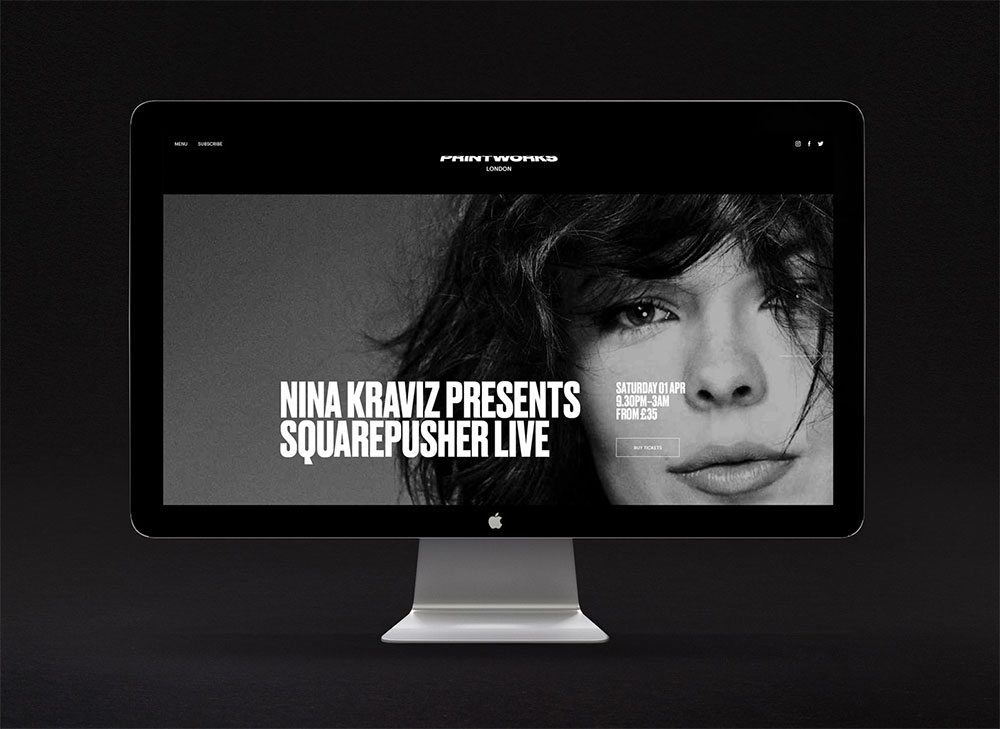
Only were commissioned to create an identity for the venue, one that offered a flexible framework for promoting eclectic events in what was once the largest printing facility in Europe.
![]()
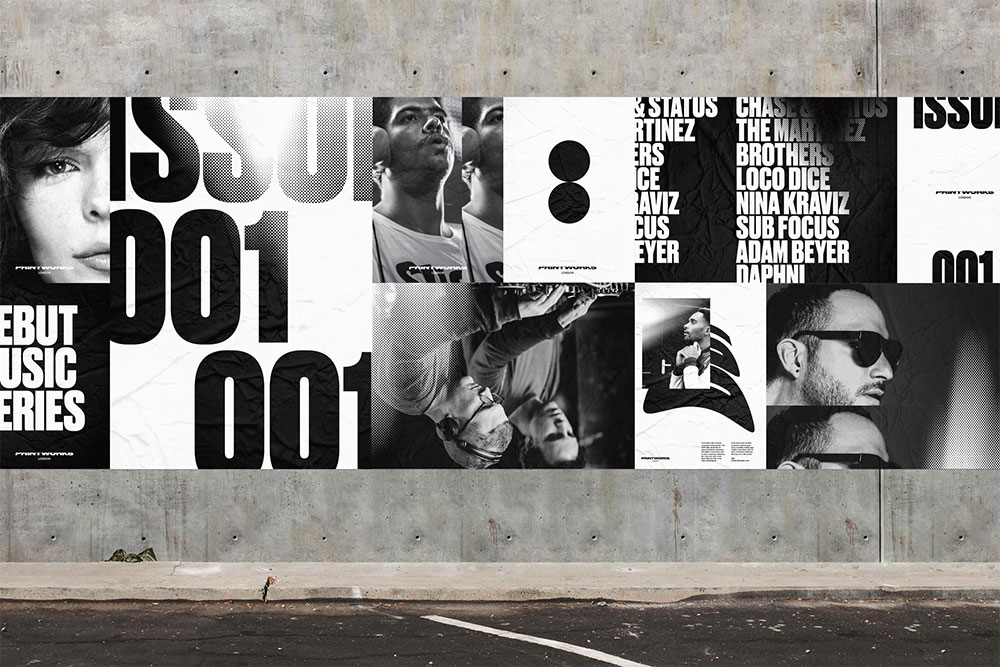
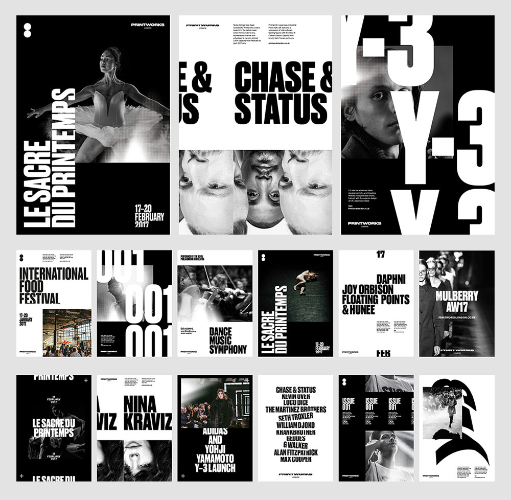
“Wrapping type around cylinders we generated infinite iterations of the logotype for use across applications. Typographic expression and the movement inherent to historic printing processes runs throughout the wider identity.”
Eleven renderings of the wordmark were created for use across applications.
![]()
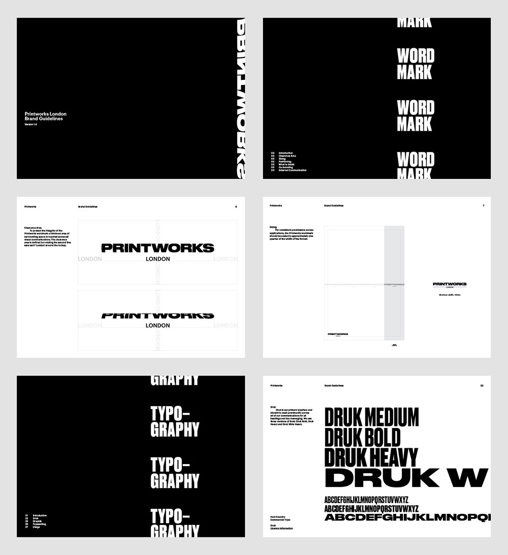
The rollers mark denotes the side profile of two print rollers, for use in small applications.


Lovely work from Only in Leeds.
Via Brand New.

Comments
Love this too, so simple and striking, black and white is always a winner, well done guys.