
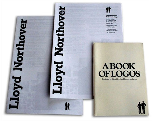
Lloyd Northover co-founder John Lloyd entered the debate with a guest piece in Design Week.
“We are told that branding is no longer about logos and design — it is about everything else; it is about corporate behaviour, customer service, product design, product performance, environments, customer communities, consumer experience, consumer power, integrated communications. Of course it is; it always has been… …But, there is no doubt that the logo has played, and continues to play, a central role in brand building.
[…]
“To begin to appreciate the value of logos, imagine the world without them. What would Coca-Cola be without its wordmark and visual identity – just another sweet brown fizzy drink? Imagine Nike without its tick (all sports products look alike), and imagine Apple without its cool livery.
[…]
“By all means give credit to the researchers, analysts, strategy developers, marketers, behavioural scientists, advertising and PR specialists, webmasters and viral communicators, but please don’t underplay the role of brand designers. Corporate design isn’t easy; it takes a great deal of talent and hard work to create a branding system that will last. So, let us stop knocking logos and logo designers. Let us celebrate the essential contribution of the designer to the building of brands. Let us be pro-logo rather than advocating no-logo.”
— John Lloyd
Simon Manchipp responded to the article through Twitter:
“I’m not knocking designers, I’m questioning what we input, not if we input! I’m saying we should do more! Defending the creation of logos misses the point — sure, create a logo, but there’s so much more to consider.
“Imagine Nike without its tick (all sports products look alike), imagine Apple without its cool livery.”
“Tosh. The product shines through. If the next Apple Air laptop had no logo, it would look even cooler, and sell just as well. That said, O2/Orange/Vodaphone — where there is little tangeable product — relies very heavily on branding to differentiate. Apple just isn’t a useful argument parameter. It’s the exception, not the rule.”
—
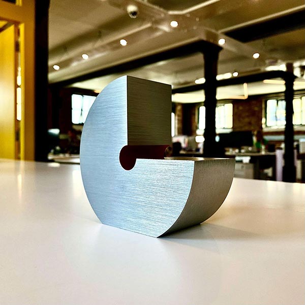
On the face of it, Manchipp and Lloyd disagree, but I’m sure they’ll agree that while logos can be important, they shouldn’t be looked at in isolation. Here’s one of Manchipp’s projects making use of similar mosaics to identify the brand.
Full Design Week article here.
Comments
“all sports products look alike”
No, they don’t.
I wish there were no logos.
I remember just 15 years ago they were a lot less prominent than now, more-so further back.
Anything… I mean ANYTHING I purchase, I remove the logo. I am NOT a walking advertisement.
If I can’t remove the logo, I refuse to use and/or buy the product.
I think the point is when companies like AT&T, to name one, have icons like Saul bass’ now basterised ‘iconic’ line screen ball that do nothing to represent the brand. In any way. Yes it’s a shorthand but only after it becomes recognised. This takes time. The wordmark AT&T would do the job just as well.
Therefore are they useful? All they do is add a spot colour to the print job in the case of AT&T (Obviously print is dead so this is no longer relevant).
Apple’s, I would argue, represents the old (not too sure if it still stands) ‘think different’ strategy. Therefore to me it’s useful. A nod to newton. Fine.
The example used in the article, IBM, is just a word mark. It has no icon or ‘logo’. No problems with that, same for coca-cola. Nike’s great with or without a tick. It’s Nike. They sponsor everyone who’s good in everything!
If the logo, icon, whatever you want to call it is abstract and of no use other than design for design sake then get rid. Its just arbitrary drivle.
I agree about branding being so much more than a logo. It’s the quality of products, customer service and user experience that make or break a brand. Once customers associate that good experience with the brand, that’s when a logo becomes truly powerful.
“If the next Apple Air laptop had no logo, it would look even cooler, and sell just as well.”
The laptop may appear cleaner and less branded as a product, but I don’t agree it would sell better. There’s too much brand equity in the logo and name. If you told me it was a Mac and I didn’t see the official Mac logo anywhere, I might think it was a knockoff. You can slap a logo on Goods & Services. The nature of Goods as stand-alones require logos for the sake of identification.
Alternatively, I will agree there are a lot of companies that target customers who only buy Goods based on image and perception. Some people tend to buy into a logo or name over the value of the Good or product. In most cases, those companies are focused on making great first impressions and creating buzz, but ultimately produce a cheap product. Of course, their customers usually don’t care about the product anyway, just how others perceive them. And the easier it is for others to see a cool, flashy logo, the better.
A hyper-exaggerated example would be the trend/fad a decade or so ago of people wearing the price tags on their clothing. They don’t care about the product as much as they do others knowing they have brand-new clothes. It’s all about image.
“Corporate design isn’t easy; it takes a great deal of talent and hard work to create a branding system that will last.”
Pretty sure that should be corporate identity not a ‘branding system’ #trying tomakethingssoundmoreimportantthantheyare
In the instance of his “no-logo” Wright Brother’s project, he contradicts himself. Every time the Wright Brother’s name appears, it is the same typeface, the same style, the same texture, and the same treatment. How can anybody say it isn’t a wordmark? I think the mosaic project is pretty awesome and it takes the idea of a brand further than most people would.
To say that we don’t need the logomark stamped on everything is one thing, but to say that we don’t need the logomark at all is a contradiction.
The brand isn’t the logo, but a message communicated between the consumer and the service provider.
I don’t think that logos will ever be dead, but instead they could contribute to the brand rather than be the sole recognizable aspect of the brand.
The brandmark carries the brand.
@Adam: Its not only “corporate business” who need an identity.
I have made several product-brands within one company. I think “brands system” is a good word to cover it all up.
I think it’s too easy to say that Apple or Nike don’t need the logo. They are well known already! Try to make people aware of a startup company without a logo. And as @Eric is pointing out “Wright Brothers” has a logo. It’s says “Wright Brothers” with a certain typeface!
Any good business needs to be recognized. Branding and a logo help. But it’s not just the logo and it’s not just the branding.
I think that’s all Simon Manchipp was trying to say.
@Adam-I have no problem with the term “Branding System”. It’s actually a better description than Corporate Identity. I probably feel this way because I also like the term “Branding Guide” and Branding Guide seems like it would be part of a systematic branding initiative, a Branding System, if you will.
I’ve never much liked “Corporate Identity”. I don’t know why, it just doesn’t seem culture conducive. It seems more mandatory then opportunistic. It’s right up there in ill-placed terms with having job titles being labeled as “creative” or calling a piece of ones portfolio “creative”.
#WowI’mWayOffTopic #SplittingHairs #ArguingSemantics
@Mats @Travis
A brand and the identity are two different things, as you know. I think the word ‘brand’ gets thrown around to much because it sounds better than identity but in reality one is the look and feel the other how the consumer interacts or relates with your product or service.
A logo may stir a certain emotion in people but ultimately regardless of how good your logo is it’s how people perceive your brand which will make the difference at the end of the day.
#mypetpeeve #firstworldproblems :)
I agree that Apple would work on it’s own without a logo but so many other things wouldn’t.
Think about when you go shopping, whether it’s for food, electrical goods or toiletries, you go for the brands that you know do the trick. If you’re getting rid of the logo then you’re getting rid of the rest of the branding too such as colour schemes etc as these are formed from the logo. If this happens then you have no idea what product you are buying without looking at a tag which would take a while to look through all the tags and find the brand that you trust.
Logo’s are there for a visual purpose as we know, but not just to ‘look good’ or for people to show off the brands they use, they’re for quickly identifying between products.
Besides that, I love logo design and think it’s one of the most creative things to make as you are summing up a brand in one simple form.
Probably been said already, and maybe slightly off topic, but try and imagine the Nazis without their branding experience. Their image was so recognizable it influenced the designs of pop culture villiains for… well it still does!
As designers, let’s all set our forthcoming logos in Helvetica and call it a day. Let’s see how far that takes us. It’s extremely difficult to develop a brand and its essence without a mark. Sure it can be done, but there often is a lot of equity and stake in a companies logo.
It’s impossible to quantify how a company would do if you stripped them of their logo. Just speculation.
I’ll speculate and say that if you removed the swoosh from Nike, their sales wouldn’t increase…
People are obsessed with brands and image, that is a huge part in what drives business and revenue if you remove that part (logo) from a company you risk catastrophic outcomes.
Look at the Tropicana disaster of 2008-2009.
^ and by mark, I mean logo, logotype or wordmark. Not necessarily a clever, creative logo.
If Adidas removed it’s triple stripe from It’s products, sales would plumet. If Puma had no puma on It’s products, sales would plumet. If Nike removed It’s swoosh from It’s products, sales would plumet.
See a theme?
We are taught at college that slapping a logo on everything is lazy design. The final major project of the second year (just completed) was entitled ‘Corporate Identity’. I was the only student who didn’t use a logo. I had rules about colour, photography, typography etc and recieved a very high grade for my work. I was inspired by the Jamie Oliver Kit Food which can be found on the D and AD web site.