
“The idea was to use a tiger as the key symbol, but in the style of a university emblem.”
![]()
“There are many departments in the store; each of them is presented by the emotions of the tiger.”

“Additional icons are directly associated with specific departments.”
![]()
Denis created accompanying patterns using the bookstore’s corporate colour.

“Each department has its own small emblem. The one with scissors for the office, one covered by drawings for the children’s section, etc.”

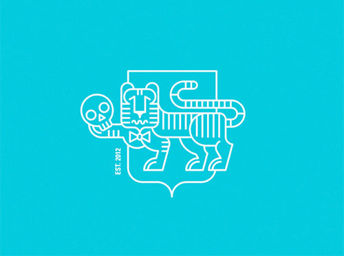
“Each department-related tiger can be shown holding a relevant icon — the skull for classic literature, the plunger for gadgets, and so on.”

The department emblems can be further enhanced with the addition of a heraldic shield incorporating the brand patterns.

A larger emblem was created that included icons from all departments, in order “to reflect the general values of the store.”

The project was topped off with a simplified logo for use at small sizes.
![]()
Denis Bashev is currently working as creative director at Sila Sveta. View a few more of his identity projects on Behance.
Tip of the hat to Christian Lindig.
Comments
I wasn’t sure how I felt about this until I saw the logo for smaller formats. I love it.
For all the illustrative detail, it’s that simplified logo that I particularly like.
I like this so much. All the details. If I ever visit Russia, I’ll go and visit the bookstore. :)
this branding is awesome. I love how playful the tiger & brand is.
This is so well executed. I really love that everything has so much character – fun, yet maintains a professional & established feel. Clearly a labour of love. Thanks for sharing!
What a fun and imaginative logo.