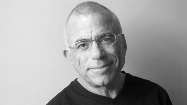
While working in their garage in 1977, Steve Jobs and Steve Wozniak asked Rob Janoff, who had studied design, to create a logo for their first Apple products. When Janoff went to Jobs with final sketches, everything went very smoothly, and the bitten apple has been the symbol of the brand ever since.
Some like to rationalise the bite with different stories. From pointing to the original sin, to the idea that it was in memory of Alan Turing, the father of computer science who, in 1954, was found dead with a suspiciously half-eaten apple beside his body. However, the designer of the logo himself has a different story.
“I was going for the silhouette of an apple, but to make it look more like an apple and not some other round fruit, I did what one does with an apple, I took a bite out of it.”
The bitten apple, nowadays is the subject of cartoonists’ and poster designers’ works. They make jokes out of it, stick it to their cars, and copy it in such an amount that no other logo has ever been. Rob Janoff, back then, a young man, never imagined that Apple would become the brand it has, and his logo the most well-known, even more than Coca Cola and Google. But whatever it was, he is still proud of it after 40 years.
Is this the best logo you’ve designed?
Yes. Nothing quite holds a candle to the Apple logo.
Did you ask Steve why he named the brand Apple?
Not really. I knew that he had been a fruitarian for a period of time and that he lived on a ranch or farm in Northern California for a while where they had an apple orchard (Steve thought an apple was the perfect food). They had a list of names for the company and had to pick one the next day to sign business papers. Apple was the favourite on the list and if they couldn’t come up with something better, Apple was going to be it even though Woz thought they would get sued by Apple Records. They didn’t come up with something better, so Apple it was, and I’m so glad.
What’s the reason behind the bite?
Like many things, stories have a way of getting stretched and changed in the retelling. I was going for the silhouette of an apple, but to make it look more like an apple and not some other round fruit, I did what one does with an apple, I took a bite out of it. The most enlightening part of the project came about ten years later when I started reading the stories about why I designed the logo the way I did. The stories are way more interesting than my rationale. Stories are told and people believe them and the lore gets passed on (all before social media). The fact that people believe the stories tells me that people feel a special connection with it, beyond the love they have for the devices the logo adorns.
What was Steve’s reaction when you presented the logo?
He just smiled and nodded and didn’t say much. I didn’t have to sell hard or pitch the idea. We both liked it and knew it was the way to go.
Your version of the logo had colourful stripes to represent the full-colour displays of Apple. Was the audience supposed to get it?
The coloured stripes did illustrate Apple’s main point of difference when compared to the competition, but it served a more important function. I thought one of my biggest challenges in designing the logo was to make a computer seem friendly enough to bring home for the whole family to use. Computers back then had a harsh and negative connotation, I wanted to create a warm and positive feeling about the Apple computer.

How effective do you think the logo has been in Apple’s success?
Their success is mostly due to Steve Jobs knowing what people wanted in a device before they knew they wanted it. Also Steve’s super high quality standards for functionality and design were a huge factor. That said, I do think the logo helped a lot. The love people have for Apple products goes hand in hand with Apple logo love. If they didn’t love the logo they wouldn’t put it in the rear window of their cars.
What’s the most important feature of a well-designed logo?
Simplicity. Too often clients have long laundry lists of elements the logo “must have.” That’s a recipe for failure. Logos need to be simple and distinctive or they won’t be remembered. The frequency that a logo is seen is a huge factor in its success. The fact that the Apple logo was on the corner of every screen of every Apple product helped to make it an internationally known (and loved) icon.
—
This post was kindly contributed by Touraj Saberivand, Rob Janoff’s Iranian design partner.


Comments
Great interview, Thank you Touraj!
Call me pedantic, but that apple is not a logo. It is a symbol. A logo (short for logotype) is a wordmark, which is often combined with a symbol. Eg CocaCola has a logo, Ford too.
Shell started out with a combination of symbol and logotype, but are mostly symbol now; as was Bell in its time.
The fact that Apple doesn’t have to include its name is impressive. There are not many symbols as recognisable.
Wrong, logos can have only words, only an image, or both combined. A logo is not defined by having an image and a wordmark. For example: Starbucks, McDonalds, Nike… all brands with only an image as their design.
Although I’m not an expert, people ought not to be so quick in responding if just basing their answer merely on common use of words. In fact, the first comment is right, there are three different words used in brand design, namely logotype, imagotype and isotype.
Logotype is a brand depiction using only words, though possibly using a characteristic font/typeface; from “logos”, greek for word (e.g. IBM, Coca Cola, and Ford as explained on the first comment).
Imagotype is a brand depiction using a picture only; from “imago”, latin for image.
Isotype is a brand combining a logotype and an imagotype, broadly used in marketing (Apple, Windows, McDonalds…).
It’s called a ‘rebus’.
Bert, this is the definition from Google:
logo
ˈlɒɡəʊ,ˈləʊɡəʊ/
noun
a symbol or other small design adopted by an organization to identify its products, uniform, vehicles, etc.
@Bert Vanderveen, you’re not just being pedantic, you’re also dead wrong about what the word logo means…
A logo (abbreviation of logotype, from Greek: λόγος logos “word” and τύπος typos “imprint”) is a graphic mark, emblem, or symbol commonly used by commercial enterprises, organizations and even individuals to aid and promote instant public recognition. Logos are either purely graphic (symbols/icons) or are composed of the name of the organization (a logotype or wordmark).
or
lo·go
ˈlōɡō/
noun
noun: logo; plural noun: logos
a symbol or other design adopted by an organization to identify its products, uniform, vehicles, etc.
“the Olympic logo was emblazoned across their jackets”
synonyms: emblem, trademark, brand, device, figure, symbol, design, sign, mark.
Lol, you guys are great at using a Google definition but not much else.
Dest is the only one here with a handle of the modern usage of the word. The word logo does not derive from the word logotype. It’s a short hand of it, yes, but there is also the word logogram which it has also been confusingly used as short hand for.
It derives from the Greek logos: speech or word. The word was then mixed with the Greek suffix gram: something written or drawn, later to make logogram, a symbol that represents a word or phrase (much like the apple symbol is a logogram for an apple). The word logotype has a similar history (although the stupid mixing of logos {word} and type doesn’t do much to properly describe what a logotype is). Based on the etymology of the word, Bert is partially correct, it’s not strictly a “logo”. It’s a brand mark, one which functions as a logogram.
That said, if you want to call it a logo, go ahead, everyone else does, but to be technical it’s a brand mark or emblem. No one’s going to call it that though, but if we’re going to be pedantic, it’s not just a symbol and the existence of the word logotype isn’t a good enough reason to not use the word logo, because logogram works just as well.
Great insight from a great mind. It shows different level of thought process behind such a big, yet simple design. People who love the Apple brand always have questions and who better to answer them the man who designed the logo.
Loved the article, but no mention of the original Apple logo?
Let’s see how many “logos” we can find that have impressively become just “symbols”. Please add to the list. If it doesn’t come to mind in ten seconds then it doesn’t count :)
Apple, Shell, Nike, MacDonald’s, …
Great article Touraj. Greetings to you and congratulations on your work with Rob inside Iran. Great design brings people together.
As artists we forge alliances across state boundaries, across national divides… across the world! The greater our dialogue and the more we work together as creatives, the stronger our relationships become.
Joel Bohm
(the Australian partner of Rob Janoff:)
Very enjoyable read. I wonder how Janoff feels about the shift from the rainbow logo to the solid white version — the logical next step in simplification, or the loss of the friendly and warm image?
@Shane Collens
Adidas, Audi, VolksWagen.
And in Denmark we have the official mark for organically produced foods (a red “Ø”) which is recognized by 98%+ of the danish population and arguably the strongest “brand” in Denmark. :-)
Symbol: a real or abstract representation used as an identity for a company (or organization). Apple. NBC peacock.
Logotype: A combination of a symbol with type or letters as an identity. IBM. Amazon.
Signature: A type only identity. FedEx. Fidelity Investments. Also called a word mark.
Logo: Vernacular term for a symbol, logotype, or signature for a company.
Mark: Industry jargon for symbol, logotype, signature.
Identity, also Corporate Identity: What designers call all of this.
Brand: More jargon but, ultimately, all of it and more. Feelings.
Brand: Reputation
@Bert Vanderveen Okay, you’re being pedantic.
What a privilege to read the interview of the designer behind the famous Logo. Thank you so much for putting this up.
Daniel Shane,
Senior Graphic designer – Logo Orbit
“Rob Janoff, back then, a young man, never imagined that Apple would become the brand it has, and his logo the most well-known, even more than Coca Cola and Google. But whatever it was, he is still proud of it after 40 years.”
Of course he wouldn’t have imagined 40 years ago that his logo would be more well-known than Google, that company didn’t exist 40 years ago!
Logo – short for logotype (words), logomark (symbol, no words). This probably accounts for the confusion in the thread above. Logo, icon, symbol – it’s a great piece of art.
Great interview with the designer behind the famous Logo. Thank you so much for sharing.
Great interview with the designer behind the famous Logo. Thank you so much for sharing.