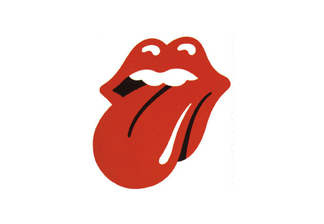
At the conclusion of the Rolling Stones’ ZIP Code tour, Robert Klara from Adweek asked me how the famous “Tongue and Lips” emblem has become as iconic as it has, and why it’s lasted so long.

Any design that achieves iconic status can only do so on the back of an iconic product. The fact that the Rolling Stones are one of the most recognisable rock bands on the planet certainly helps.
Beyond that, if a good logo’s going to endure it needs to be appropriate for what’s identified, and the sexiness associated with red lips is fitting for the legendary rockers.
Read Robert’s full piece on Adweek.
“Branding a rock band with a signature badge was a novel idea in 1969 when Mick Jagger called on London’s Royal College of Art in search of a student to create some visual assets for his band’s next album. The Stones’ front man liked the work of 24-year-old John Pasche, who accepted £50 to draw up a logo.”
From the archives: V&A buys original Rolling Stones logo.


Comments
The first impression is important. It depicts exactly the vibrancy and liveliness of the rock band.