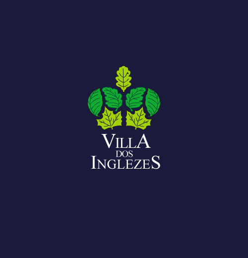
Here’s the Villa dos Inglezes design.

I wonder if the Queen approved that one, too.
Via Kalebe Lima.
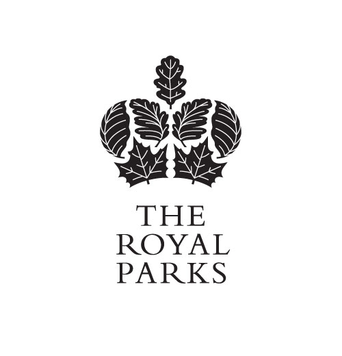
Here’s the original Royal Parks logo, designed by Moon Brand in 1996.

Here’s the Villa dos Inglezes design.

I wonder if the Queen approved that one, too.
Via Kalebe Lima.
Comments
I’d like to know more before making a judgement. If it is a rip off then it’s just wrong.
I overlayed them in photoshop, and they are exactly the same shape. The only difference is in the veins of the leaves, which is probably attributable to a crappy Live Trace job.
It’s disgusting that people don’t value designers’ work enough to realize that this is stealing.
ditto.
Curiously, do I only see the crown on the first logo… By the way, the first one is much more elegant than the second.
They are too identical in shape. I’d be shocked if this weren’t a rip off.
If a client asks for a knock off I wish designers would refuse, and if the designer ripped off this logo I feel for the client. What a shame.
That’s a shame. Gotta love the attempt at creating their own small caps font!
Lee – How much more do you need to know? This clearly is a ‘rip-off’ and I’m surprised anyone would have to think about it. The chances that a designer 15 years later would come up with the same design by chance is slim to none.
The designer probably just figured that no one would find out since the original logo is found half way across the world and thought changing the colour and font made it their own. Disgraceful.
The designer should be ashamed and if the client knew they should be too. I was approached last week to copy a logo the prospect had ‘found’ on the internet. I refused as I didn’t want to expose them to copyright issues or ruin the reputation of our design studio. It really isn’t hard to say no to this sort of practice.
Oh dear in green it just looks like a salad. Are those cabbages?
The second version is one that Prince Philip approved.
This calls for a big, fat lawsuit.
Well this is just sad, it’s very clear they want their business to never be taken seriously, & Kevin Burr nailed it, pretty bad attempt at their own small caps. Overall one giant failure.
That is appalling, the funny thing is, even though they have ripped it off nearly exactly, it still fails to deliver the level of class the original has.
That’s terrible, I wonder if it was the result of the client saying ‘I want it exactly like this one’. Like Bryan said, it is only the veins and colours that are different. At least it’s not done as well though, so Moon Brand can still take pride in that. Having it in black and white makes it so much crisper and cleaner.
If my thinking is correct, Villa Dos Inglezes translates to English Villa so perhaps they did it on purpouse to try and relate to us?… But perhaps not.
The lack of scruples is amazing…
Look at http://www.agroads.com.ar logo. Haha it is the Amazon.com logo!
How do these people sleep at night?
They might actually not know a bit about whole ripp off thing, well, at least till now, since I sent them a polite note explaining what’s going on.
Just come across this post. This is just so blatant it’s embarrassing.
Not embarrassing enough for them to have pulled it though, as sadly the ripoff logo is still in place.