
 Godfred H. Petersens Mobelvaerksteder
 Aktiebolaget J.O. Carlsson
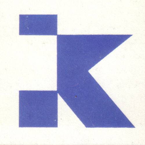
 Anton Kildebergs Mobelfabrik
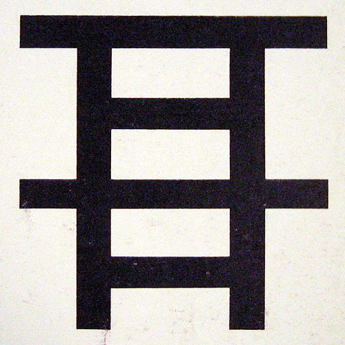
 Textil Lassen
 France & Son Aktieselskab
 Kallemo
 Unika Vaev
View the full Flickr set here.
Reminiscent of these vintage logos.
Compiled by Oliver Tomas, via @BlairThomson.


Comments
simple no fuss designs – why over work it?
Great collection. I recognize a number of those from my History of Graphic Design class.
thanks for sharing,
Jesse
Beautiful and simple. I love the Anton Kildebergs Mobelfabrik mark.
Interesting that they are all monograms, and yet all unique.
– c jONEs
I love seeing logos from previous decades! One thing’s for sure: those are all a lot more timeless than the “flashy” overdone crap that gets passed off a lot these days. Thanks for sharing David!
I’ll be thinking about the Textil Lassen one all day =)
PS David, Your site always cheers my day!
“And not a gradient or bevel in sight” — hopefully that will be the mantra of Web 3.0. :)
The Anton Kildebergs Mobelfabrik is my favorite! Its all about those lines crossing between the J and the O to let you know it has to do with something about fabric. Genius.
I meant the Aktiebolaget J.O. Carlsson one…
Yes, simple and clean, almost understated.
“Chris” said it best!…”I love seeing logos from previous decades! One thing’s for sure: those are all a lot more timeless than the “flashy” overdone crap that gets passed off a lot these days.”
The “flashy” logos of today are too decorative, many too similar.
There is a certain retro chic about them, but if you scroll away form them do you remember them? Can you draw them without looking at them? Can you match the logo to the company?
Are they just letterforms like a lot of logo’s from the 1950’s-1960’s?
Thanks David for sharing them….As we say ‘old is gold’ that’s true in all cases. These are the logos which just make a mark in our minds without a second glance.
The art of simplification is indeed very difficult.
Anton Kildebergs Mobelfabrik is probably my favourite. For me, it’s the most memorable and I love that blue as well. If anyone’s interested in seeing more mid-century design classics, Shelby White regularly updates his blog with some really beautiful images from that period. You can find him at wanken.com. :)
Very nice! It is like some sort of language, almost as if each shape has some profound meaning.
I really like the France & Son Aktieselskab logo. It’s good to be reminded of simple logos that just work, why overcomplicate things?
Great post.
Wonderful post :) I love the timelessness and simplicity of these logos, it’s so inspiring to see this stuff. In particular I’m also drawn to the France & Son Aktieselskab logo, and also the Unika Vaev logo – the combination of the shapes and the blue is beautiful :)
Inspirational, I love logos and letterforms like this. Bold colours that strike you in the face. Its things like the Bauhaus movement and Scandinavian art that has made Graphic design what it is today. I like this collection, it has given me some ideas.