At that time, most Czechs were fervently patriotic, so they called their first company Slavia. Their bicycles sold well, so Laurin and Klement decided to take the next step and add motors.

They started making motorbikes in 1899, changed the name of their company to the Laurin & Klement Co and chalked up several racing victories. While making nearly 4,000 motorbikes of various types, they started experimenting with a new phenomenon — the car — which began to gradually replace motorbikes from 1905 on.


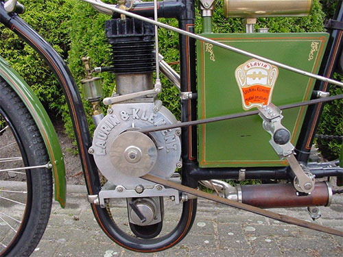


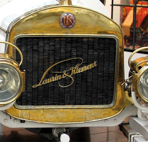
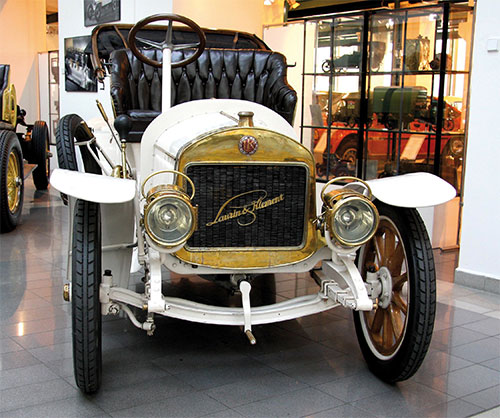
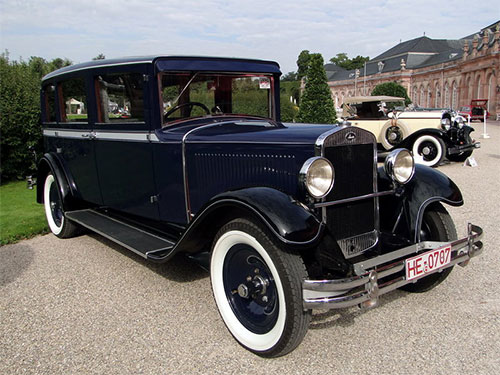
When war began in 1914, the Laurin & Klement Co started manufacturing for the armed forces too. Because of the economic conditions in the region at the time, Laurin and Klement needed a strong industrial partner to strengthen and modernise their company. They were now not only producing a range of cars, but also trucks, buses, aeroplane engines and agricultural machinery, such as motorised ploughs. They merged with Pizen Skodovka Co in 1925 and became ŠKODA.


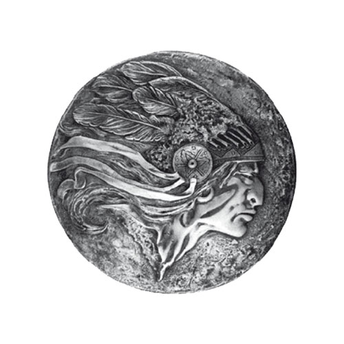
According to ŠKODA, around 1918-19 in the management office in Plzeň there was a picture portraying a Native American, and the picture was likely the inspiration for the feathered logo. The commercial director at the time, Tomáš Maglič, was thought to be behind the idea.
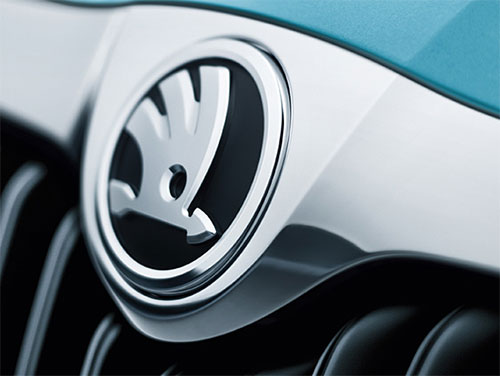
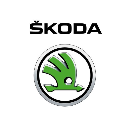
Two trademark variants were registered with the Office of Trademark and Design in Plzeň on December 15th, 1923. The first variant (below), used in 1924 and 1925, was a five-feathered winged arrow in a circle with the word ŠKODA.

The second variant (below) showed a three-feathered winged arrow in a circle, and it has not been significantly changed since.

In 1939 came World War 2. Czechoslovakia was occupied by the Germans and the period until 1945 was a disruptive one for ŠKODA. The civilian car production programme was very limited and the majority of manufacturing was to support the German war effort.

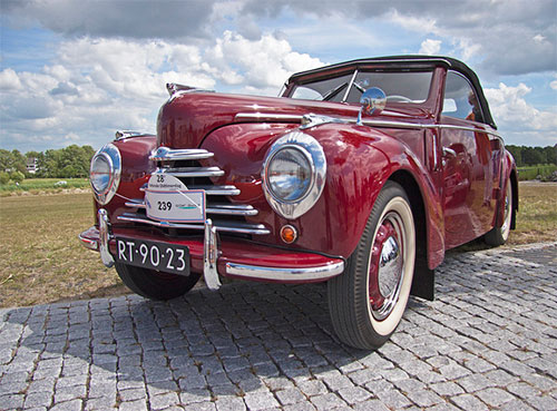
After the war, as part of large-scale nationalisation in Czechoslovakia, the company became a national enterprise and took over all passenger car production. This period saw the ŠKODA Tudor successfully exported as far as Australia and the introduction of the mould-breaking ŠKODA 1200 which was modernised several times before, as the 1202, finally ceasing production in 1973.
ŠKODA also manufactured the ŠKODA 440 which, in 1959, evolved into the first Octavia, named because it was the eighth model to be produced after the end of World War 2.

New market economy conditions came with the political changes of 1989 when the Berlin Wall was brought down. The government of the Czech Republic and the management of ŠKODA began to search for a strong foreign partner in an effort to secure the company’s long term international competitiveness.
In December 1990 they decided on Volkswagen and a joint venture began the following year. ŠKODA became the fourth brand in the Volkswagen group, alongside Volkswagen, Audi, and Seat. Since then, ŠKODA has gone from strength to strength.

If you liked this content, you might also like to see the Aston Martin logo evolution, or the history of the Ferrari logo.


Comments
Nice identity, as is the case with cars today, could be a Kia, Rover, Nissan, Toyota, Hyundai, etc., in the affordable price range, most cars look alike.
Kia? You have no idea the industrial design of this company.
But the question is WHY a stylized feather / arrow?
I heard this was introduced when Skoda was first exported to USA and the logo was devised to combine the Red Indian feather head-dress (originally 5 segment) and the arrow – to make it look American.
Exactly. The logo from 1915 is the missing link here. On this one was pictured the profile of an Indian in red color and no arrow. This badge hung on the walls of Skoda employees’ offices back then. The arrow came three years later, in 1918, beneath the head already was stylized by then. In the spring of 2015 German magazine Auto Zeitung had a special edition dedicated to Skoda’s 120th anniversary, where the evolution of the logo was tracked out and that’s where I know it from. Of course, Google doesn’t know everything, so unfortunately, I cannot send you a link with the images.
How could the 1915 logo be the missing link when Skoda did not exist until somewhere around 1923 or 1925?
My son asked me today “Why do SKODA shoot arrows through the head of an angry bird”? Lol
How did the arrow and the red Indian head dress come into being? Was an American interest in Skoda involved? So many people have asked me about the symbol on my Scout.
The answer is right here on SKODA’s own brand heritage site – indeed, a Red Indian influence.
Thanks very much, Neil. I’ve updated the post.
So what does the Skoda name mean?
Skoda Name Meaning. Czech, Slovak, and Slovenian (Škoda): from škoda ‘damage’, ‘loss’; apparently a nickname denoting someone who was accident-prone or a bungler. Also… A tour of the online Czech-English dictionaries shows that Škoda, when starting with a capital means: “Too bad!,” whereas if you swap it out for a lower-case “š,” the meaning changes to “damage, harm, detriment and injury.”
It doesn’t mean anything. It’s the surname of Emil Riter von Skoda, the founder of Pizen Skodovka. He was an industrialist who Laurin & Klement merged with in 1925 to move the company further in auto production.
Another fact may be underlined. Other Austrian brands had chosen trademarks like so: a target for Steyr, a bow for Austro-Daimler. A tradition was born.
That logo is hideous and cheap looking. They’d be better off just using the wordmark.
Agree. Skoda just should have stuck to their original inspiration – the grumpy old Indian :) and make it their logo. Would have looked so cool. 🙊
I have delved into Skoda’s history quite a bit. Nothing really about their wartime production. Of course most people know about their involvement with the various models of Panzer tank. Very little detail is available.
But Skoda is also into machine tool and cranes manufacturing. What happened to those activities. BHEL Hyderabad in India had a long term collaboration with Skoda for manufacturing heavy power equipments. What happened to that division? Is it still active in the market?
Look closely at the crossed flowers motif from the bottom of the emblem in the first picture. And now search for pictures of old Mercedes Benz emblems. Isn’t it a striking similarity? I wonder what kind of plants they are.
The logo is a chicken head, but green.