
![]()
Created by Bruce Mau Design, the portfolio page unsurprisingly doesn’t mention the effect — it’s a subtle bonus, not the main idea — but I doubt the illusion went unnoticed on during development.
—
Update: It was spotted about halfway through the process.
—
It didn’t half generate some brand attention (on Gizmodo, The Verge, Quartz, Business Insider, The Drum, Yahoo, 9GAG, and plenty more).
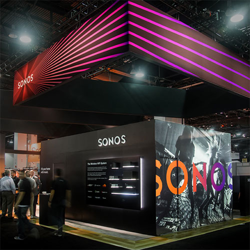 Tradeshow booth mockup.
![]()
More identity imagery on the Bruce Mau website.

Comments
I like when logos go that extra mile with little design accents like this. I wonder if this effect was intentional. It sort of reminds me of those motion poster that movie studios sometimes creates.