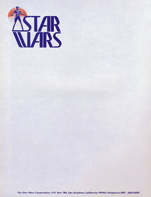
The above design was produced during the film’s pre-production. In the first Official Star Wars Fan Club newsletter, reprinted in the Star Wars Scrapbook (Chronicle Books, 1991), there was an explanation about the decal by Ralph McQuarrie, who did the art:
“It was done as a symbol for the film — to go on film cans and letters. George [Lucas] had had one for American Graffiti, and wanted one for Star Wars.
“It was done while we were working on costumes. This was how we first pictured Han Solo. It could be a sort of Luke character, but I think it’s more like Han. Anyway, George decided that Han Solo should be a more relaxed character, and his costume was changed. But this decal was designed before the change.”
In the Star Wars Scrapbook it was revealed that Joe Johnston did the title lettering seen on the letterhead, with the type design based on the Precis font family.


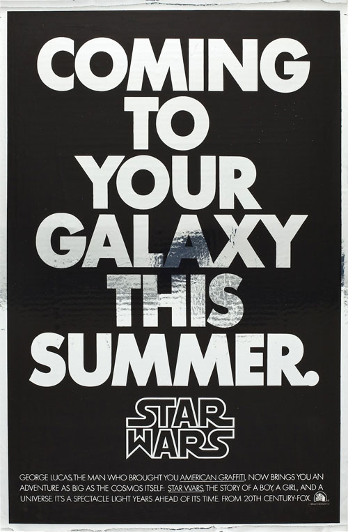
Lucas turned to Suzi Rice to design a new Star Wars logo. She wrote about her involvement in a two-part post on her site (no longer online, sadly). The Star Wars Poster Book (Chronicle Books, 2005) had a short account of her role:
“…Though the poster contained no painted imagery, it did introduce a new logo to the campaign, one that had been designed originally for the cover of a Fox brochure sent to theater owners. Suzy Rice, who had just been hired as an art director, remembers the job well. She recalls that the design directive given by Lucas was that the logo should look ‘very fascist.’
“I’d been reading a book the night before the meeting with George Lucas,” she says, “a book about German type design and the historical origins of some of the popular typefaces used today—how they developed into what we see and use in the present.” After Lucas described the kind of visual element he was seeking, “I returned to the office and used what I reckoned to be the most ‘fascist’ typeface I could think of: Helvetica Black.
Inspired by the typeface, Rice developed a hand-drawn logo that translated well to the poster campaign, and ultimately to the movie itself. “I did have the screen in mind when I drew the logo originally,” explains Rice, who “stacked and squared” the words to better fit the brochure cover. It was an aesthetic choice that has lasted nearly three decades.
The now-familiar “S” ligature extensions that Rice drew were modified a bit after Lucas “remarked that it read like ‘Tar Wars,’” says Rice. “He asked me to make some revisions on the leading and concluding ‘S’.”

Alex Jay published an in-depth look at the evolution of the Star Wars logo. See the full post on his blog Anatomy of a logo: Star Wars.


Comments
What surprised me the most when I read the Tenth Letter of the Alphabet article is how all iterations of the logo were used seemingly randomly, as if they were all interchangeable. In some cases two different variations would be used on the same piece (The Del Rey dust jacket for instance). Obviously Lucasfilm / 20th Century Fox didn’t have a set style-guide for the first film, but what’s perhaps more surprising is that I’ve never consciously noticed this before now despite being exposed to it since the age of three. Now, I can’t unsee it! I’ve gone back and looked at some of the packaging for items I once had in my collection and it’s all over the board. I also don’t think I’ve ever consciously acknowledged the variations in the revisions of the Rice Design, not all of them are so subtle after all. Until now, I’ve just seen “The Star Wars Logo” when in fact it’s been the Star Wars logo(s). The Johnston revision (the best in my opinion) has always mentally superimposed itself over whatever Rice revision was physically present. I wonder if anyone else who grew up Star Wars has had the same realization after reading the article . . . or if I’m just weird. It’s very odd because noticing these types of subtle differences is something I pride myself on being in this profession. Considering this logo has been ever-present in my life, seemingly at every stage, I wonder if my constant exposure / overexposure caused my subconscious to register the shape and “fill in the blank” without ever really processing what I was actually seeing. The Rice design is one of the first logos I was drawn to, it’s at least partially responsible for me seeking this profession . . . but which version? It’s like I just had a veil lifted and am forced to rethink everything . . . well, maybe not everything, but it’s definitely made my head spin! ;)
Always a fan of star wars and think the logo is great.