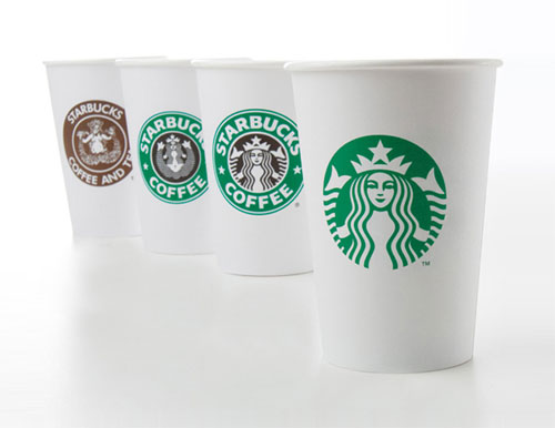
The 40th anniversary of the coffee shop giant brought an evolved look for the Starbucks logo, created by the Starbucks in-house design team in collaboration with Lippincott.

“Over time, we’ve given our siren a few makeovers. As Steve Murray, a Starbucks creative director, says, “we got to see a lot of her” in the beginning. The first update came in 1987, the year we added handcrafted espresso drinks to the menu. That’s when the logo switched from brown to green. We also gave her a more modern feel. In 1992, we became a publicly traded company. We adjusted the logo a bit more by zooming in on the siren. But 2011 brought probably the biggest change for the siren.”

More on the Starbucks website:
The Story of the Siren
Who is the Starbucks Siren?

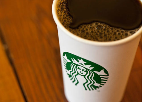
When a brand becomes so well known, so recognisable, there’s a lot less friction when simplifying the logo. In this case, the brand name has been removed entirely, similar to brands such as Shell, Nike, and Apple.
More chat on Creative Review, ABC News, the Landor blog, @Issue, and Brand New (with hundreds of comments on the latter).
If this is the kind of content you’re interested in, the archives share details on the LEGO logo evolution amongst many others. You can subscribe for free updates here if that’s your thing, too.



Comments
Great to see big brands simplifying their logo, if only they could improve their coffee.
I’m not a fan of simplifying things just for the sake of it (or because it’s fashionable to do so), in cases where doing so does not enhance the brand.
I feel in Starbucks case we have a matter of following the trend.
Nutella looks awesome though. This is because the chocolatey goodness of the product shines through behind the logo rather than it being masked by a label. The logo looks modern and is far better defined on top of it. This is an example of a good simplification, whereas I feel Starbucks were ill advised with this update.
I can see the evolution here but where’s the imagination? What’s the message to the consumer? Starbucks’s move to “de-brand” itself is going ahead but is it loosing sight of the main ingredient… coffee/café/culture. Unfortunately it is like their coffee – weak and unimaginative.
Simplifying the logo even more was bound to happen eventually and it does work, but i still prefer their previous design with text. The way the text is positioned and also the use of black with the green makes it stand out that little bit more for me.
Very brave to lose the name, however big the brand is – As with everything, we will grow to accept it,. But I feel losing the outer ring is a mistake even if it was just a thin ring just to encapsulate it. I can see that losing the black is going to cut down massively on print and collateral costs so there is no argument there. I’ll still buy the coffee though!
I like the original. I’m sure they had to ditch that as it showed breasts. I had the same problem with this logo concept:
http://www.grafissimo.com/mermaids_mug.html
Rejected by committee before it really developed. I was going to baroque it up with schooners and a wharf in the background. It’s just visually more interesting.
It’s sort of following Hills Bros. in that the turban-wearing fellow and the Eastern motifs are objectionable to some. Now Hills Bros. puts a Victorian-looking fellow on their packaging, or it is merely reduced to a font.
I do not think this is good. I am somewhat turned off by companies that are so iconic they can express brand identity through a typeface.
On the whole, the new Starbucks logo seems less balanced than the previous. I suppose they are saving a screen charge for the black.
Ben Wolstenholme of Moving Brands said it well when asked about Starbucks.
More on the Moving Brands site.
I have yet to see the 2011 logo. I like the idea of dropping the name from the logo. Their brand is very strong. Many small shops have copied the green circle and I think this newest move will strengthen Starbuck’s brand further.
I feel that the new design makes a nice icon, but I’m not sure I love it as a logo. I know the Starbucks brand (even as a non-coffee drinker), so I wouldn’t feel lost or confused if I started seeing this, but it doesn’t speak “Coffee” to me. The siren never did, but at least it had the word Coffee on the logo. If someone unfamiliar with the Starbucks brand were to look at this, there’s nothing to tie is back to what the brand sells.
This logo is a very nice evolution that’s clean and crisp. I am however, having trouble with Starbucks calling this a “redesign” because nothing, it seems, has been redesigned. The only perceivable change has been removing the type, which to me, makes the logo communicate less. The whole mermaid thing says nothing about coffee and the only thing that communicated that was the actual word “coffee” in the old logo. If the mermaid didn’t have the brand equity that it does now, this wouldn’t work.
I love it! The only thing I would have kept in the design is maybe a couple stars.
If you watch the video from Howard Schultz on the Starbucks site, the design rationale helps it make more sense. He illustrates the point that Starbucks isnt just about coffee anymore, and as their main product is still coffee… the new direction of the company it too branch out to new things.
Hence, dropping the word coffee from the logo. Not too many folks are unfamiliar with Starbucks image these days. When you are a global brand as big as Starbucks, I do not think you still need the name in the logo. Not sure I feel as if this was necessary, but I think it works.
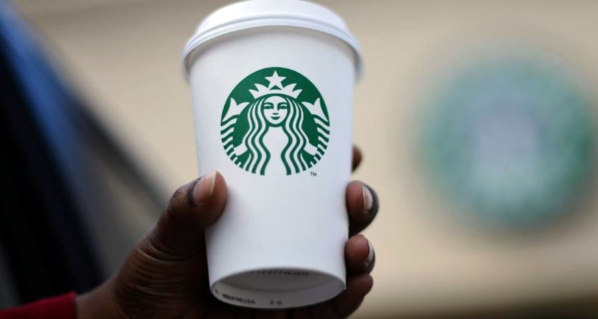
Plus, although not shown here, it says Starbucks on the back of the cup still, in the same typeface and the same green color you see on their storefronts.
Craig, I totally agree with you!
It’s still original compared to others, even more so now.
Branding doesn’t stop at a mark, and Starbucks is one of the most successful examples of this truth. This evolution is the signature for a set of branding tools that Starbucks has adeptly wielded to date. I look forward to seeing their brand team’s use of this signature in juxtaposition to evolving new branding tools in the future. Like ’em or hate ’em, Starbucks is ALL brand and they understand how to use it.
Golden arches, ahoy!
Minimalism is the trend for 2011, maybe.
I like it, it’s a bold move yes, but its obviously so they can diversify into new areas, removing ‘coffee’ etc enables them to do this.
I actually think that the green is Starbuck strongest brand asset and retaining this, the white and the graphic is a good move. It feels like a jump forward and like there should have been a stage and maybe a couple of years inbetween though.
Overall a good move in my opinion
I love simplicity but I don’t think it works for Starbucks, well maybe it’s not that it doesn’t work, I simply prefer the 1992 version. I think that it could have used an updated typeface but not completely throw away the entire outer ring as I feel this was part of the charm. For Shell and Nike it worked because the logotype was separate from the logo itself but Starbucks had it all incorporated together and I liked it that way. I think it may take some getting used to.
I really think this is a step backwards in terms of recognition from the brand. I can understand they want to diversify the brand from just coffee, however feel they should have taken the steps Manchester United did when they wanted to diversify. They kept the core logo and just removed the Football Club text from the design, I feel starbucks should have taken the same route and just removed ‘coffee’ from the logo.
Hello!
I’m a huge mermaid fan – paint them – so I love the logo idea. Maybe keep going with it so her tail doesn’t split so much. She looks most flexible!
If she is a mermaid, does it signify they are going overseas with the brand or going to swim in new waters? Or super flexibility?
More important than the brand would be the company’s fearless why. Where are they going/swimming and why? Curious about that.
thx, G.
she is more of a siren than a typical mermaid and its not like they have suddenly used that within their logo to express that the company is going in a new direction or anything. the siren has always been apart of the starbucks brand and i don’t think they have changed the logo to show that they are going overseas since there’s a starbucks everywhere in most countries. its just another company trying to make their logo more simple and to try and make their brand seem more fresh to the consumers when they view it. like i said i like the new version of the logo but i still prefer the previous one. maybe if they kept the black, white and green colour scheme for the new one then i would probably lean more towards it.
How on earth can anyone have an informed opinion by seeing the logo applied in only one way on a coffee cup?
Anyone got any more images for store facias, packaging, comment cards, pos, etc etc etc?
Branding is more than just a logo or symbol. I’d like to see how it works with the name (which I bet it will appear next to at some point).
We are only seeing a tiny part of the story, although I’m not impressed so far, it all feels a bit first stage. Are they doing a Gap to test the water and get some free PR?
I like the new logo, I think starbucks has been trying to branch into new areas of business for a number of years now and the new logo should allow them todo so while maintaining the starbucks brand at its full strength.
What Craig already said, we eventually grow to accept it. My opinion is that the previous logo is more authentic and that’s a part of starbucks. But anyways they don’t lose customers.
Too bad starbucks is an evil, evil company that screws people over to bring you nicely branded coffee, eh?
But essentially, this logo is just someone making free with the circular marquee tool and then CTRL + X.
@James Random – You’re right they aren’t the most responsible multinational!
Regarding them just removing the text, they have done more than that. Apparently the graphic hadn’t been touched for 20 years, so needed some work. They have cleaned it up and simplified it. I’d agree that there is a feeling of ‘unfinished’ about it but I think overall it’s an improvement.
I agree with most of the commentary. The simplicity, in Starbucks case, works to their advantage. The “woman” in the logo has become iconic and is much more memorable in her simplicity.
We are seeing this a great deal with website design, as well. My company has been analyzing this very concept.
Please feel free to check us out.
Thanks for a great post!
Nope, nope, nope…hate it. The overly complicated mermaid is NOT the part of the logo that we all recognize at a glance….in fact she is overly complicated and has no relation whatsoever with the product itself, and not in a good way.
I would have gone completely the opposite route and figure out how to just use the outer ring, name and stars or reductions of those elements….that’s the part that says Starbucks to me.
Ditching the black hurts too…the whole thing becomes too playful and soft for this brand.
Next…
@Gareth Coxon
After comparing the before and after, I find it very difficult to see where any ‘touching up’ of the lady was done (no puns intended). It really does look like someone went round the centre of the logo with the circular marquee tool, cut it, slapped it in a new document and modified its colour. That’s all.
Similarly I don’t think that it will have any particular impact on the General Public. Your regular Joe isn’t going to say ‘Cool, they touched up the lady finally after 20 years’, they’re going to say. ‘They got rid of the outside’, shrug and move on.
I think this redesign has less of an impact than the news that they recently released a size of drink that contains more liquid than your stomach can physically hold.
This logo represents a sad day in rebranding for Designers everywhere.
@ Everyone who says the siren image has nothing to do with it
I agree that it may not be the simplest or most beautiful mark they could have chosen, however, the fact that Starbucks is recognizable enough to do this is has got to be worth something. When you see a white cup with a green circular image, you think ‘Starbucks’…
Most people don’t know what Nike’s swoosh has to do with sports equipment – yet it’s one of the most recognizable brands in the world.
@James Chillcott
I agree completely. While this looks nice, to me it has completely lost the Starbucks feel. I just DON’T see Starbucks when I look at it anymore. I’m a daily visitor of this company, and I have a hard time identifying it with Starbucks. The text was the big marker; heck, my uni just redecorated the Starbucks and put a huge “STARBUCKS COFFEE” sign, using the original font, in the shop. The text has been such a huge part of the brand for so long that I feel it’s too late at this point to remove it and still maintain identity.
I saw this topic this morning on another blog, and promptly showed the first five people I ran into the new logo and asked them to identify the company. One had a Starbucks cup in her hand and still NONE of them could place it… I really feel this logo is a miss, though I do feel it’s much more attractive.
if somebody ask me to draw starbucks logo I would draw a circle with COFFE AND STARBUCKS inscriptions inside in green and white colors. I saw this logo thousands times and I haven’t mentioned that there is a siren inside the circle. SERIOUSLY. so the simplifing this logo in this way is risky for me.
First off, you have to like Starbucks coffee to really care but that said…
I really like the older logo’s better. But I’m sure they wanted to drop the “coffee” in favor of being able to serve MORE types of products.
But, every step that gets them “in the news” just fuels the brand recognization, good or bad, you know about them and that IS their ultimate goal because for every one that may not like them, another one will. And the do want to sell more things besides just coffee, heck I expect them to have a clothing and perfume line soon.
I just found out about this new logo… I can’t say I’m fond of it. I think it’s a watered down version of the previous two incarnations. The black/white/green logo is much stronger in my opinion than the duotone new one. Then again I’m a sucker for black/white + single color.
On the topic of watered down: that matches the something-which-resembles-but-isn’t-quite-coffee they sell (hearsay from coffee-drinkers here from the Netherlands, I don’t drink that stuff).
Where’s the navel? They should’ve kept the belly button! It would show up just at the bottom quadrant of the circle, meaning that they’re coffee is still sexy! That’s just my 475 cents for a grande caramel macciato. ;D
Each stage of design is like an award for the brands growth and recognition.
40 years on and their logo is now at the stage of becoming simple and iconic, says nothing about coffee yet still recognisable as Starbucks at a glance. Brilliant! Not just a logo but the evolution of a brand!