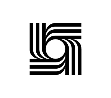
Stefan Kanchev was born on August 6th, 1915, in Kalofer, Bulgaria. He studied mural painting in the National Art Academy (1940–1945) in the class of professor Dechko Uzunov, and went on to work in all areas of applied arts. He was an author of numerous covers of books with folklore fairytales, posters, trademarks, postcards, advertisements, forms and envelopes, postage stamps, labels, packaging, etc. But it was his logo work that stands out, ahead of its time due to the simple, yet distinctive form.
Kanchev designed more than 1,000 trademarks and symbols, and in the first world exhibition of trademarks in New York he presented 23 out of the 250 logos on show from designers worldwide.


In 1994 Stefan Kanchev was recognised as one of the top ten designers of trademarks in the world, along with Paul Rand, Saul Bass, and other luminaries. The title was awarded by the International Trademark Centre in Ostend, Belgium.
He died in 2001 at the age of 86.

Many more trademarks on the Stefan Kanchev website.
With much thanks to Andrian Dimitrov, Yana Simeonova, Vladimir Georgiev, and Julia Zidarova for their work documenting the designs. The Bulgarian logo archive displays work from other Bulgarian designers.


Comments
Thanks for the post David, I was not aware of how vast Stefan’s work was. The Center for Industrial Design logo reminds me much of the CBS logo. On that note, have you seen the video of the history of the CBS logo? It’s quite interesting.
http://www.youtube.com/watch?v=wB63odkphhg
Great designs. But sad to hear the owner died. Its very difficult to create logos of fine perfection. But he can….
I love love LOVE that Operetta State Theater logo. Not too sure about the CID, but I’m pretty sure he’d have been one of the first to pursue the eye silhouette which has become a bit of a cliche now. Looking through his site, there are some really great logos, but there are also some very pedestrian, over-complicated ones. I really like the Central Puppet Theatre icon, it’s playful but direct.
Let’s not forget the fact that most of these logos were designed for Bulgarians (using Cyrillic alphabet). And not in 2009 but some 30-50 years ago.
Which is why I think it’s a testimony to Kanchev’s talent that quite a number of them have stood the test of time! You’ve got me interested now though, I’d like to see an article on logos across different languages, cultures and character sets (and time?). Maybe a focus on a certain type of logo (i.e. for a manufacturing business or a financial business) for the purposes of comparison.
With such simplistic-looking designs, it’s clear there’ll be similarities. Particularly given how long Stefan’s work has been in circulation. The CBS eye short was interesting to watch, Jacob, cheers for the link.
Ian, if you don’t mind I’d like to pick your brain about life in Adelaide. Giving Australia a shot has been in the back of my mind for a few years, and Adelaide is one of the few cities I can take up skilled residency. You’ve been there for about eight years now, isn’t that right? What do you like about the place?
Hi David, you’re correct, I’ve lived in Adelaide for pretty much bang-on eight years now. It’s a nice little city. I don’t know if you’ve visited Australia before, but you can’t really compare it to the bigger cities like Melbourne or Sydney. The CBD’s probably about half the size of theirs. While we don’t necessarily have as much going on – which some people find boring – we also don’t have to deal with awful rush hour traffic, tollways and a ‘high speed urban lifestyle’. I really like it here.
The city sprawls a bit in the Northern and Southern suburbs, but it’s bounded on the East at a reasonable distance by the Adelaide Hills, so from the coast to the hills it’s only about 40 minutes by car. It’s a very green city, we’ve got parklands surrounding the CBD on all sides, and there’s a lot of reserves and other little parks dotted all the way through the suburbs. The Botanic Gardens are beautiful here too. There’s also the Fleurieu Peninsula to the South, which has got all sorts of camping and walking opportunities. It’s not difficult to escape for the day is the gist of it I guess!
In terms of culture, our main event is the Adelaide Fringe, which is an annual event now. The city really comes alive for about a month, and we get all sorts of theatre, exhibitions and street artists out and about. http://www.adelaidefringe.com.au/ if you’d like to check it out. If you’ve got any specific questions or you’d like to see some photos of the hills (where I live), feel free to shoot me an email (ianhoughton {at} gmail {dot} com).
Great post, David. Many of the new logo designers today do not know the challenges it takes to create a simple and iconic, yet dynamic logo symbol. Stefan Kanchev’s work is a fine example of these types of symbols. Hope all is well, dude.
Ian, that’s superb, thanks. I once heard how good the Fringe was when working at the Edinburgh Fringe (another excellent month-long festival). I think a trip to Adelaide is on the cards, and probably when the Fringe isn’t on, so I can judge it by what it’s usually like (but then, if I don’t return, I’ll miss the fun!).
Kevin, all is well, mate. And I hope with you, too.
Hey David, I was from Sydney but my parents live in Adelaide. Much too slow for me, but a very pretty place. It feels like you go back in time about 20 years when you’re in Adelaide.
If you like your wine though – its the place to be!
As for the logos – I think the opera one is really nice but it has a big glaring dirty curve in the middle. I guess we take digital logo creation for granted these days!
Such fantastic work; his logo for the pianist, Olga Shevkenova is truly sublime.
No problem David, happy to help. Make sure you do visit during the Fringe though at some point, the city has an amazing atmosphere!
Hey, David. Iconic indeed! Haven’t yet gone to the link for his website, but the examples of his work displayed here are eye-catching.
The Operetta logo stands out here; it’s beautiful and to me, communicates a love for the music and I’m reminded of the open lid of a grand piano by the negative space. Thanks for this. I’ll have to check out the link though.
Hi Nathan, you’d probably also feel like you’ve gone back in time with a trip to Ireland then. Great resources here, but in terms of cityscape it doesn’t compare to Sydney.
Ian, yep, would love to check out the Fringe. And Gerard, no problem at all.
Wow, those are some unique icons. I like especially the “Publishing House of the Communist Party logo” just for it simplicity and the way that the book icon comes together to form a start in the middle.
Benga creative
Ignoring the political burden of it: I love the “Publishing House of the Communist Party”!
I’m wondering if I’m the only one who thinks that the books look like arrows pointing to the “communist” star? As if there is a subliminal message of “everything points to the communist party”.
Quite possibly, Tjeerd. It’s a clever symbol. One I like a lot.
kanchev’s work is fundamental. it has innate clarity, which is what we’re chasing as designers. it cuts-through.
reminds me of rob janoff’s work on the apple logo, simple, memorable, effective.
I just did a short presentation on Stefan Kanchev to introduce my coworkers to this lesser known yet significant designer and share more about his beautiful work and prolific career as an artist/designer.
Hi all! There is Magdalina Stancheva’s book for Stefan Kanchev called “Logo Book Stefan Kanchev”. Regards.
http://designreforma.com/en/stefan-kunchev-logo-book/
Nice post David, I have been looking into Stefan Kanchev work and he was quite a talented Bulgarian dedigner. He’s designed some very unique and simplistic icons back in the day, I have his book on order looks nice.
https://www.presentandcorrect.com/collections/read/products/logo-book-stefan-kanchev
I have held an exhibition in Kuwait back in 2005 of Stefan Kanchev’s work and I can assure you that his work predates the CBS logo by at least one decade, however I do agree that once the work is minimalistic it could be just a coincidence.
Thanks for dropping by, Louai. Wondering if you have any documentation from the exhibition. That’d be brilliant to see. I hope all’s well.