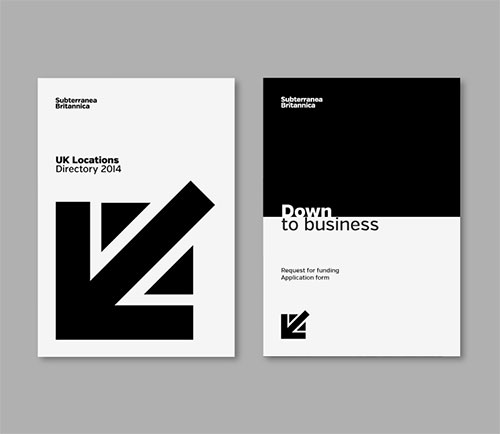
The one that got away, by designer Ryan Tym across in London.

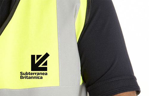
Ryan’s work was pro bono work the non-profit Subterranea Britannica.
“I was convinced that the identity proposal, which abstracted the Union Jack to form a downward arrow to reference the subterranean world, and Britain, was worth pursuing.”
— Ryan Tym
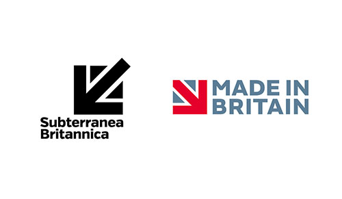
But before his work could be presented to the board, a similar-looking design appeared for Made in Britain, so Ryan decided to pull the idea.

It’s unfortunate. I’m sure the identity would’ve served Sub Brit well — a relevant, distinctive idea with a clear step up in quality.

It’s also a quick reminder not to jump to conclusions when two similar logos appear.
“Every day, blogs are filled with comments from designers criticising each other over which identities they have copied to get to their solution. The reality, most of the time, is mere coincidence. Basic shapes, symbols, graphics and letterforms are consistently at the heart of an identity, and the ideas around their usage often overlap.”


Comments
I too designed this in 2009 for Visit Britain while at The Brand Union – although the client never took up the concept. Still think it was a good one.
Great minds…
®
And the UK Space Agency is somewhat similar.
http://www.bis.gov.uk/ukspaceagency
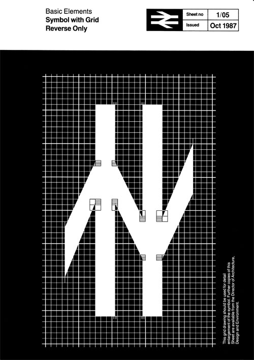
FHK Henrion was there first. In the recent Unit Editions “FHK Henrion: The Complete Designer” a very similar looking logo features on the spine, and there are numerous variations of the design contained within. Can’t tell you what it was for as my copy is at the office.
https://www.uniteditions.com/shop/fhk-henrion
(See spine + penultimate image in second column.
Very honest of him to say to the client they should not continue pursuing his idea. Because who knows what could’ve happened if they continued pursuing it.
I would like to think the two logos could have existed together in the same world. Extend the lines of the arrow out a bit past the triangles, like the center stem line already is, and I think it would be different enough to exist without infringing upon what The Partners designed for Made in Britain. Obviously contact with The Partners and Made in Britain would have been required to see if they would have been ok with that to head off any litigation.
The issue shouldn’t be about similarity. It should be about the bland generic banality that has engulfed design in general. I like to reference Paul Rand before I begin any design job…
“Don’t try to be different. Try to be good.”
A good solution is a good solution. There’s nothing bland about that.
I think the idea was a good one and should have been explored more. For example, what if it had been the whole flag, but with all the potential arrows pointing down, or a mix of that with a reference to the tube, or stairs, or any number of other potential variations that would have made it unique?