
The Subway logo is ubiquitous in these parts, with multiple stores in small-city Bangor where I live, but it once looked quite different.
The story began in Bridgeport, Connecticut, during the summer of 1965. That’s where seventeen-year-old high school graduate Fred DeLuca was looking for a way to pay for university fees. During a chat at a barbeque with family friend Dr Peter Buck, Peter suggested that Fred open a submarine sandwich shop — having seen something similar in his hometown become hugely successful. Peter lent Fred $1,000 and the duo formed a partnership that saw Pete’s Super Submarines open in August 1965.

Pete and Fred opened a second shop the year after. Then, realising that visibility would be key to their business success, their third shop was in a highly visible spot, still serving sandwiches today. The name was shortened to Pete’s Subway and the familiar yellow logo was introduced.
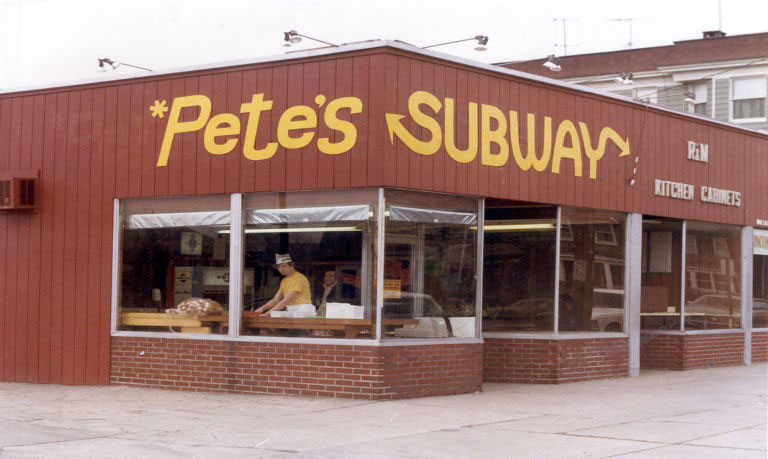
It was in 1968 when “Pete’s” was dropped altogether, and the brand became known as Subway.
Franchising was the next step in their business plan, and in 1974 the first Subway franchise opened in Connecticut.
The first Subway logo was used with slight changes until 2002, when the logo most people are familiar with was introduced, shown below, in use from 2002-2016.
![]()
A single colour variation was introduced in 2015.
![]()
Then in 2016, with somewhat of a return to the original look, the Subway logo lost the italics and found more curves.
![]()

![]()
Today, Subway employs 450,000 people across 44,000 outlets in 111 countries. According to Forbes, Peter Buck amassed a fortune of $3.6 billion. Fred DeLuca died in 2015, aged 67, with a net worth of $3.5 billion.
The new logo was rolled-out across all Subway locations in early 2017.
Via @Logo_Geek.

Comments
Interesting stuff. Thanks for sharing. I think the new logo looks fantastic. Now I’m hungry!
I just wanted to know who the the logo is aimed at. I’ll just assume it’s aimed at everyone.
The new logo disconnects me from the product, somehow. In fact, my first impression was that it looked like the logo of a trucking company. The monogram is certainly very clever, akin to the FedEx arrow. But changes to well-established logos require a period of adjustment. Maybe someday I’ll bemoan the loss of the ‘classic’ 2016 logo.
Not a big fan of Subway but I feel the italic form in the old logo was representing a fast service, quick food. That’s missing in the latest one.
Arrow in, arrow out makes no sense unless it was a drive-through.
Subway is a play on the word Subway – like the train – there’s an In and an Out. Like an NYC Subway or any major Metro, the original sign is intended to look like a hybrid of a street and an old subway (Subway train) sign. It gives them a history (like they are Italian from NYC) rather than spinning it to old hicks in Florida with a sandwich shop idea. That doesn’t make great story telling. :) Well it does. But it doesn’t. It is kind of like a drive-through when you’re on foot as it’s not just random stations of registers like McDonald. You have to join the queue – spend time there – spend time with sandwich builder – pay – leave. There is an in and out process. As in the car but on foot. Look at menu – order in speaker – agree that your order is XYZ – continue to drive through – window one – window two – food – condiments – gone. Same things you get at Subway on your way out. Difference is on feet, however, to the average customer, meaning not a brand geek like me – of course I agree with you.
Blah blah to the naysayers. This is a brilliant and character-rich update. The previous logo was solid and mainstream, but the new logo strikes me as more original and, in some ways, it’s less ‘slick’ and more wholesome. It already looks A LOT like Subway, as if it’s always been there, somewhere in the background. I wonder how this logo will look against images, though, unless it’s reversed out to white, or they put it in a white box (perhaps that’s coming).
Entirely my own preference, but I love the eccentric right hand twist to the Y, it’s both awkward and endearing, like a crooked smile.
More original? Look at their logo from 1977.
I had no idea of the history of this franchise! Not a fan of the food, but love a good story.
That being said, the newest logo rendition is quite nice. If it was a redesign “just because,” then it would make no sense. But a modern update with the obvious nod to the original logo? Well, that’s a perfect way to do it.
Include me in the ranks of the believers. The new mark is more visually unified, has greater presence, Beautiful modulation into the signet monogram, better color memorability and is going to seem timeless within a month of its introduction. Only downside is the loss of the vernacular-ish tonality of the old one – but everyone knows it is not a corner shop anymore.
Quite humorous to read the comments on this and other design forums, all praising the “originality” and “freshness” of this new wordmark… when it is nearly a line for line copy of the previous logo style that was replaced in 2002. All that’s been done is a small tweak to the arrows and removing the brown background… and voila, back to the future… circa 1990. Not exactly new branding.
The “S” icon is a new image… it might catch on… although I agree with the poster who said it suggests a trucking company.
Basically it’s just time – signs are worn, etc. I don’t pay much attention to their shops but considering their growth rate and flexibility as a franchiser this is always an area that makes smaller franchisees and individual franchise groups squeamish, because new anything = exit of cash. But I’m sure Subway has given them time and has a loan program for the disruption in cash flow this causes for the smaller counterparts so they can survive the hurdle. It’s also a profit area that a large company very infrequently gets to tap into – now stores will look fresher with new uniforms and paper products. Plus it’s a sign of stability and growth – you change your logo when you’re relevant. This is a win-win logo. It means the same as the old one – arrow IN and OUT – (= quick serve). Green is go. Yellow yield. But no red. No stopping. All traffic-based and health-based. Green lettuce. Yellow bread/cheese. Most likely always avoided red – even though red is tomato – as it associates with every historically unhealthy fast food chain. Wishing them great luck. The owners I have encountered over the years when I worked near one were always eager to please and never cried the big man takes my money – like some easy-launch places. Subway owners work hard – but not because they told me so – I recognize it in their labor and care.
Both arrows are actually pointing out…
I love the 60s feel of the original ones. They look like they may have been made out of real ingredients by hand. While the new logo looks clean and tidy, and it’s a good clean up of the previous, fussy, unnatural looking logo (which I never liked), it’s still extremely corporate.
I’d rather eat at Pete’s Super Submarines.
Fun fact, in 1964 Tom Geismar created a very similar monogram for Seatrain Lines. Check it out on Wikipedia.
That is correct. That is pretty much the Seatrain logo. I grew up with seeing that logo quite frequently as my father was the president for a short duration in the 70’s.
It’s a nice logo, as nice as the one it copied:
http://www.logobook.com/logo/seatrain-lines-2/