
The Superman shield, also known as the Superman logo or the Superman symbol, is the iconic emblem for the fictional DC Comics superhero Superman.
“In 1945, National Periodical Publications (later simply known as DC Comics) trademarked Superman’s symbol, allowing the ability to print his stories in perpetuity, rather than allowing the printed material to become public domain after 75 years, as was the norm at that time. The ability to license and merchandise the character created another source of income for the comics industry.”
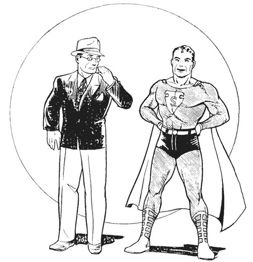
Clark Kent first appeared between 1934-35.
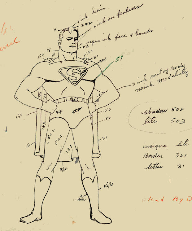
In 1944, the trademarked version of the symbol appeared in Superman 26.

“Superman’s symbol has become recognizable all over the world. However, at one time it wasn’t very consistently drawn — and that is the crux of this article. Prior to having trademarked the symbol, it went through a great deal of change. Here is the story as we know it.”
View the full archive on Brian G Philbin’s excellent resource MetropolisPlus.com.


Comments
The first few look very weak and the next ones are very cartoony and playful, almost not very superman-ish. Where’s the bold, strong, powerful slab serif?
This’ll always be the one I remember most.
Funny coincidence, my client just said that one of my recommendations reminded him of the Superman logo (not even close). I replied “Is that bad?”
The logo in the cartoon looks like the classic one to me.
I don’t think I’ve come across those earlier versions but I remember drawing and re-drawing those last two S’s…
In the comic at the top of the page, Superman looks like he smokes and would call me racist names.
When you concentrate just on the S logo it appears much wonkier that when it’s on Superman. Weird, I thought it was much more precise than appearing hand drawn.
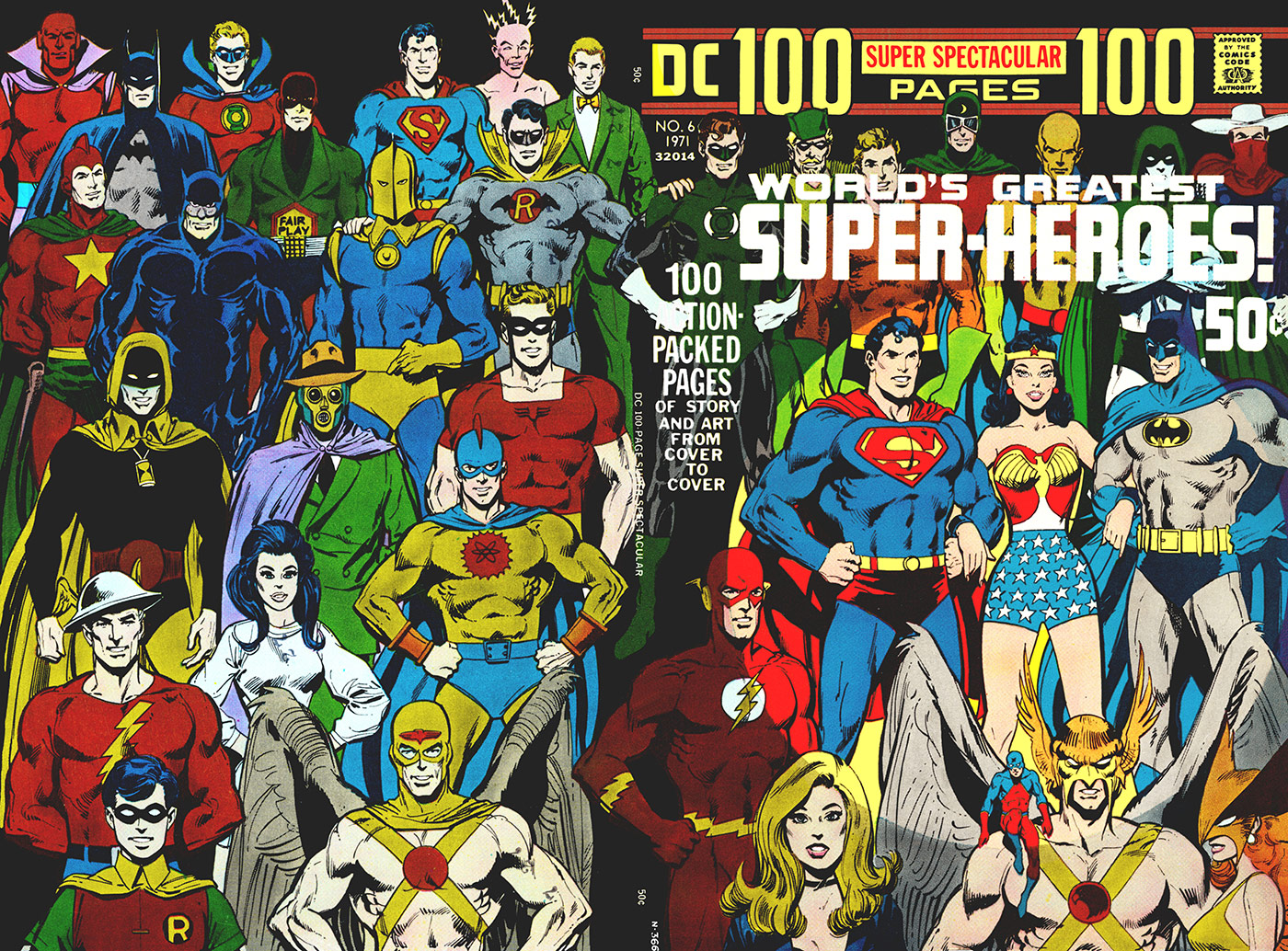
I see so many articles – like this one – that take their information and graphics directly from my webpage (which has existed for 24 years, now) on this subject but make no effort to credit my work (www.metropolisplus.com/superman). The last set of symbols I drew/painted myself. The first image I scanned and stitched together from my personal copy of DC 100 Page Super Spectacular No. 6 (which is identifiable by several digital “signatures”). The early image of Shuster’s Superman/Clark Kent is from a scan I did myself and the close-up of Superman #26 is my own, as well. I think this stuff is great to share (my own webpage has no ads and I pay for it out of my own pocket every month), but geez, a little credit for the enormous effort I continue to put into improving the page every year shouldn’t be out of the question.
My apologies – and my mistake – there it was, just above the last set of symbols.
No need to apologise, Brian. Many thanks for all the work you’ve put into your website. It’s appreciated.