
“TCRP’s mission is to find a cause, and have an effect and from there, grow their initiative by inspiring others to be catalysts for change as well.”
The identity was created in 2012 by Singapore-based Bravo Company, a design studio founded by Edwin Tan and Janice Teo.
The work’s a great example of how a simple-looking symbol can form part of a much stronger visual identity, and why there’s a lot more value in logos when viewed as part of the bigger picture. The symbol’s based on the Chinese character Rén, meaning “people.”
![]()
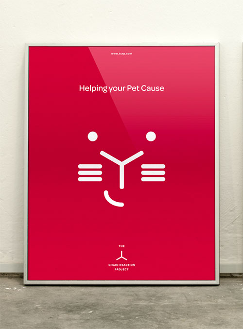
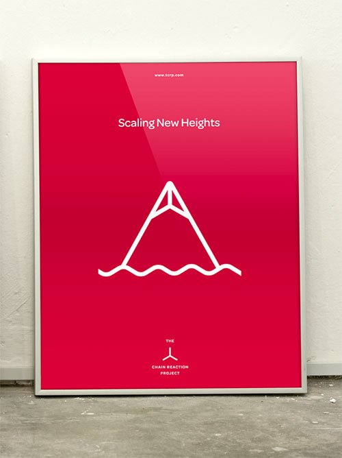
Bravo created a series of icons with the symbol for their client’s various causes.
![]()


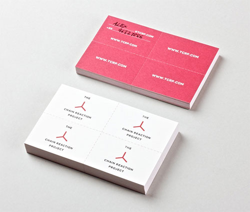
The namecard creates its own chain reaction. You can pass it on to three other people.


More from Bravo Company, and The Chain Reaction Project website.
Comments
This is a great example of how a seemingly simple idea has very deep roots. I really love the concept and it’s various applications. Really great stuff. Thanks for posting this.
Fantastic project, especially like how the marque is followed through all the different materials. The icons are a work of genius!
Simplicity by all means. Excellent work!!
I love the origin of the project and that it’s included in this post. A lot of artists don’t show their process.
I see the flux capacitor.
I love that! Brilliantly imagined, developed and implemented. A great identity for a great cause. Fantastic website, too.
Great stuff. Bravo! (Unfunny pun intended.)
A great identity that fulfils all a brand needs through its extension. Brilliant!