
Alternatives crop up, one of which is the Golden Wattle.
“The wattle is our only authentic national symbol – totally, unambiguously of this land. It is not conflicted or qualified in its identity or loyalty. It is eloquently, elegantly and undoubtedly Australian.”
— Terry Fewtrell, President, Wattle Day Association

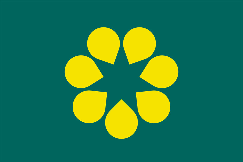
Australia’s official floral emblem is the golden wattle, with about 950 different species of wattle being native to the country.

Green and gold are Australia’s national colours, and were derived from the golden wattle leaf and blossom. The flag emblem has the dual meaning of the wattle and the seven-pointed Commonwealth Star that’s created by the central negative space.


Designed by Jeremy Matthews of Ammunition, it’s my favourite from these alternatives (below) recently featured in the press.

Read the full rationale on the Golden Wattle flag website.

Comments
Nice, clean solution. So much better than the other options.
This would be an amazing flag for Australia.
Brilliant!
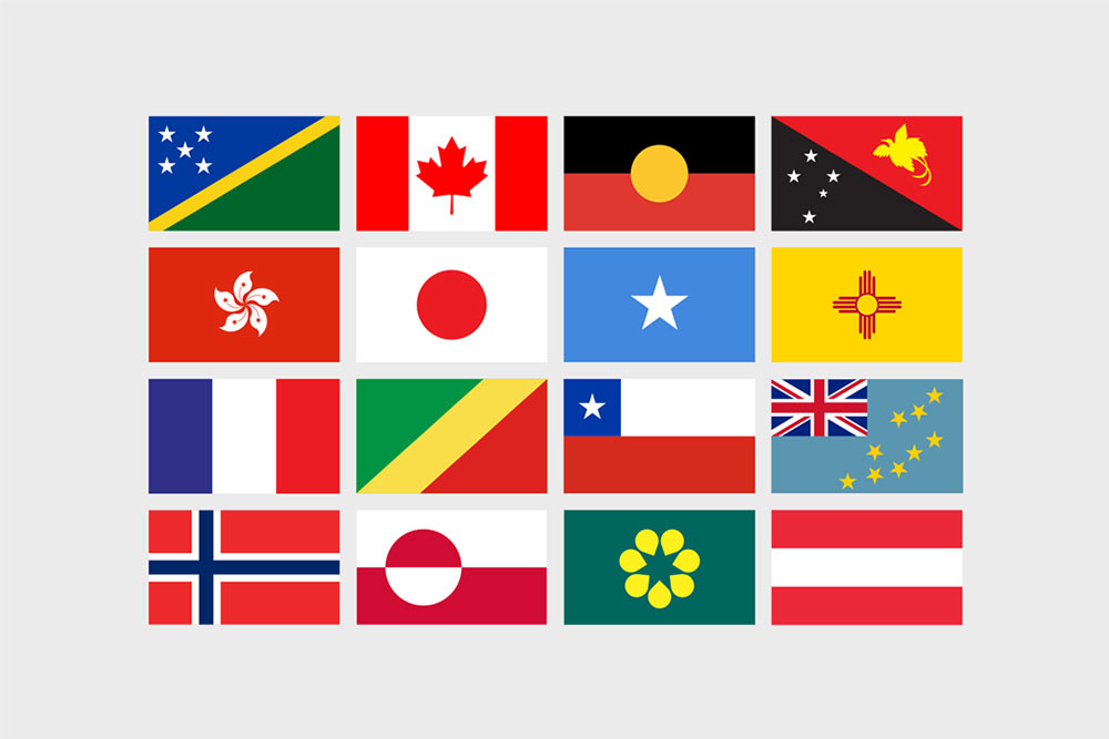
I find this one more pleasing:
http://www.flagforaustralia.org/
Great design by Jeremy Matthews, reminicent of the Designers Republic’s work on the flags for Wipeout 2097. Love the use of negative space, dual meaning and clean solution.
This would be my pick as well! As an Australian I connect with the Golden Wattle more than our current flag.
Great idea. So simple, so beautiful.
Very good, but would be better without the ‘star’ in the middle, which could be avoided by rounding the inward point of the ‘droplets’.
I refer to it as the Spinach and Corn flag, for obvious reasons. Others preferred.
http://www.flagforaustralia.org/ looks like a corpoate logo. The Wattle is very easily recognisable, like Canada’s maple leaf. But of course, anything to sever the link with the unfortunate british influence!
Love it! I really like that the wattle star emblem is primarily a unifying symbol, many united equally as one. Also, that it combines two national symbols, wattle and Commonwealth Star in one emblem.