Derbyshire-born Cook (1808-1892) began his travel company in 1841, 50 years before this brochure cover (below) was in use.
 Cooks Tours brochure cover, 1891, via The Guardian.
The business passed to his only son John who had been his partner since 1864.
Here’s the “Cooks Tours” logo from late in the 19th century.
![]()
In 1914, a fifth continent was added to the surrounding ribbons (below).
![]()
And in 1928 a fifth ribbon was added, and the brand name changed from Cooks Tours to Cook’s Travel Service.
![]()
The globe was replaced in 1930 with TC&S for Thomas Cook and Son.
![]()
These two designs were used between the mid-1930s until after the second world war.
![]()
Cooks was seen between the 50s and 70s.
![]()
The “flame red” Thomas Cook logo was introduced in 1974.
![]()
It changed again in 1989.
![]()
The “sea and sun” yellow and blue was launched in 2001.
![]()
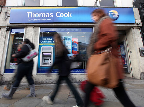 Thomas Cook signage, 2011, photo by Chris Ratcliffe/Bloomberg.
And here’s the new look.
![]() The sunny heart logo, launched worldwide in October 2013.
The sunny heart logo, launched worldwide in October 2013.
“After a successful year in the Nordic countries, the sunny heart is now the unifying symbol for the whole Thomas Cook Group, in more than 70 countries.”
Quoted from the Happy F&B website — the Swedish agency behind the design.
![]() Ving signage in Sweden and Norway as part of the trial.
Ving signage in Sweden and Norway as part of the trial.
Thomas Cook marketing and ecommerce director Mike Hoban said, “The gold sunny heart logo had been created to evoke warmth and emotion and worked for all types of holiday, even skiing. […] Then, the type in metallic grey reflects a high tech, digital Thomas Cook.”


The Independent reports that this is the first time in Thomas Cook’s 172-year history that all its companies will have a unifying identity.
Elsewhere:
The sunny heart brand page, on Thomas Cook
Thomas Cook press release
Thomas Cook unveils new logo, on The Belfast Telegraph
Thomas Cook unveils Sunny Heart logo, on The Telegraph
Thomas Cook history in pictures, on The Guardian (from 2011)
Thomas Cook biography
The logo journey of Thomas Cook (PDF)
Logos and dates courtesy of Loulla-Mae of Marketing Magazine.

Comments
I like the original logo. That one had some class!
Oh it’s a heart is it? Must admit I didn’t see that at first.
Maybe because, I suspect, it’s actually a ‘V’ for Ving with a heart rationale added later. I like grey and yellow as a colourscheme and I’ve used it a few times although it’ll take some time to grow on me in the context of travel agent, has a very corporate feel.
Their new logo design is nice and warm to look at. Just like it should be when you consider traveling to warm countries. I just wonder how they may have developed a logo design that seems like many others out there.
http://obieosobalu.files.wordpress.com/2011/09/excel_for_mac_2011_icon.jpg
http://upload.wikimedia.org/wikipedia/en/5/54/SVT_Play.png
There’s an incredible similarity that cannot be mistaken. Yes these logos perhaps have a different color and are turned 90 degrees, but still.
I don’t get it – imho the globe is more important than this heart shape.
It’s mixed up with a hammock?
http://kayakdave.com/wp-content/uploads/2012/08/byer-hammock.jpg
I don’t like it – sorry.
I did not see the heart at all. Also it does not sit well on the tail of the plane. why all the gradients? Are they trying to show a heart or the fold or the curve? If the heart then why the fold and gradients? Not sure what is the reasoning behind it. Overall it fits better for a product in a pharmacy.
An obvious ripoff designed for Ving over Thomas Cook, maybe there was a reason the whole brand wasn’t unified under one logo. The yellow is nice but grey is the last colour that should be used by a Holiday company.
If they brought back the 1928 logo I would go with them every time I traveled.
The logo with ribbons on it was classy and I was pretty stunned how the new logo turned out. Definitely has a good feel to it.
Nice and cheerful but it looks like a pharma company logo. Still nice nonetheless.
Cheesy use of gradients and highlights… is that a lens flare? The logos appear to get successively worse in my opinion. The The 2001 “sea and sun” yellow and blue is terrible.
My word, that globe thing was truly horrible. Anything’s an improvement on that, even these little golden pills.
I’m with Rich – bring back the one from 1928. It’s lovely, speaks of the history of the company, and evokes a sense of adventure sadly missing from modern travel. I look at that and think of doffing a pith helmet and exploring exotic new places.
I look at the new one and think of bland package holidays which make reading a Dan Brown novel seem like a good idea.
It looks like a crisp to me.
The Belgium web agency madewithlove (http://www.madewithlove.be/) brings an attack against Thomas Cook for “plagiarism.” They’ve had nearly the same logo for three years.
This is an example of not being afraid to completely change the logo.
Yep, sure looks like “madewithlove” has had this logo in action for quite sometime. IDENTICAL.
I used to work for Thomas Cook and definitely share some of the same sentiments of other designers on the new and previous logos. This new mark made sense for Ving but using it for TC seems completely out of context. However, as some people mentioned previously, anything is better than the globe version.
I’d also like to mention that just as the globe with its gradients and style seemingly fell out of fashion fairly quick (if it ever was in fashion), so too will be the fate of the golden gradient pill heart. Solutions=simplicity IMO.
Hadn’t had to use a Thomas Cook store since the rebrand until recently, so couldn’t find it on the High Street because it didn’t look like what I was looking for. The logo looks like a Quaver. End of.