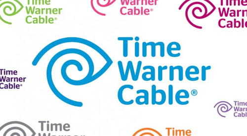
On the Time Warner logo, “When Time Inc and Warner Communications announced their merger, the new company lacked a trademark. Warner was primarily concerned with entertainment, Time with journalism. So their common denominator needed to be much broader: looking and listening, reading and hearing, receiving and sending. The new logo was a pictograph combination of an eye and ear, the essence of communication.”
That’s quoted from Maggie Macnab’s excellent book, Decoding Design, as well as on the C&G Partners website.

The mark was designed by Steff Geissbuhler in 1989, while working at New York-based Chermayeff & Geismar. Today the symbol is used by Time Warner Cable, and the design was altered (below) by The Brand Union.


When Steff Geissbuhler, who went on to form C&G Partners, was asked by Johnson Banks to name the worst design crime he’d seen, he said, “The redrawing of my Time Warner logo, making it weaker, and then calling it theirs.”
It is a strange refinement. It’d be interesting to see behind the scenes for how the update was explained.
Time Warner Cable was acquired by Charter Communications in May 2016. The brand is now known as Spectrum, doing away with the classic Time Warner eye, and replacing it with something much more forgettable.


Comments
This logo has creeped me out more than any other. It looks like the Egyptian eye of Ra… and represents hypnotizing a vast media audience.
Stare into the logo, you can’t look away!
Even worse, its the pedo swirl, ancient symbol, along with the star of remphan.
Its a nice marque. I really didn’t get the ‘ear’ element though! There’s something new to be learned every day ;-)
I think the ear-eye motif is remarkably extensible but the typeface feels weak in comparison.
I have never seen the ear in the logo until now. I thought it was a hypnosis logo that made a T. I agree with Josh in that it always creeped me out. They don’t even hide the fact that they want us mindlessly glued to the TV!
Completely agree with Josh – very creepy for a company with such a reach within the media to have a logo that is so close to the All Seeing Eye. I know the symbol won’t be recognised by the majority of Joe Public for what it really is – but someone in the design process must have clocked it.
Creepy hypnosis was my first hit as well. Did not see the ear until I read the description.
Totally agree with the other comments. It’s creepy hypnosis of the all seeing eye hidden in plain view. These huge corporations are all about symbolism and sneak it in at any given opportunity,
Glad to see I wasn’t the only one who thought this logo was eerie (ear-y?).
I’d seen this logo and the concept in one of my design books and didn’t understand it then, nor now. Sometimes, you have to dumb down your concept to get the point across and this is one of those examples. Like everyone is saying, I didn’t see this or that communicated when it is essential to the design. When you add to the fact that TW doesn’t have the best service, it really starts to complete the idea that they are out of touch, period.
This logo always seemed to me a bit creepy, it seems to have some weird sci-fi elements to it that throw me off.
This is a well crafted logo design. I didn’t see the ear but I can see how the idea has helped evolve the logo into it’s current form. At the end of the day it is a strong and original mark that is easy to reproduce and recognise – an effective an practical logo design.
The logo has certainly had a lot of thought go into it but I didn’t realise there was an ear in the logo until it was pointed out to me. I’m not sure whether that’s my own lack of concentration whilst looking at the logo or if it is too subtle. Regardless, the logo is very clever and it is perfect for a company like Time/Warner.
Totally looks like the eye of ra. I believe he is the all seeing eye which I’m sure conspiracy theorists will have a blast with this one…
Designers don’t make accidental designs, especially in regards to logos. I’m sure the designers we’re aware it would be interpreted as a hypnotized eye or an egyptian eye of Ra. The fact that a large number of the comments here point that out shows that it’s not hard to see that. I’m not trying to push forward a conspiracy theory but it’s apparent to me at least that it can be easily interpreted in a number of ways.
Looks strikingly like my little cousins naruto headband. You know the hidden leaf symbol? That makes it even creeper. TW are a bunch of magic ninjas controlling the media.
To me this symbol is announcing Time Warners allegiance to Satan’s service.
The eye of Ra which is an ancient Egyptian symbol with a hypnotic swirl with it. The King of Babylon (the eye of Ra) uses Time Warners airwaves via their television, internet, media servers to implant lies and deceit subliminally through the eyes of viewers who watch the blue screen via Time Warner.
Ps: I refuse to connect to Time Warner upon moving to my new apartment b/c I will not, nor ever will give any of my money to fund Satan’s army. I am no longer watching TV as the building has been “given” to Time Warner and all apartments are hardwired for them. Another giveaway as to where their allegiance lies is they will not carry Shepherd’s Chapel Network which has 24 hour Bible study options 24 hours day, 7 days a week.
They know exactly what it represents, the Eye of Horace. Splattered all out in front of us daily, US Dollar Bill, Google Chromecast Splashscreen with Katy Perry, the so-called benign symbol is doing more to all of this world than anyone can imagine. Now even in the drawn artwork by a teenager for her Black Lives Matters cause, the Eye is there. Why do you think they call television content… “programming”? I destroy everything with that Eye and never use it again.
One last thing: for all the naysayers about the Lord God Almighty, you cannot have one (the evil one) without the other good one.
For those following this world evil, have a great time at the eternal BBQ soon. I won’t be attending.
This is illuminati symbolism right in our faces. Of course they control the media. It makes me want to get rid of my tv, but I’m hooked like the rest of the masses.
You’re absolutely right, Kelly. It’s the illuminati all the way. And as with most symbolism of the illuminati, they are in our faces all the time, everywhere in damn near everything.
But most of us don’t recognize it if we don’t have knowledge of their presence. This really is some scary shit because at the end of the day, that is what they’re trying to do. Hypnotize us! And every time I look in my mailbox, there’s something in it from them.
Some scary shit out there! ?
Amazing! The curve at the top, with a horizontal line under it, making a mound shape is the Hieroglyph for the letter T. The spiral shape, on its own, is the hieroglyph for W.
That is a pedo symbol. Jewelry, rings, stickers, signs, logos, clothing patterns, all are instantly recognizable to pedos around the world. It is a very evil symbol, and I would wager that TW has ties to that world, at least their highest paid execs.
I was a low level manager at what later became Time Warner Cable when this logo came out. I immediately loved it for its strong lines and curves. When I read the memo of introduction we got, I was further impressed by how aptly it conveyed the vision of the new company. We were told about the pun-like implication that the “I” and “E” represented the brand’s information and entertainment legacy and promise.
I proudly display it on a variety of novelties given us over the years. Now, long retired, I’m grateful to finally have discovered its genius creator. Attaboy!
Looks to be like a 666, like the CERN logo. Also look up FBIs symbols that pedophiles use for code. Looks just like the “little boy lover” logo as well. And the all seeing eye is there.